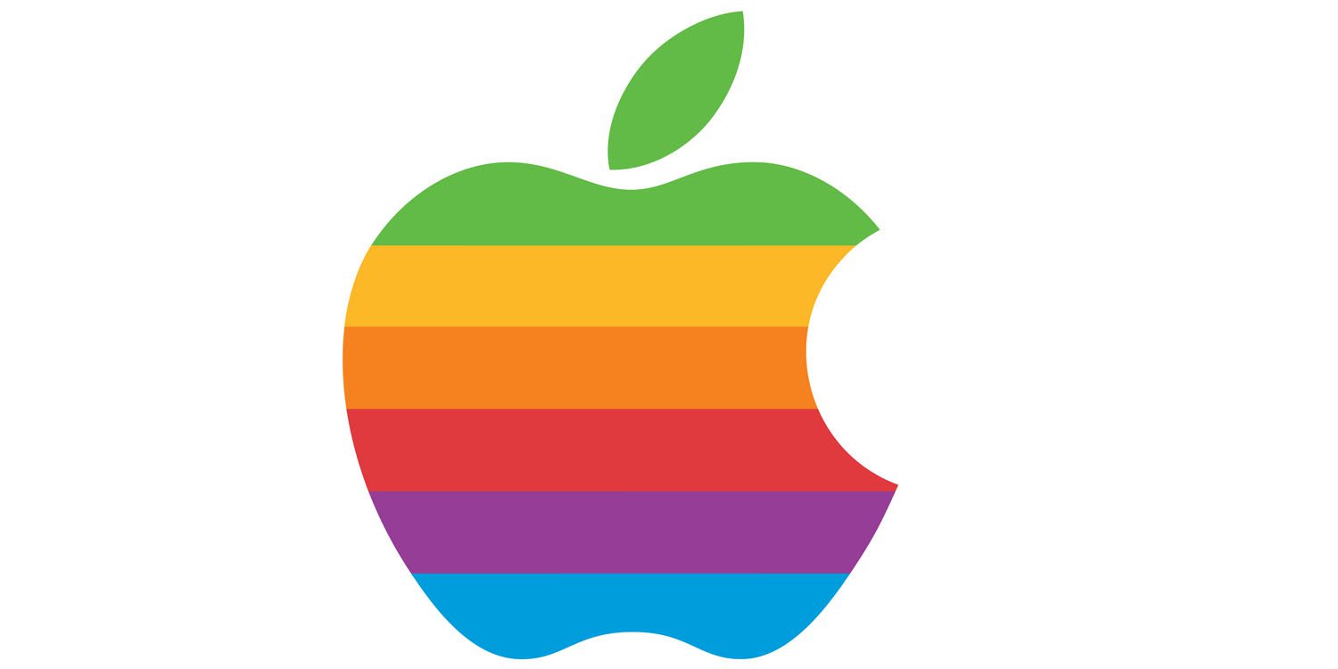
The Apple logo has undergone several major changes during its existence. In today's part of our series entitled From the history of Apple, we will remember the end of August 1999, when the company Apple said a definitive goodbye to the logo of a bitten apple in the colors of the rainbow, and moved to a simpler, monochromatic version.
It could be interest you

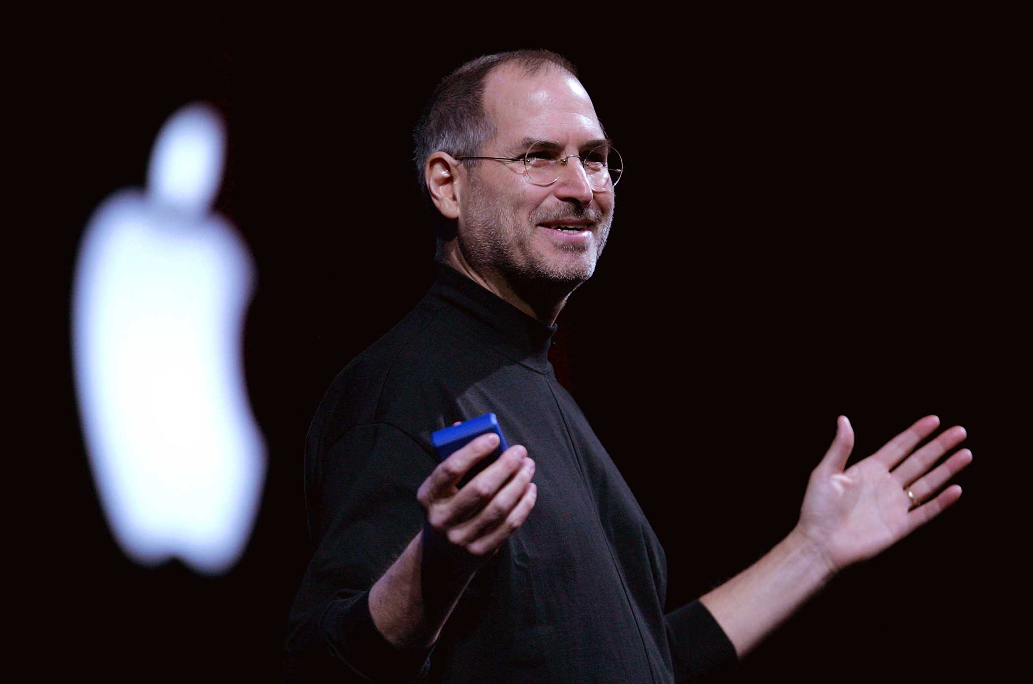
For most of us, replacing a colored logo with a simpler one seems like something we don't even need to think about. A number of different companies change logos in the course of their operation. But in this case it was different. Apple has used the rainbow bitten apple logo since 1977, and replacing the rainbow variant with a simple monochrome version did not come without a backlash from Apple fans. Behind the change was Steve Jobs, who had already been back at the head of the company for some time, and who, after his return, decided to make a number of important steps and changes both in the product range and in terms of the company's operation, promotion and marketing. In addition to the logo change, it is also associated with Jobs' return, for example Think Different advertising campaign or cessation of production and sale of certain products.
Apple's first logo featured Isaac Newton sitting under a tree, but this drawing was replaced by the iconic bitten apple after less than a year. The author of this logo was then 16-year-old Rob Janoff, who at the time received two clear instructions from Jobs: the logo must not be "cute", and it should visually refer to the then-revolutionary XNUMX-color display Apple II computers. Janoff added a simple bite, and the colorful logo was born. "The goal was to design an appealing logo that was also different from any that existed at the time," Janoff said.
Just as the colorful logo reflected the novelty of Apple's product offering at the time, its monochrome version was also in line with the new products. For example, the monochrome logo appeared on iMac G3 computer, in software from Apple - for example in the Apple menu - but the rainbow variant remained for some time. The official change occurred on August 27, 1999, when Apple also ordered authorized resellers and other partners to stop using the rainbow variant. Partners could then choose between a black and a red version of the simplified logo. In the related documentation, Apple stated, among other things, that the change should reflect the development of the Apple brand. "Don't worry, we haven't replaced our logo - we've just updated it," the company said.

