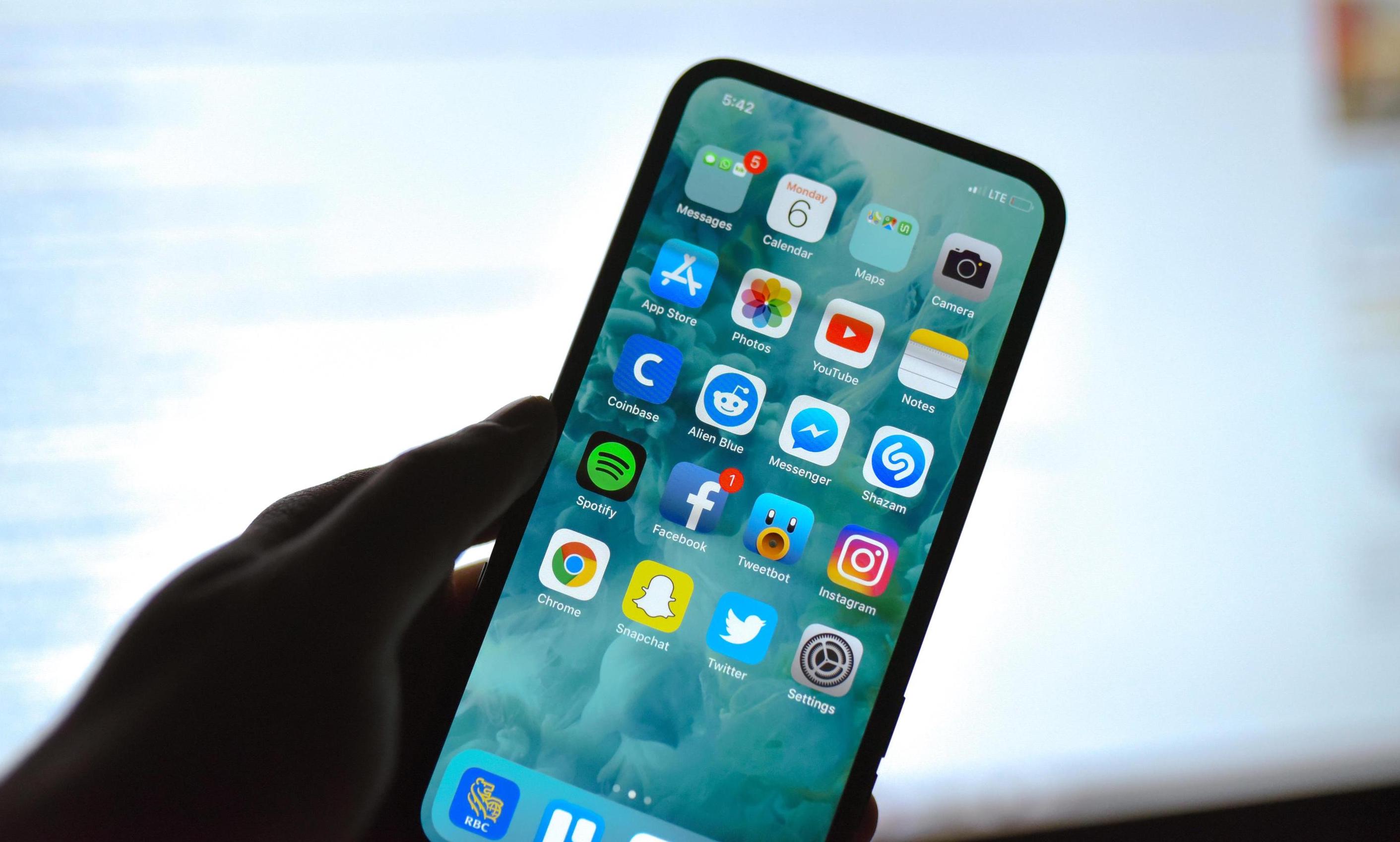
With the iPhone 13, Apple has reduced its notch in the display, but it is still a laughing stock for Android phone users. What about the fact that it contains unique technology to biometrically recognize users when it is monstrous in their eyes. However, according to the latest rumors, the iPhone 14 Pro will come with a pair of punch holes. If so, will the status bar also have a new use?
When we had iPhones with a desktop button here, of course their status bar was across the entire width of the display, which also brought a lot more information. To this day, many people have not gotten used to the fact that they do not see the percentage indicator of the battery charge on frameless iPhones. But if Apple minimized the cutout in iPhones, this information would finally fit here, and in addition, the door could open for other uses.
It could be interest you

Inspiration mainly for Android
We are talking about the fact that Apple could be inspired not only by its macOS, but especially by Android, and bring new functionality to the line. This would consist in the fact that Apple would let other applications into the status bar. So you could see the missed events here with the icons, and not only from the native titles from the Apple workshop. Android 12 also offers a user-defined amount of content that you want to display here. It can be all notifications, but maybe just the three most recent ones, or just display their number.
These would probably not be active elements that could be clicked on and redirected to the appropriate application. After all, not even Android can do that. This only alerts you to the given information, which you can then find by swiping your finger across the display from the top of the display downwards, which will bring up the Notification Center on iOS. It is therefore a very similar functionality, with the only difference being that the status bar of iPhones does not inform about anything like that.
Its full form is offered by iOS when activating the Control Center. Here you can also see if you have set alarms and just the desired battery charge percentage of the device. In any case, it's an extra step and you won't get much more information here anyway.
It could be interest you

Criminally underutilized space
In iOS, Apple generally wastes space throughout the system interface. Inexplicably, the lock screen does not use the possibility of displaying numerous information, the home screen seems like a waste. Why can't the status line be below the viewport, or actually have two lines? There really is a lot of space here, even considering the space between the bottom row of icons and the page count display. Actually, it would be enough just to move the whole set of icons a little lower.

 Adam Kos


