It's been a few long months since Apple finally announced the long-awaited macOS Big Sur and wiped the eyes of literally all the fans and bad tongues. Unlike the previous version in the form of Catalina, the new addition to the portfolio brought a whole series of drastic visual changes to make the user experience clearer and simpler and ensure more intuitive control. If you were expecting only minor changes and a few different fonts, you couldn't be further from the truth. In addition, Apple really kept what it promised and together with the final version of macOS Big Sur, which was released to the world yesterday, a number of high-quality comparisons surfaced, where it is clear that the designers and developers of the apple company definitely did not slack off. So let's take a look at the most important news that will probably please you. Of course, some small things may change in future updates, so keep that in mind.
It could be interest you
First impressions
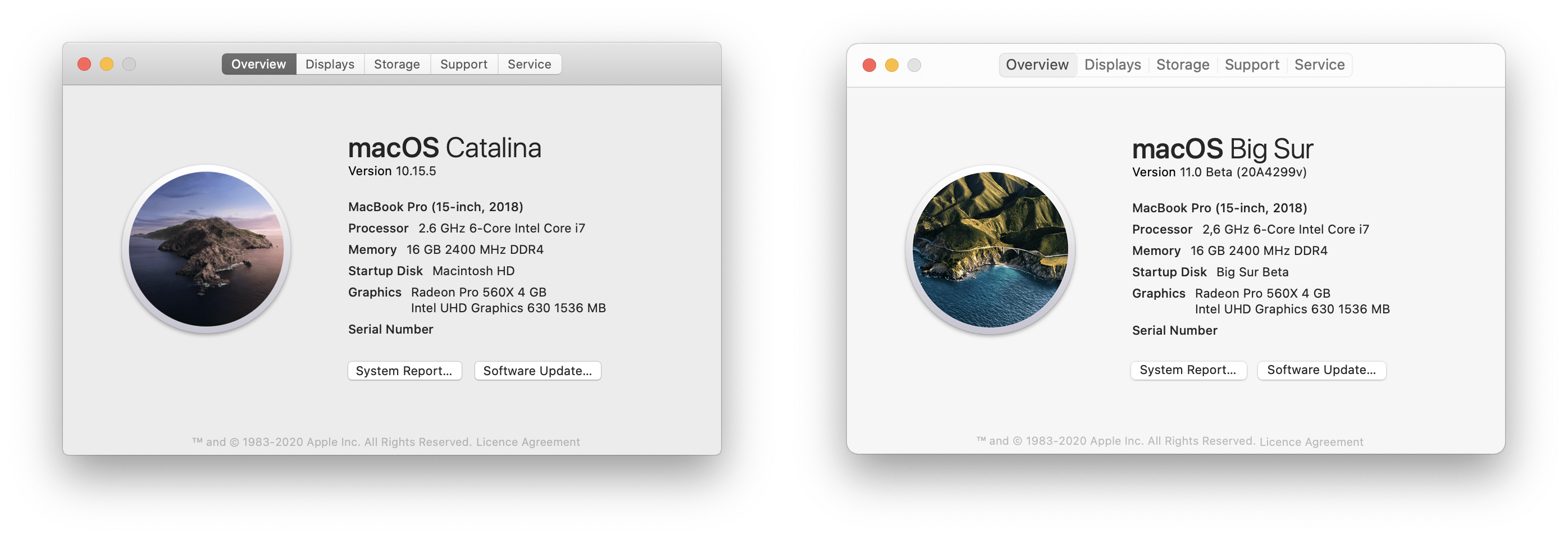
At first glance, it can be seen that Apple has really won with colors. The entire surface is thus much more colorful, more lively and, above all, literally pleasing to the eyes, which is a rather drastic difference compared to the previous, much darker and "boring" version. There is also a major change of icons, which we already informed you about in the past. They are rounder, more visually attractive and, above all, much more cheerful and welcoming than in the case of Catalina. In addition, thanks to the modernization of the icons, the overall area seems larger, more voluminous, more clear in many ways and, above all, creates the impression of a 3D space, especially due to the enhanced contrast of colors and lines. One could even argue that Apple is preparing space for future touch control, but at this stage it is only conjecture. Either way, the pleasing surface is what fans have been calling for for a long time, and we can safely say for ourselves that the more colorful Big Sur will definitely be used better than its older sibling.
Finder and preview managed to surprise
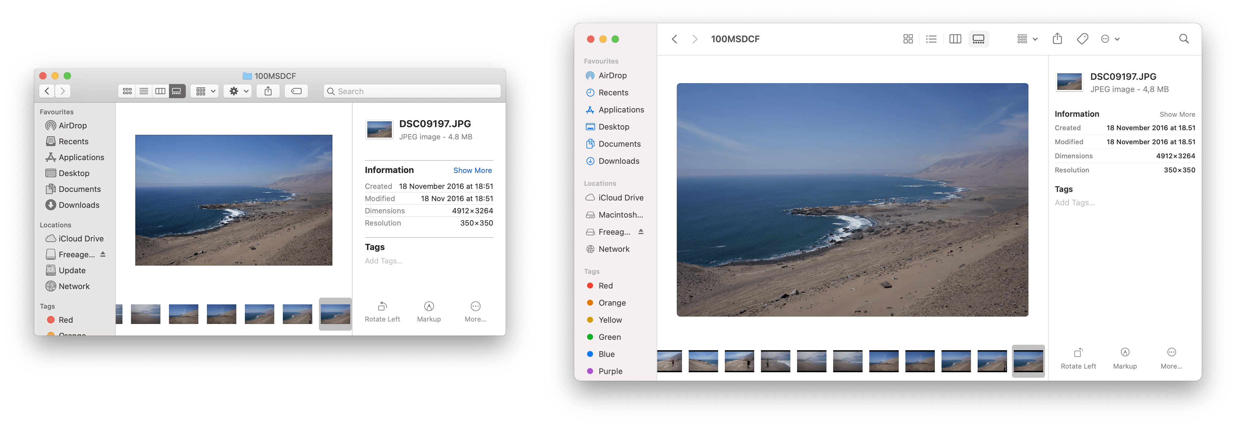
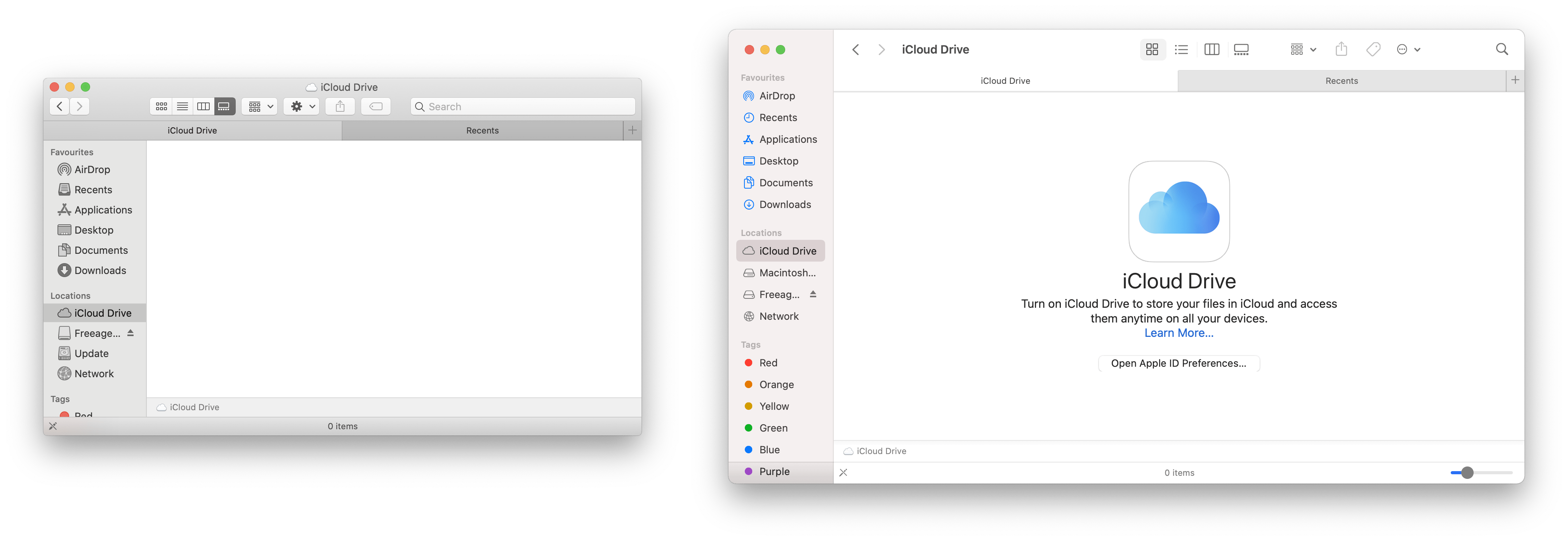
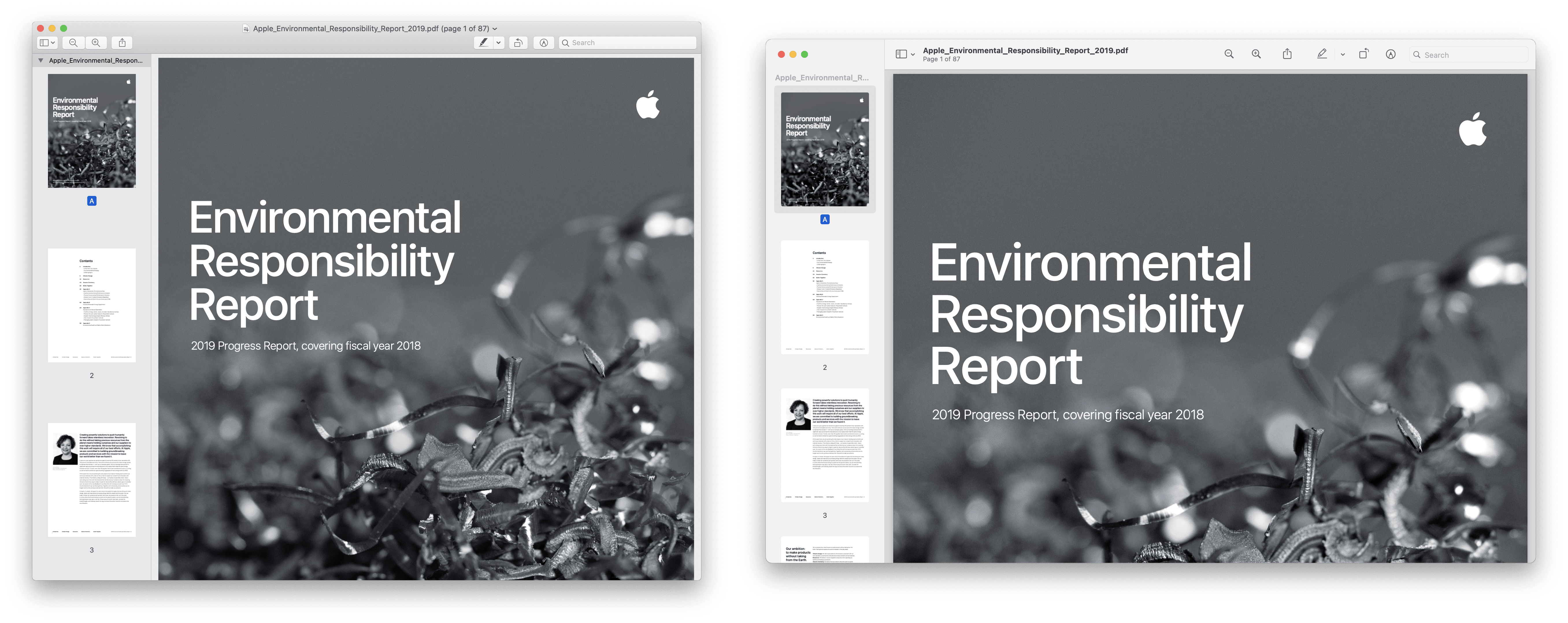
Paradoxically, probably the most fundamental and biggest change was not the desktop itself, but the Finder and Preview. One of Catalina's long-standing ailments was the fact that the Finder was somewhat outdated, confusing and, above all, did not meet modern user requirements in many respects. Apple decided to focus on this area and overhauled almost the entire design, which you will notice at first glance. In addition to the recognition of larger and more colorful icons, macOS Big Sur can also boast of minimalism, the pleasant contrast of the gray side panel and the selection area itself, as well as the incomparably larger native size of the open window.
The overall design is thus cleaner, more intuitive and above all, at least in the case of the left menu, many times more lively. The only drawback can be overly advanced functions that are not completely in line with the simplicity of the whole concept and tend to be switched on natively. If you want to enjoy as few distracting elements as possible, you will have to select and sort the individual functions. Otherwise, this is an excellent enrichment of the existing design, which brought the system one step closer to iOS.
The setting pleases and disappoints
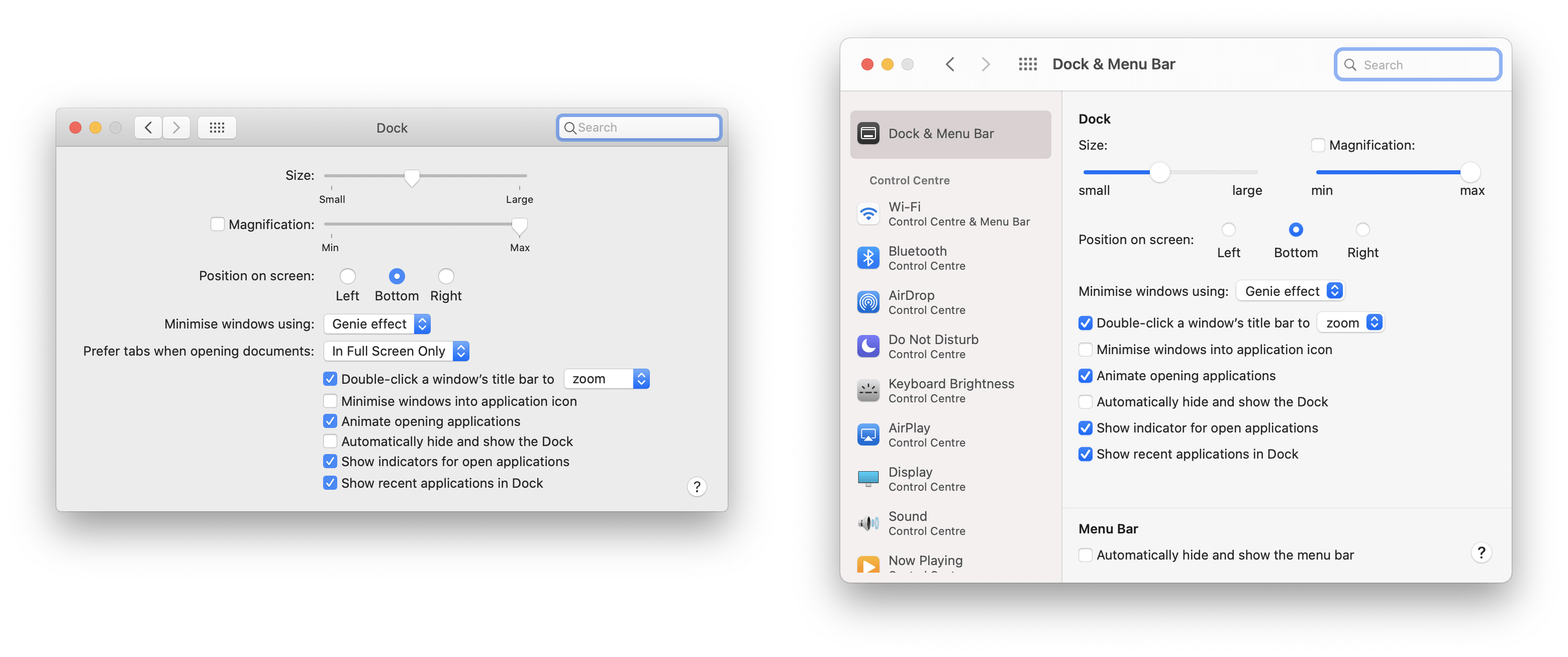
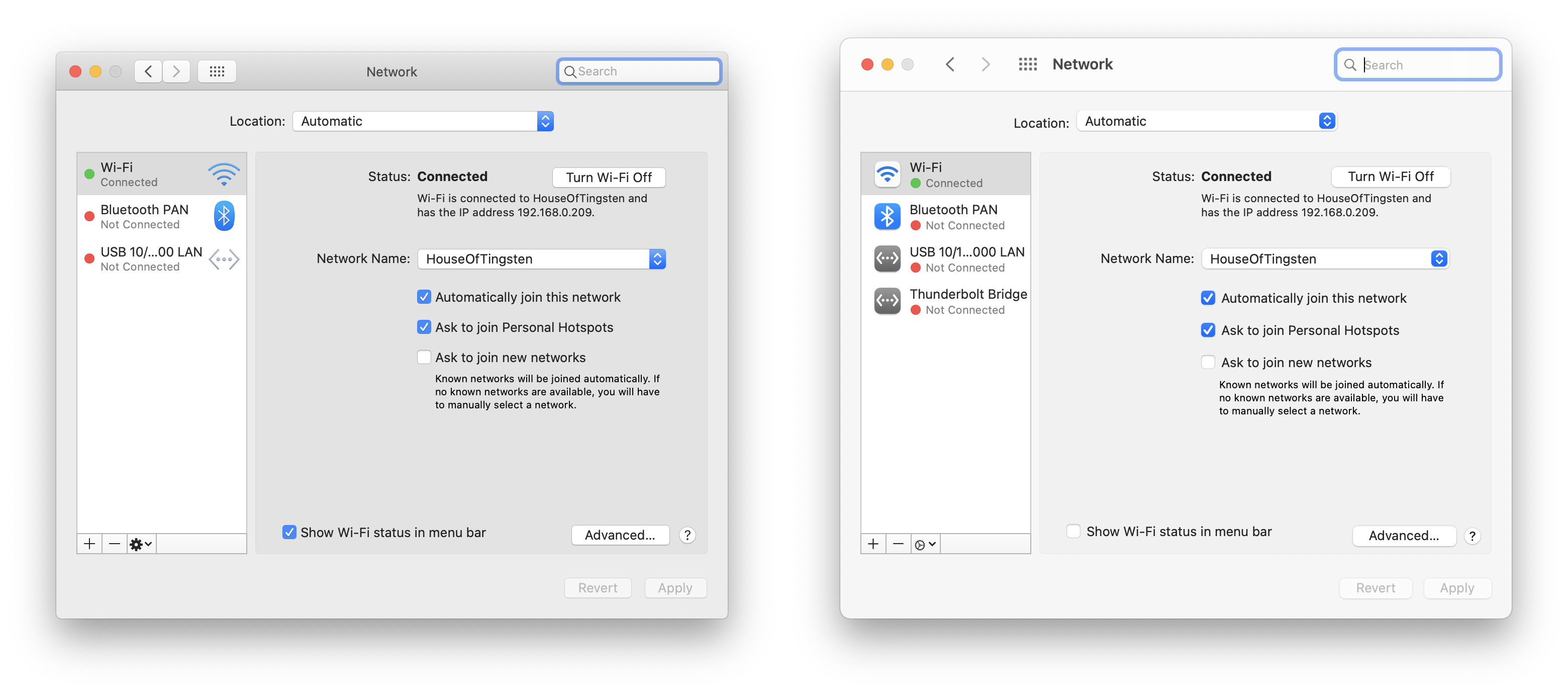
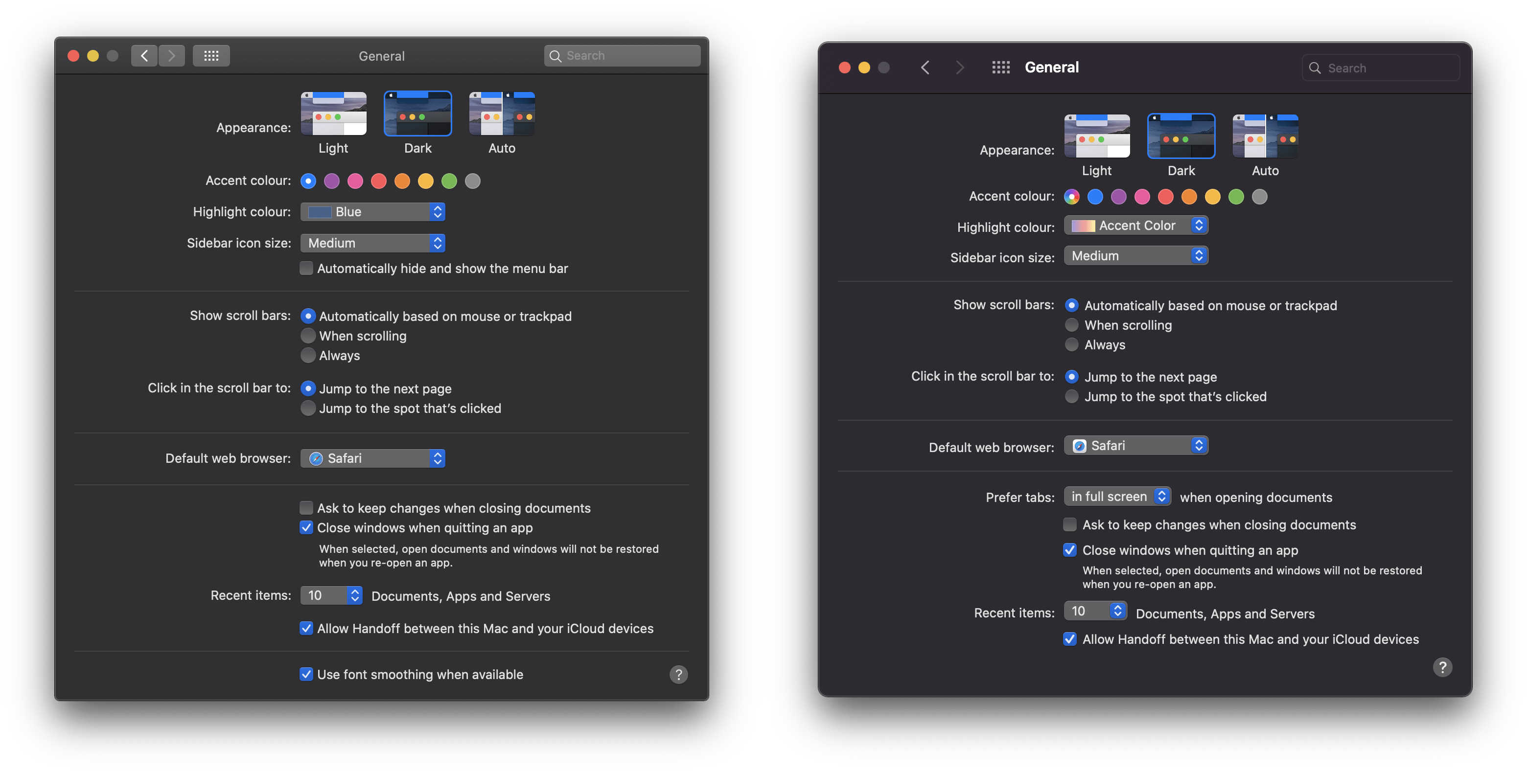
If you were hoping for a similar makeover of the settings overview as was the case with the desktop and Finder, we have to slightly disappoint you. Although the menu itself has received a number of new and certainly pleasant elements, such as a sidebar where you have an overview of categories and can switch between them at will, basically the user interface still relies on a somewhat outdated search bar and, above all, incomplete icons. These are almost the exact opposite of the desktop, and although Apple tried to make them slightly special and different, compared to Catalina, they did not hold up very well. This is, among other things, the prevailing opinion of fans who have already had the opportunity to try macOS Big Sur. In the overall context, however, this is a small thing that the apple company will surely improve over time. On the other hand, it would be nice to have a clearer processing of notifications, for example when you want to switch the boot hard disk.
The taskbar and notification center under the microscope
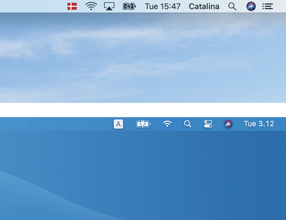
If there was anything that took our breath away and put a smile on our faces, it was the bar and notification center. It was these two, at first glance, inconspicuous elements that played a partial role in how satisfied the fans would be in the end. In Catalina, it was a disaster, which with its boxy design and unsuccessful icons literally ruined the entire upper part, and after a while this inconvenience started to really irritate many users. Fortunately, Apple in Big Sur focused on just that "trifle" and played with the bar. It is now fully transparent and offers white icons that clearly symbolize what the user can imagine under them.
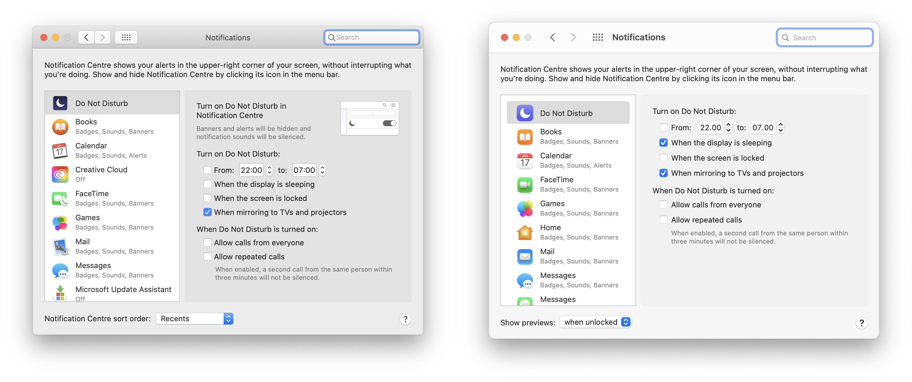
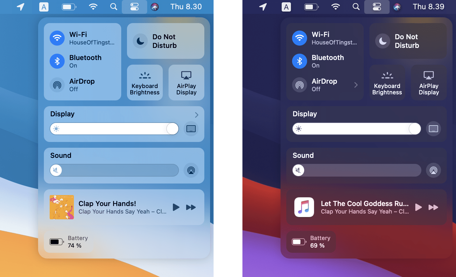
The same is true of the notification center, which has come much closer to what we know from, for example, iOS. Instead of a long scrolling menu, you will receive pleasantly compact round boxes that will clearly alert you to news and deliver the latest information right under your nose. There is also an improved graphic design, for example in the case of stocks that show a graph, or the weather, which shows a weekly forecast with accompanying colored indicators instead of a more detailed description. In any case, this is a significant improvement that will please all lovers of minimalism, simplicity and clarity.
He didn't forget about other Apple elements either
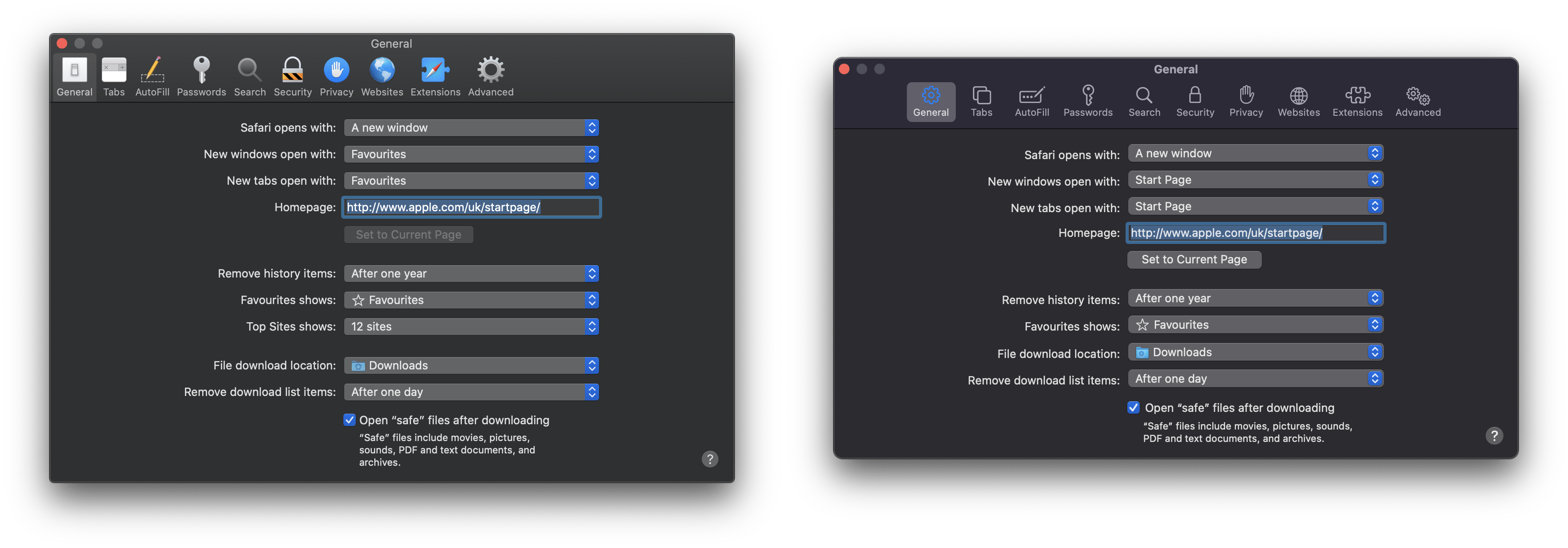
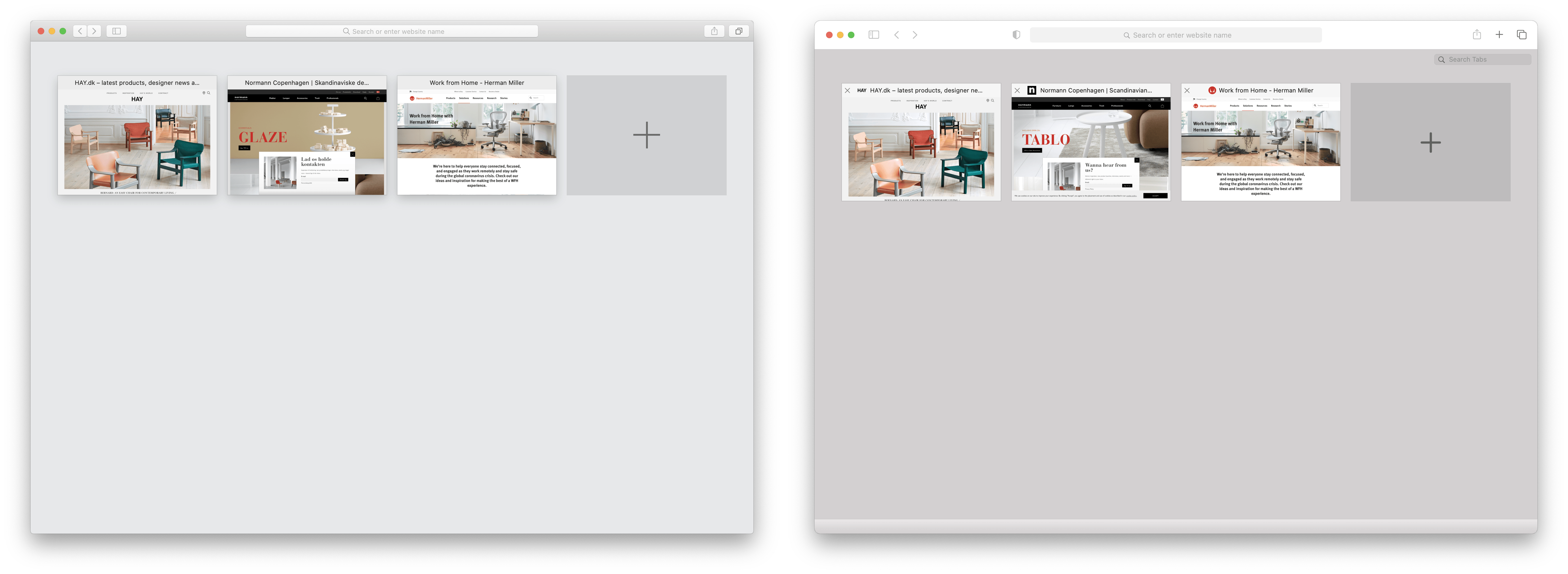
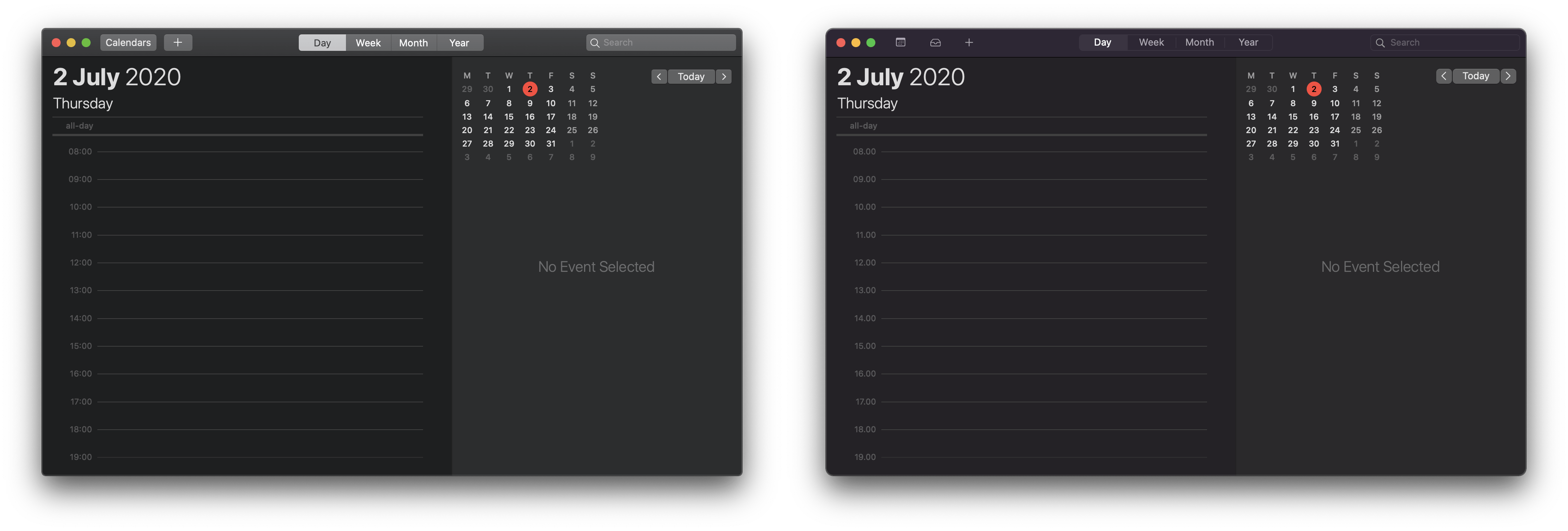
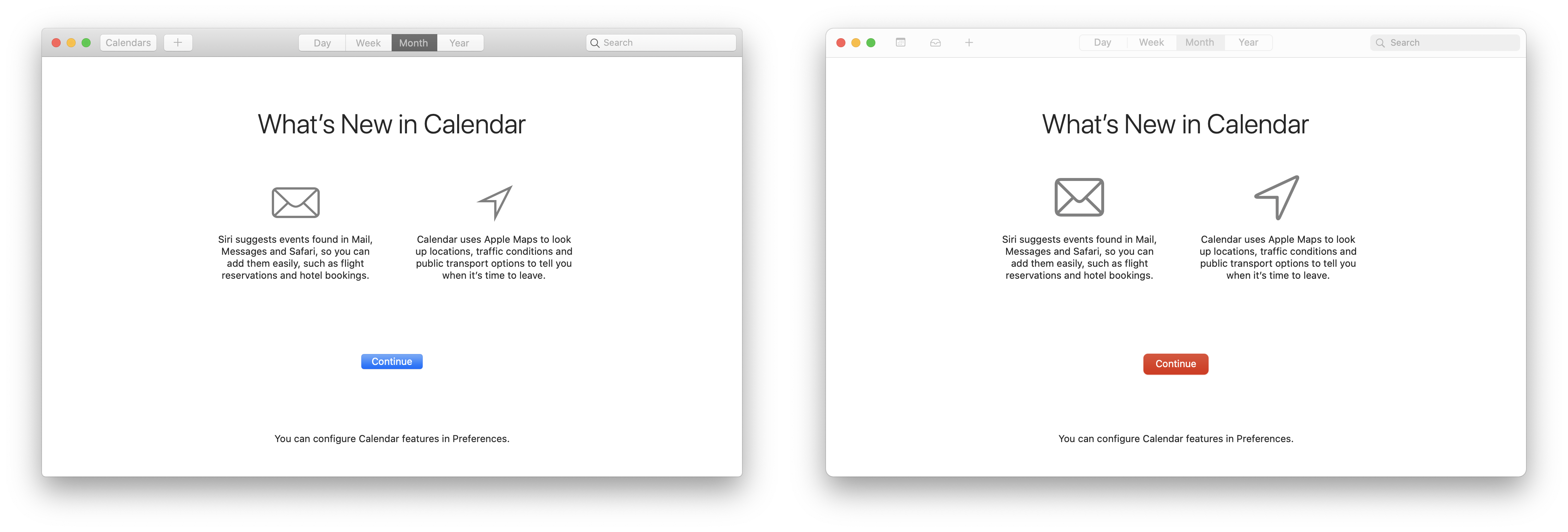
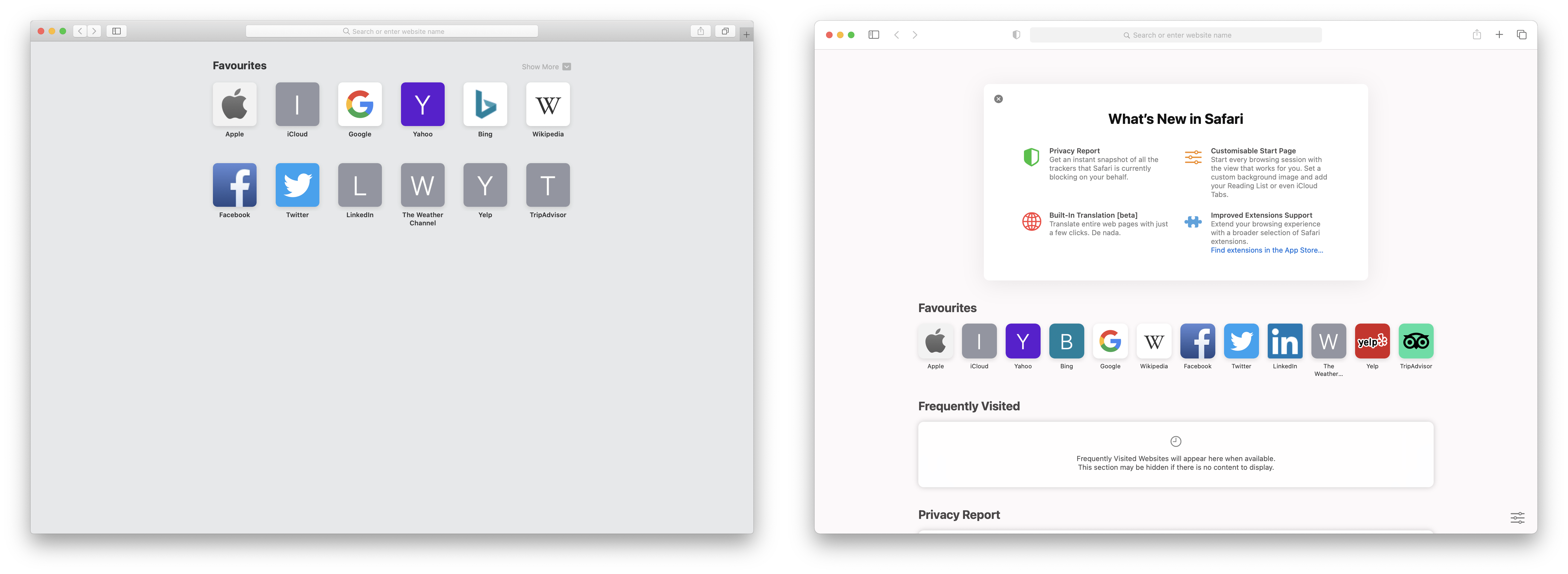
It would take hours and hours to list all the new features, so in this paragraph I will give you a brief overview of the other small changes you can expect. The popular Safari browser has also received a renovation, in which case there is, for example, the possibility to customize the home screen. Extensions have also been improved - Safari is not a strictly closed ecosystem like before, but is more open and offers similar options as, for example, Firefox. But with great power comes great responsibility, so Apple has also focused on greater user privacy. Minor changes also occurred in the case of Calendar and Contacts, in which case, however, there was rather a partial redesign of the individual icons and a change of colors.
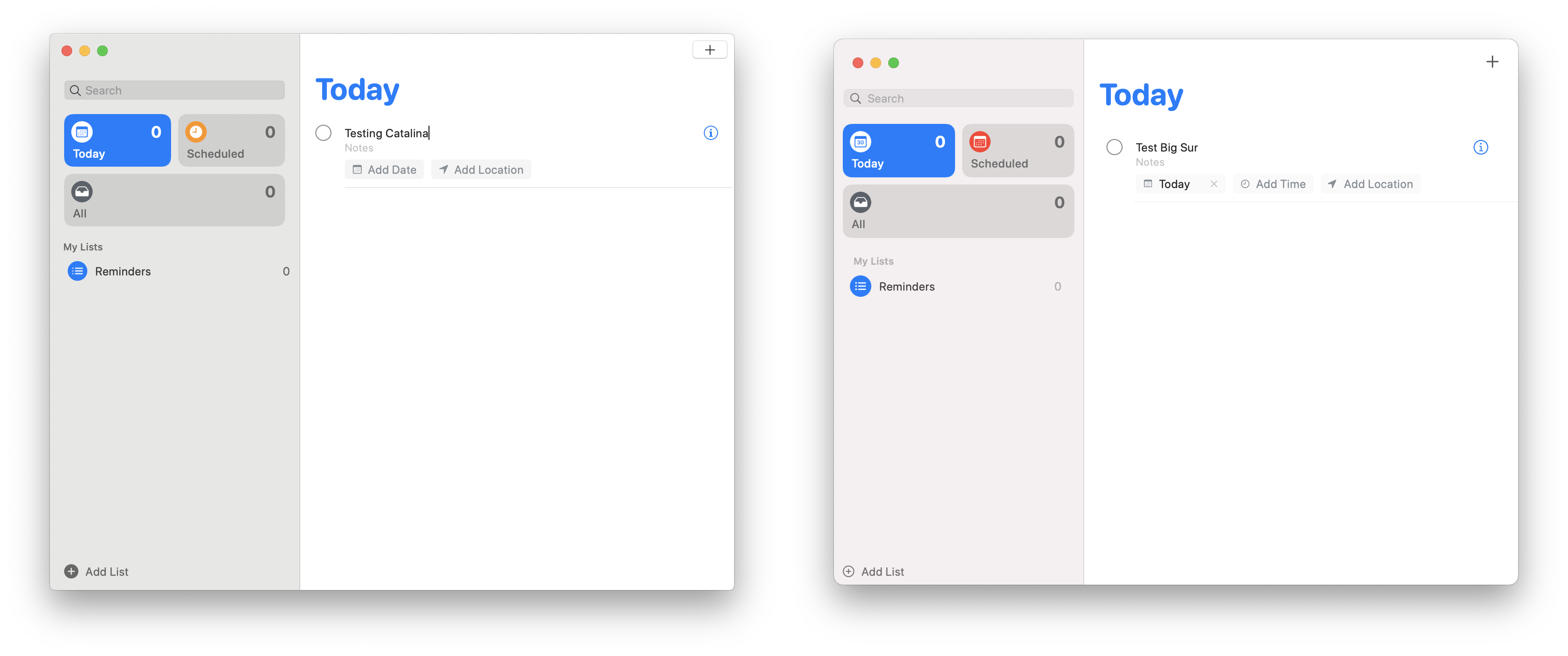
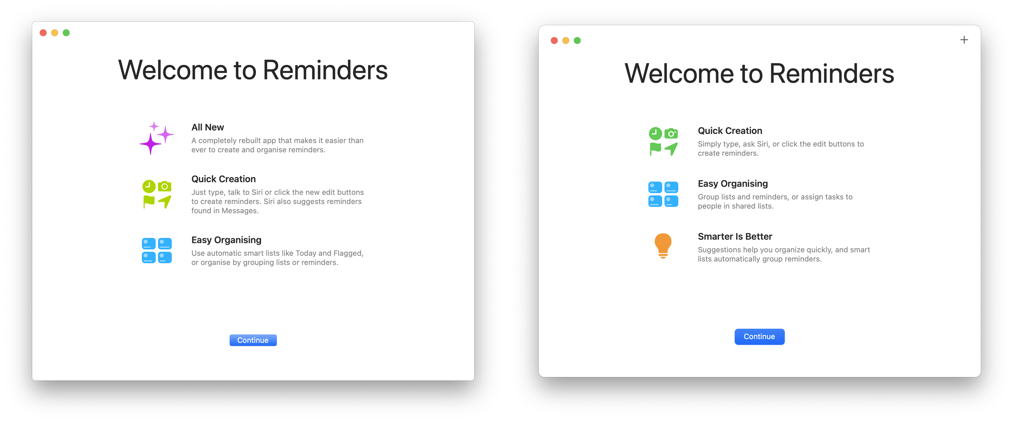
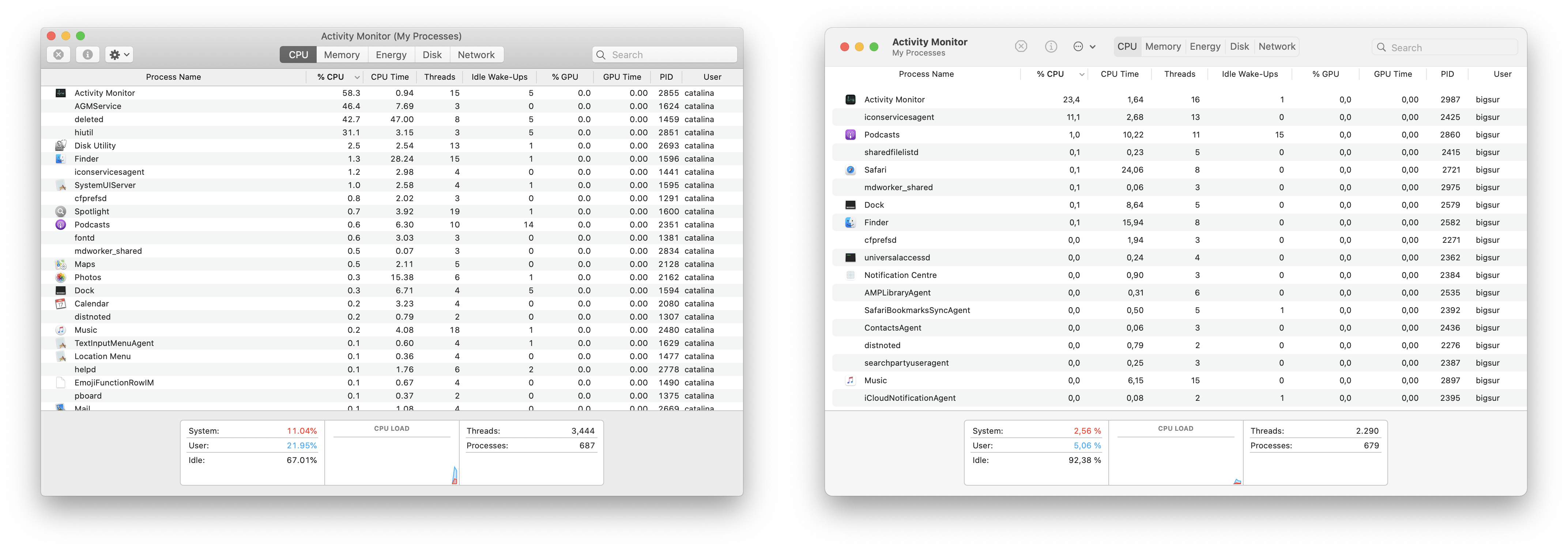
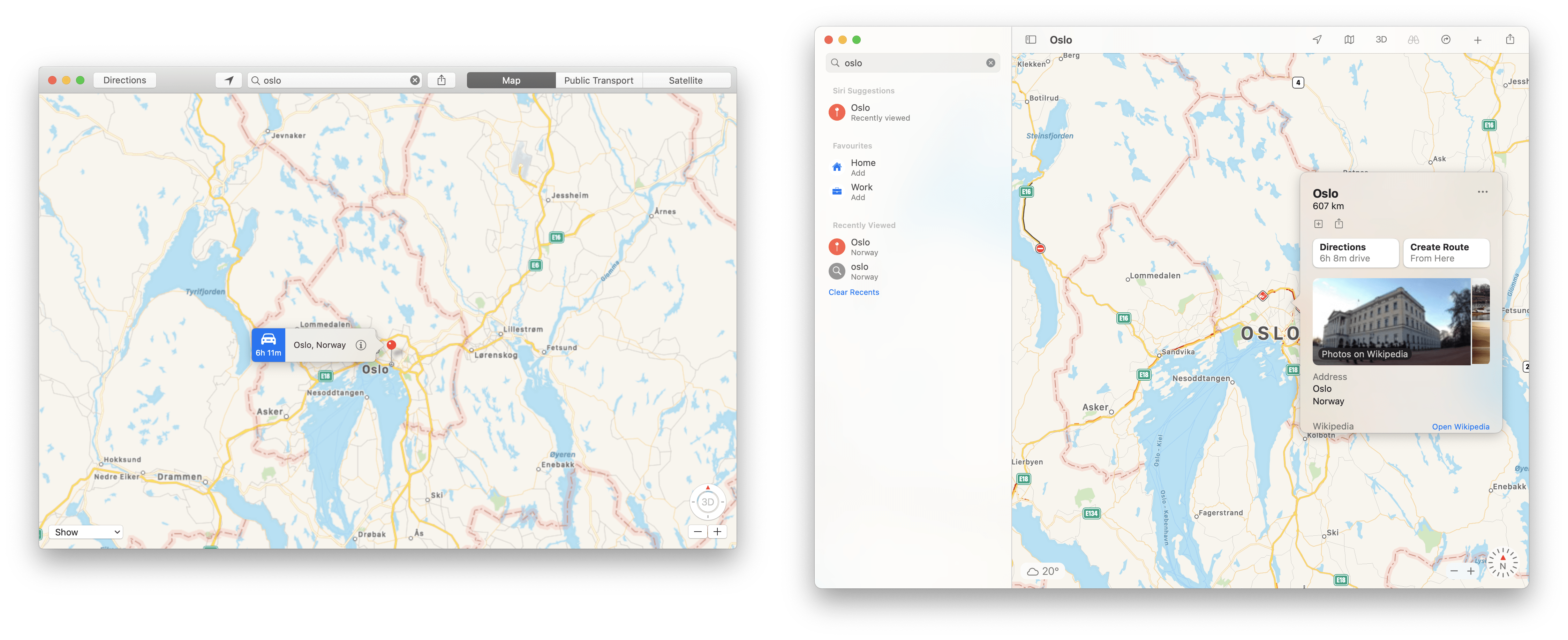
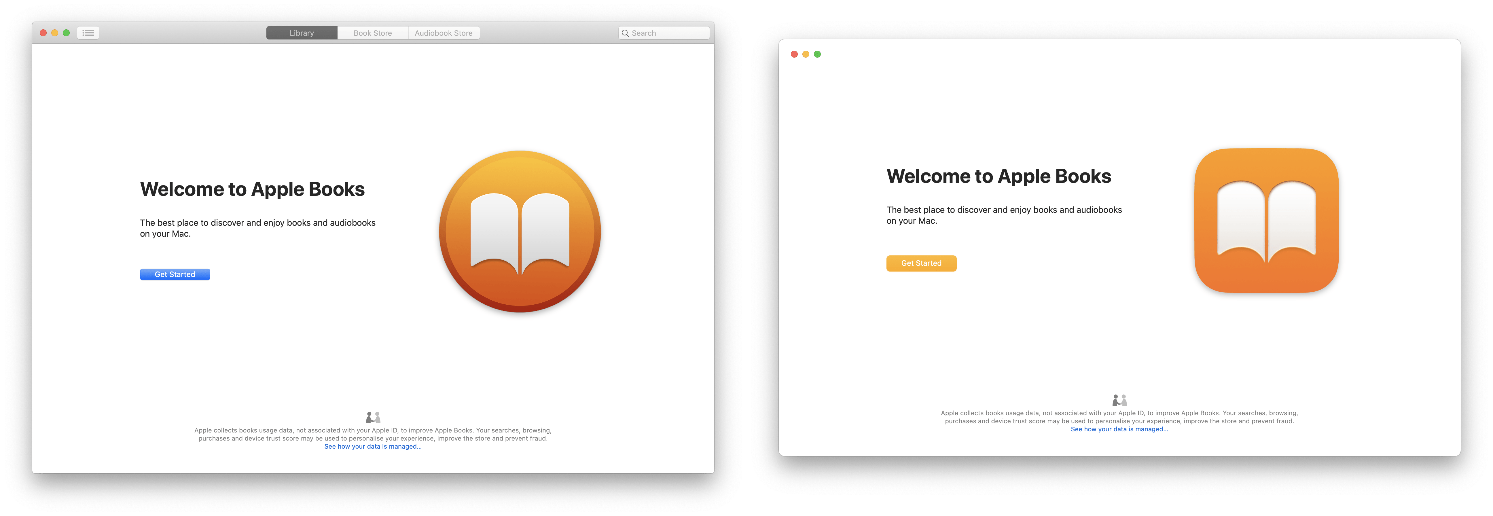
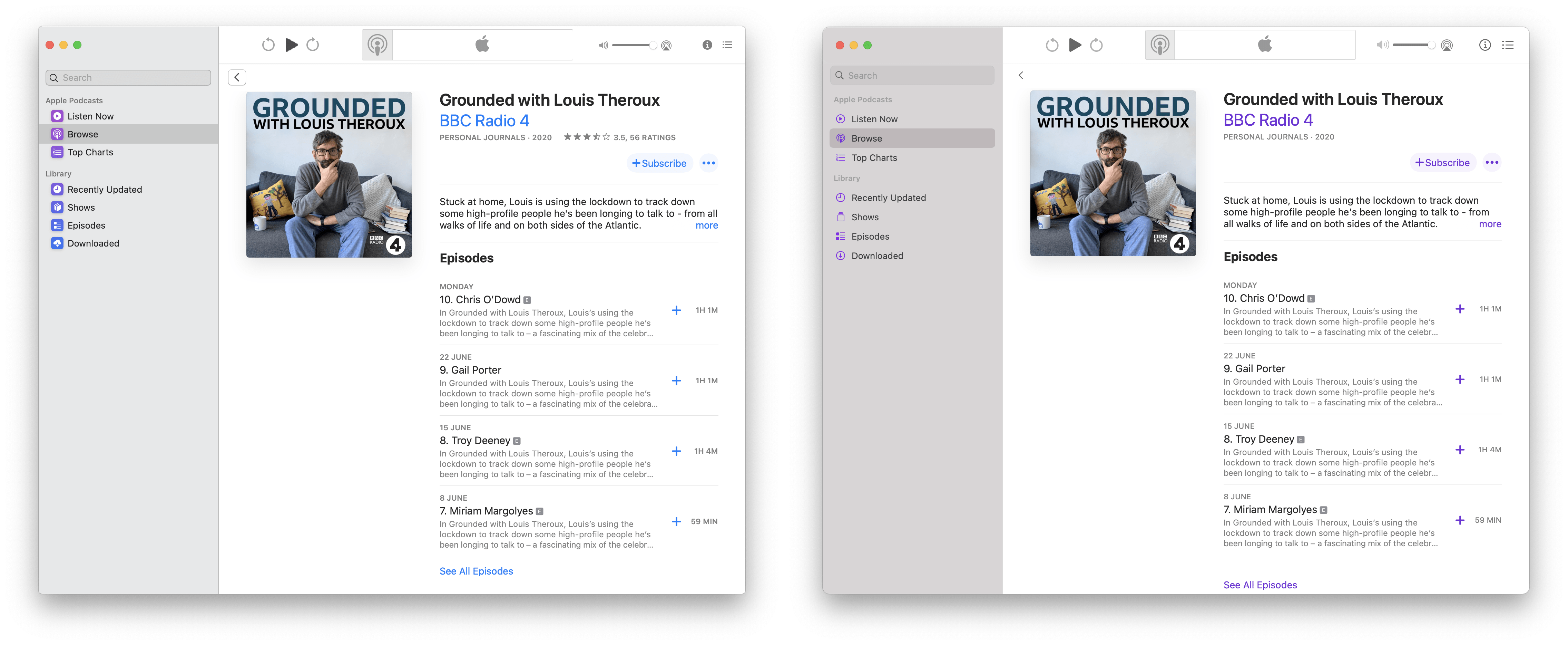
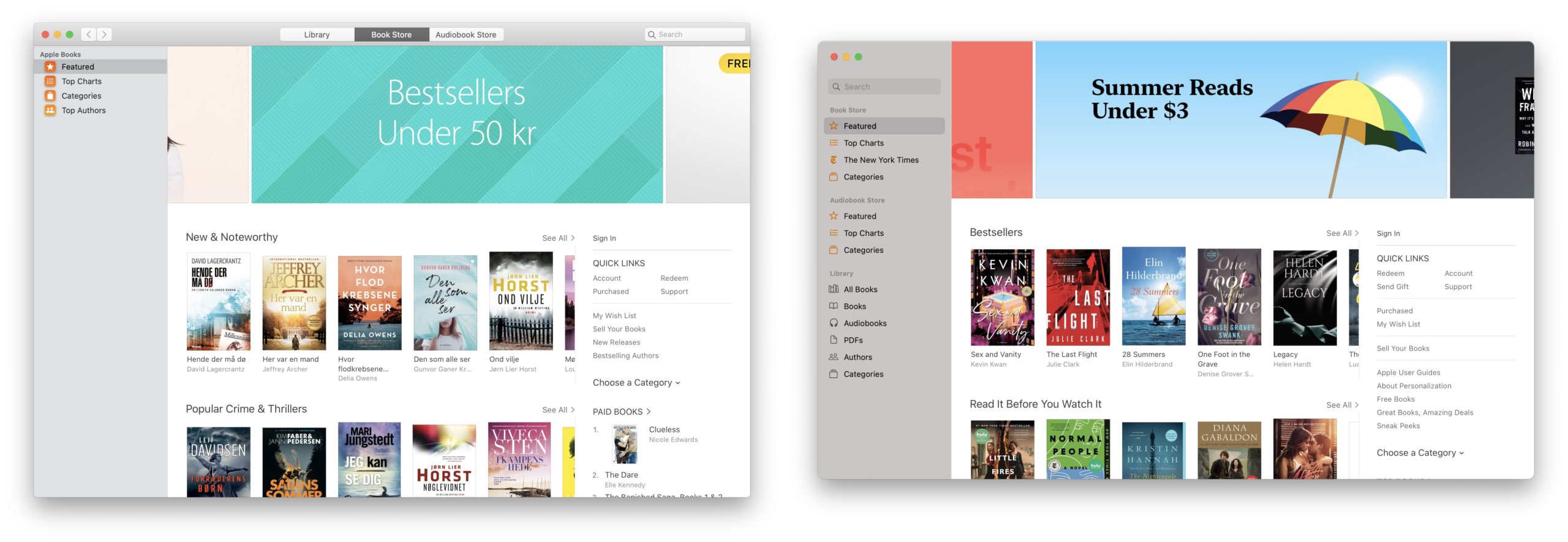
A similar situation occurred with Reminders, which is not too different from Catalina and rather offers more vivid shades and grouping according to similar notifications. Apple added colors to the notes, and while in previous years most of the icons were gray, including the background, now you will see the individual colors passing by. The exact same case occurs with photos and their viewing, which is more intuitive and faster. One of the almost unchanged things is the Music and Podcasts applications, which were introduced to Catalina last year. It is so logical that the user interface is almost the same, again of course except for the colors. The Maps, Books and Mail applications also received attention, in the case of which the designers modified the sidebar. As for Disk Utility and the Activity Monitor, the apple company did not disappoint in this case either, and in addition to the redesigned search box, it also offers a clearer list of currently running applications.
What didn't fit into the movie or sometimes the old is better than the new
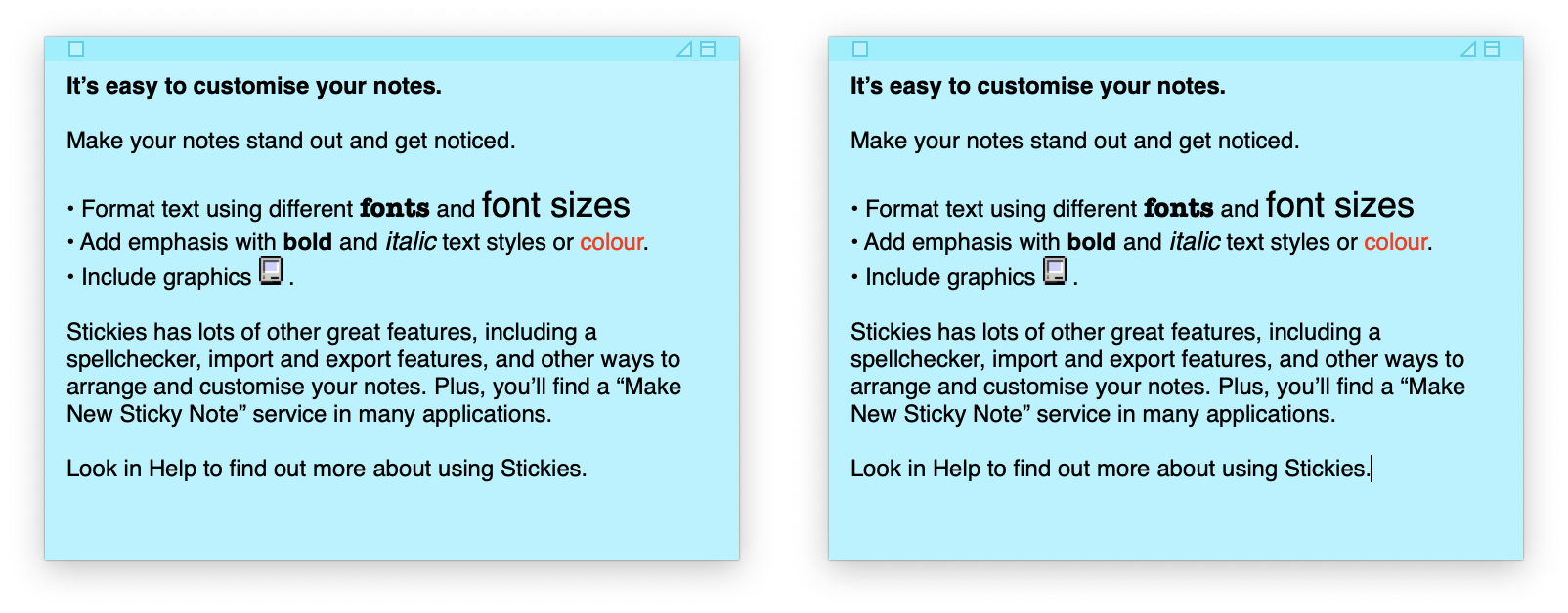
Although we mentioned in several previous paragraphs that almost nothing has changed in the case of several applications, Apple has at least taken some initiative. In the case of the other programs, however, there was no change and, for example, Siri was somehow forgotten. It's rather strange that Siri enjoyed a major overhaul in both design and functionality in iOS 14, while macOS Big Sur plays second fiddle. Even so, Apple most likely decided that there is no need to dramatically change the smart voice assistant for the time being. It is no different in the case of Lístečki, i.e. compact notes that retain their traditional retro style.
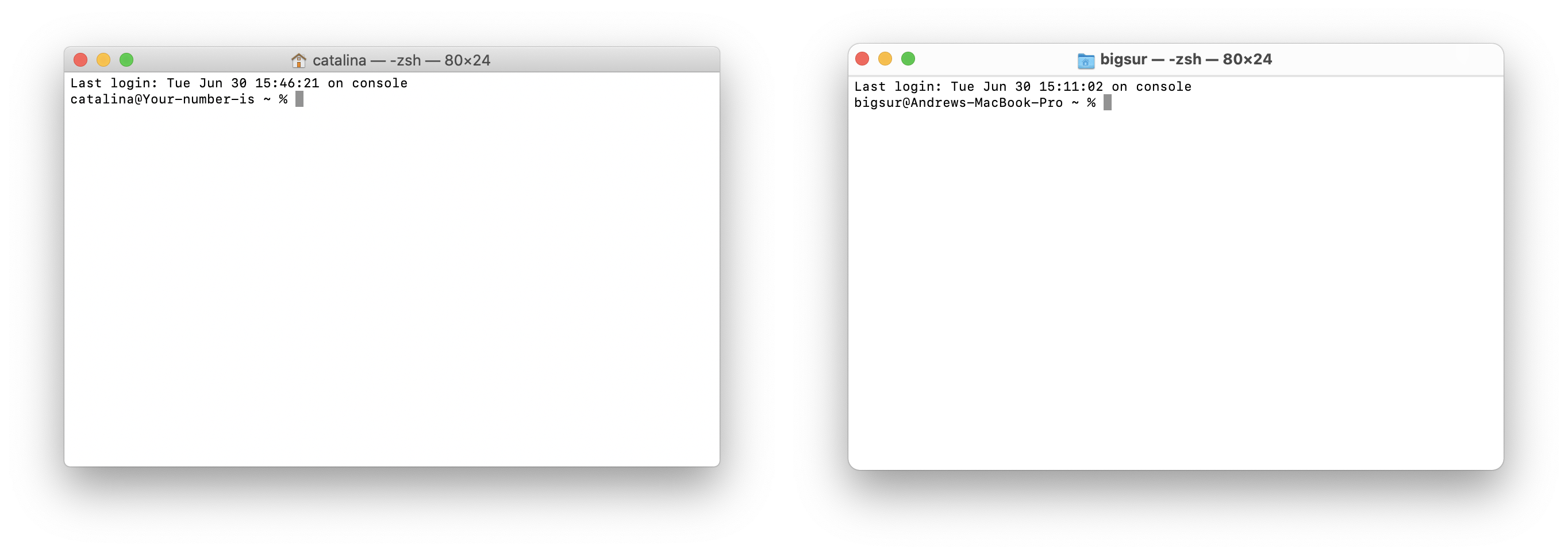
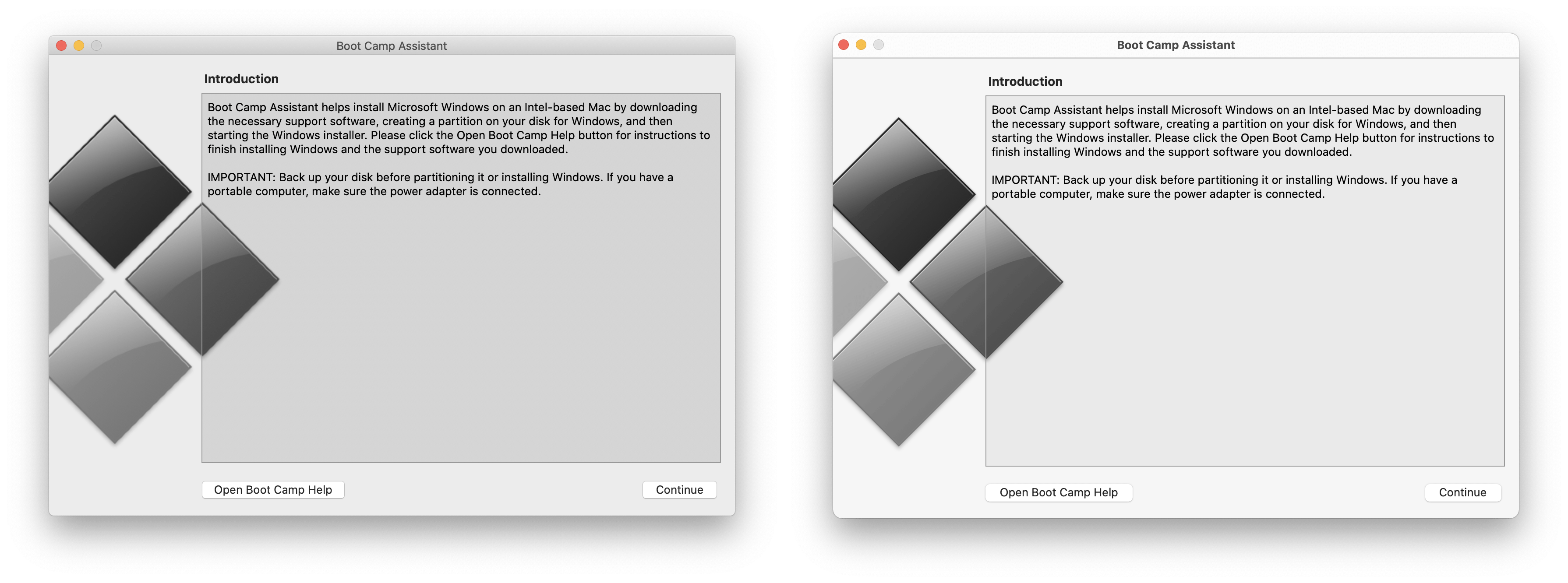
However, this is not harmful either. The Boot Camp program, with which you could start Windows virtualization, for example, is also completely deprecated. However, with the transition to Apple Silicon, the developers probably left this feature idle, except for changing the icon. Either way, this is a nice list of changes and nothing should surprise you too much now. At least if you're going to update anytime soon and Apple doesn't rush out with any more huge changes. Do you like the new macOS Big Sur?
It could be interest you

















Weird coloring pages that take up more space on the desktop without adding value - a higher menu bar, a bigger dock, more window decorations, etc. Why? :-(
In the article you state that Boot camp allowed virtualization of windows. Where did you get that information? I thought Windows ran natively with bootcamp, not virtualized.
Disgusting for me. I reinstalled Catalina, the original Safari and blocked the update. If there was an option to return the 10.6.x design, I wouldn't hesitate.
I don't like the waste of vertical space, for example in safari completely unnecessarily above and below the address bar, but otherwise I don't care at all.
Well, before updating older Macs, it's a good idea to read this, because the update to Mac OS 11 seems to be blowing up some older Macs in such a way that they turn into bricks. https://www.macrumors.com/2020/11/15/macos-big-sur-update-bricking-some-macbook-pros/
The author of the article praises it quite a bit.. for me it's a half-baked job.. as it was already written here, safari has an extra line - unnecessary, the search is now even smaller - also nothing in the middle of the screen.. a livelier area..? Change the wallpaper in catalina to an illustrated one and it's livelier.. icons in the bar - useless gic - lampshades go back to the skeomorphic design - useless.. I'm going back to catalina...
After the update, the battery percentages disappeared, I have to click to see them. Can the percentages be set, would they still be visible?
Take a look at this article, you can: https://jablickar.cz/jak-v-macos-big-sur-aktivovat-zobrazovani-procent-nabiti-baterie-v-horni-liste/
JJ thanks I already found it