Control Center is a feature of the iOS operating system that was introduced as part of iOS 7, which was released in 2013. During its existence, Apple has already redesigned it several times. It allows devices to directly access important settings, but there are still some essentials that should be changed. Hopefully with iOS and iPadOS 16.
At the time of its introduction to iOS, the Control Center was launched by pulling a finger from the bottom of the display, which, after all, remained the case for all devices with a Home button until now. For iPhone X and newer bezel-less devices, it pulls out from the top right corner for both landscape and portrait views.
It could be interest you
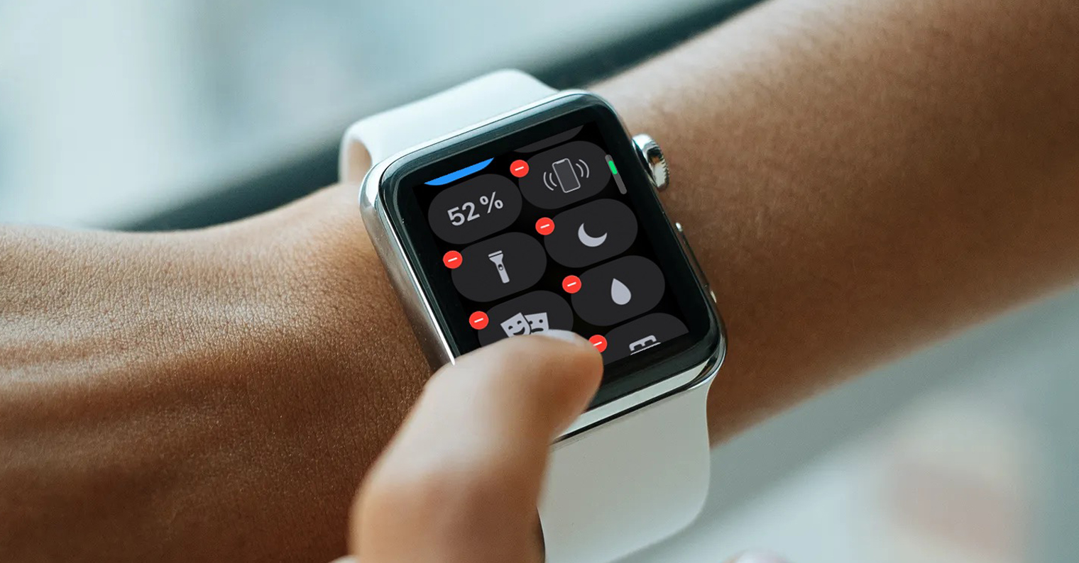
History of the Control Center
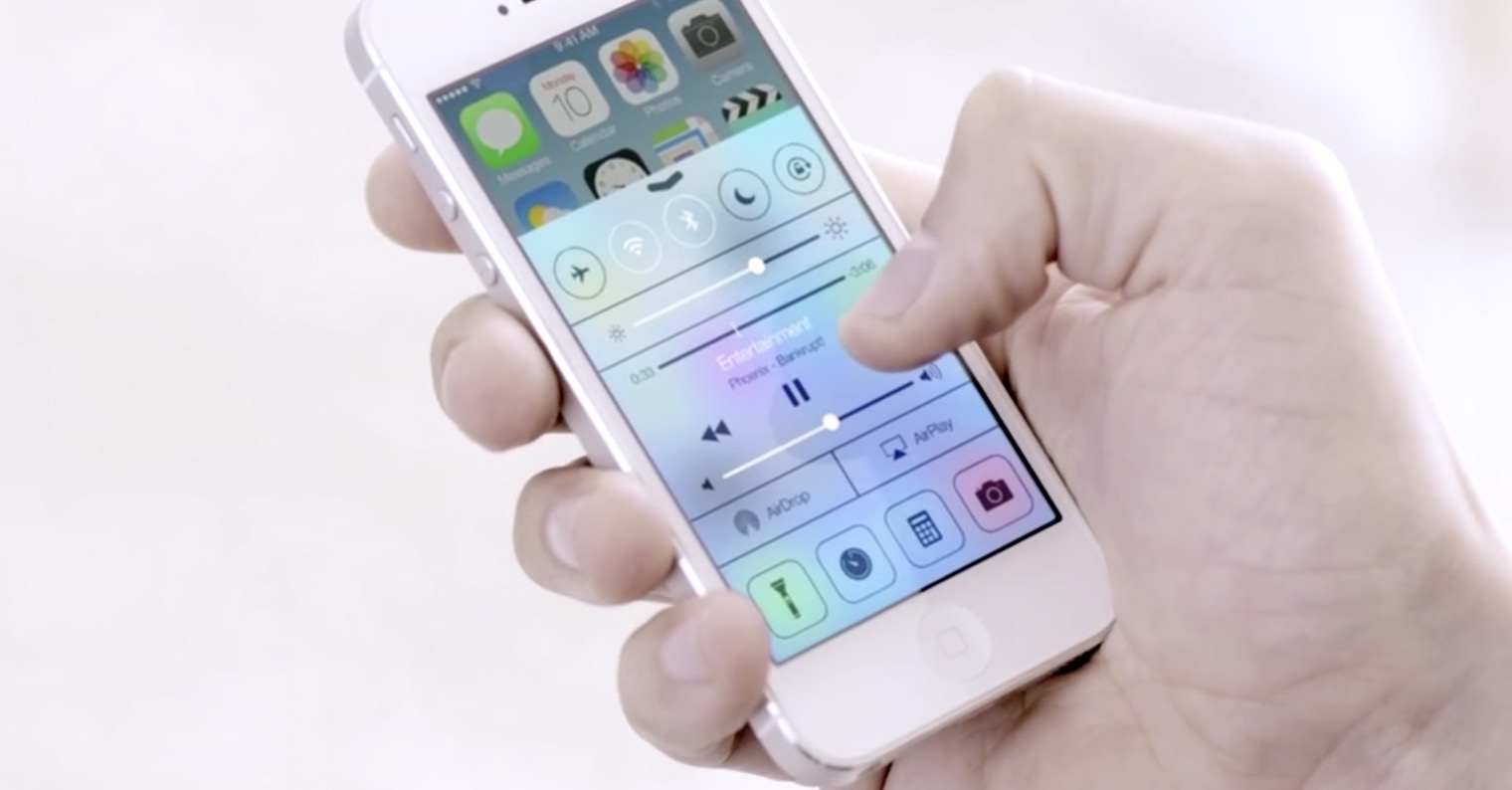
The original version contained one tab, on which you found functions such as Airplane mode, Wi-Fi, Bluetooth, Do not disturb or screen rotation lock at the top. This was followed by display brightness controls, a music player, access to AirDrop and AirPlay, and a link to the flashlight, alarm clock, calculator, and camera.

In 2016, i.e. with the launch of iOS 10, Apple reworked it into three cards, where the first enabled the control of the basic functions of the device, the second provided the music player, and the third provided HomeKit home control. The form of the center reflected the gray slightly translucent interface, but the design of the icons was already very similar to the ones we know today.
It could be interest you
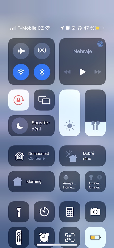
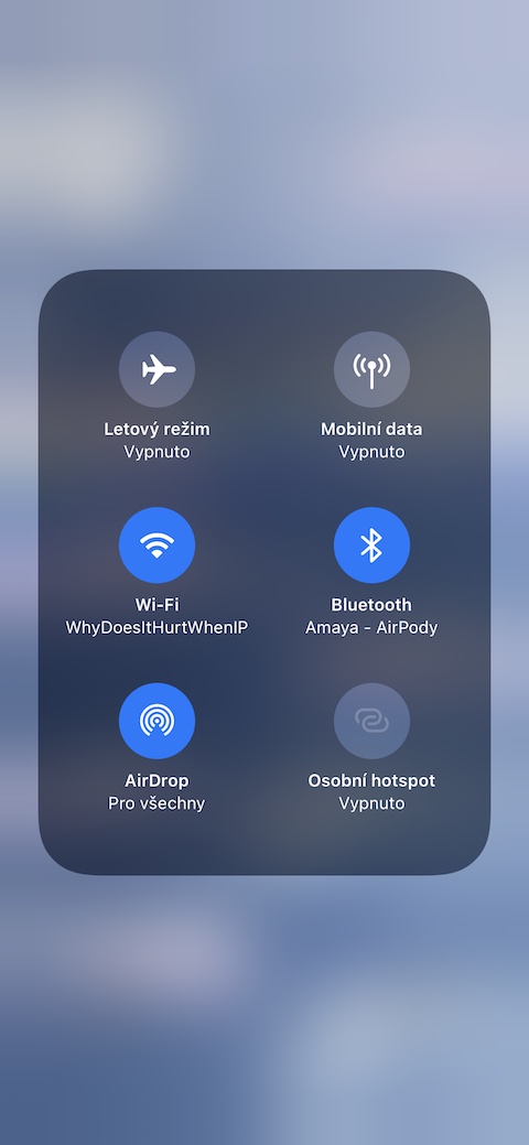
The current form was introduced in 2017 with iOS 11. It merged all the tabs back into one, and the Control Center has since been displayed across the entire screen. Some control elements can only be turned on/off, others can be defined even more closely by holding for a longer time (or through 3D touch) (as of iOS 12).
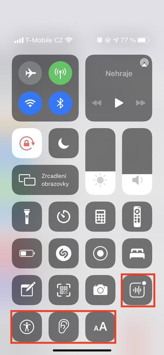
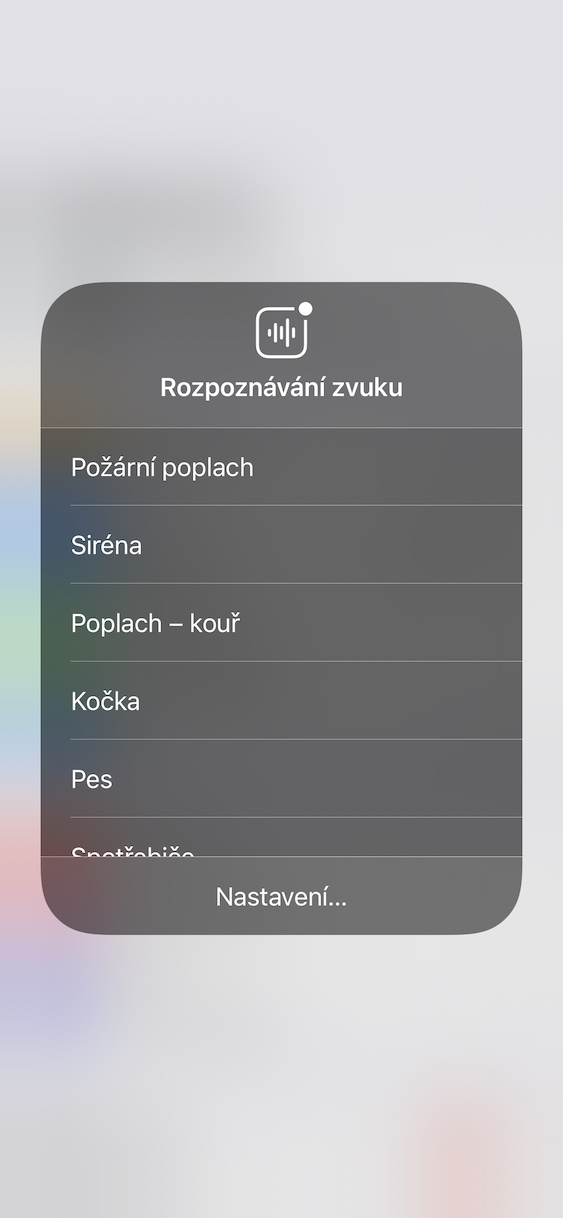
The iOS 14 version then brought several new options to the Control Center, such as sleep monitoring, sound recognition or Shazam. The current iOS 15 then added, for example, the Focus mode instead of the simpler Do Not Disturb mode (after clicking on it, it can be defined even more closely to driving, work, etc.).
It could go better. Much better
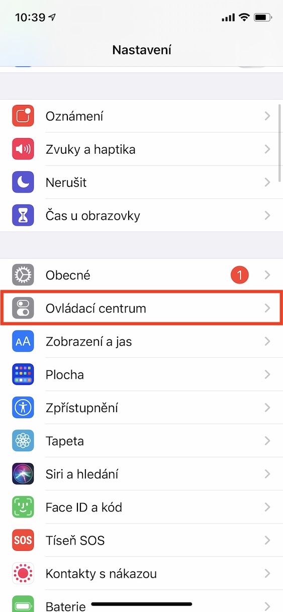
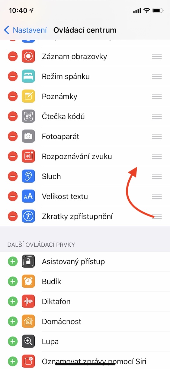
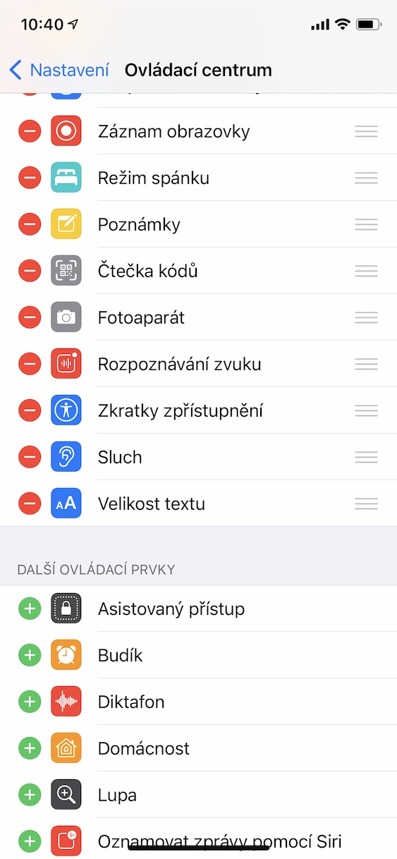
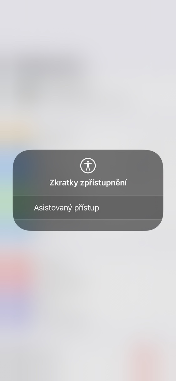
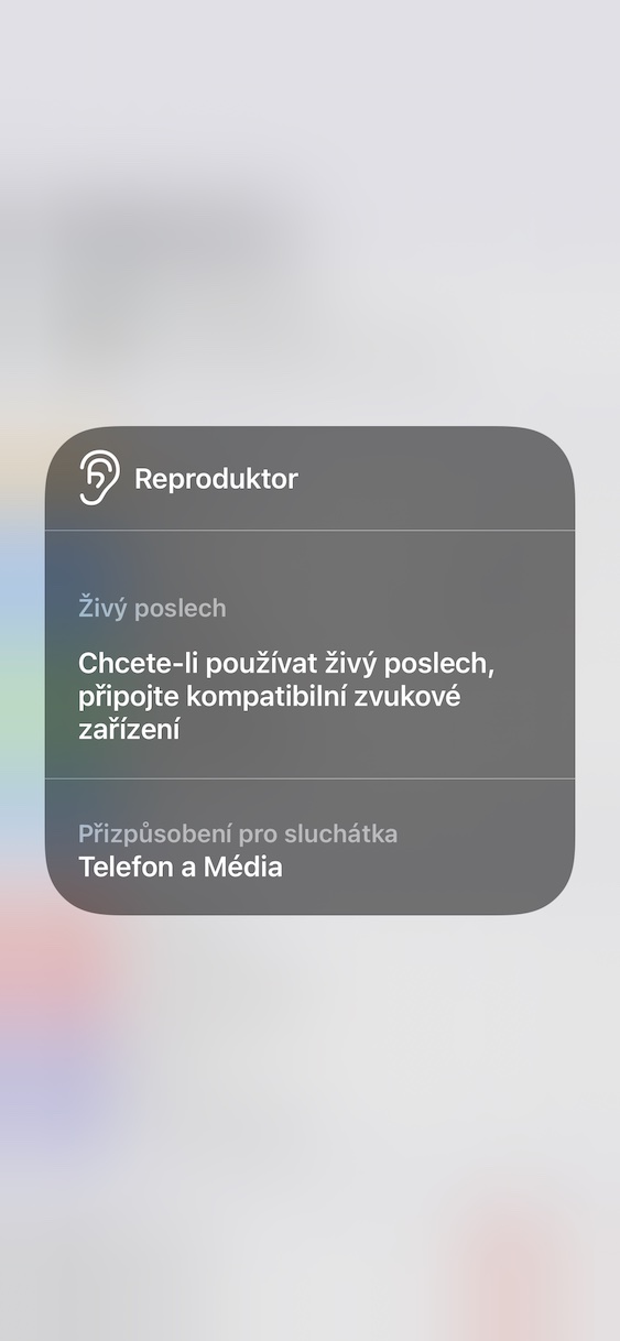
In recent years, new options have been added as they come with iOS updates. But the Control Center still needs to be completely illogically defined only from Settings. Therefore, if you want to add, remove or rearrange some options, you cannot do so in the center interface, but you have to Settings -> Control Center and only here to add, remove or sort them.
In addition, Apple is constantly forcing things here that you may not use at all and just take up space. You can't move the network or music controls, you can't remove the Screen Mirroring icon, or you can't remove Focus. What can be adjusted according to your needs are only the function icons below these.
At the same time, it would only be enough to add a sorting option, as is the case on the system desktop. Similar to how widgets are added to the desktop, you would add elements, similarly to dragging icons on the desktop, you would define them to your liking here as well. But for some reason it doesn't work.
In addition, Apple could be a bit more benevolent here with individual elements and their functionality. Why can't we, for example, add our own contact to quickly call him, or a link to a frequently used website, or immediately launch a favorite album from Apple Music? The solution is directly offered, so let's just hope that Apple will listen to us and we will see some useful news at WWDC22 in June.
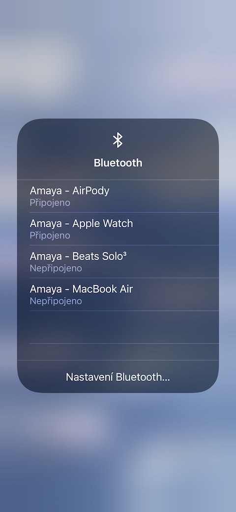





I can thank the developers of tweaks (jailbreak) for the changes, we had them much earlier than Apple incorporated them, but they take over most of the functions