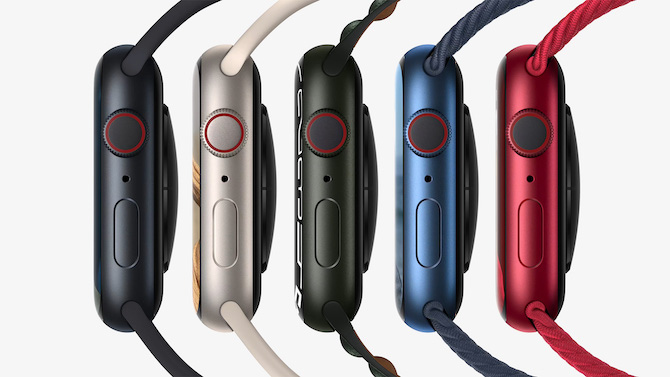
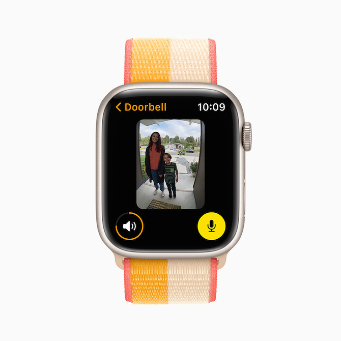
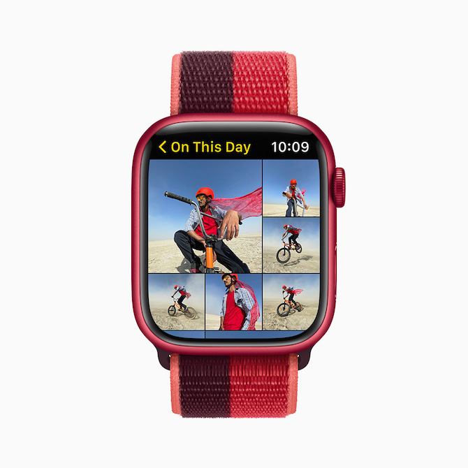
Where is the end of those iconic colors so typical for Apple? Previously, it was mainly white, which currently persists only on accessories such as adapters, cables and AirPods, while it has disappeared from the main products. After all, this is because it is a typical color rather for plastic. But now we are slowly saying goodbye to silver, space gray, and therefore gold. And even on Apple Watch.
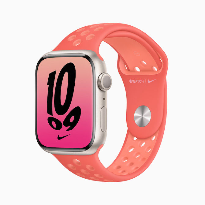
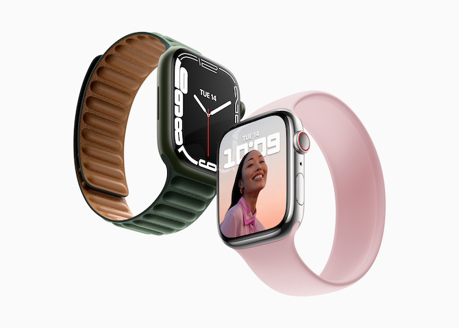
Silver is, of course, typical for aluminum products and has been associated with those of Apple since the arrival of unibody MacBooks. It was present not only on iPhones, iPads, but also on the Apple Watch. But with the current Series 7 it is gone. So the most universal color suitable for any situation ends and is replaced by star white. But starry here means rather ivory, which may not be entirely to the liking of many users.
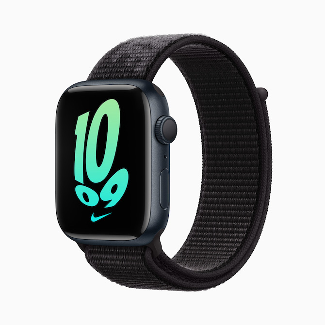
Then here we have space gray. Typical color for iPhone 5 and newer, not excluding the Apple Watch of course. And yes, we have now said goodbye to that too, and it has been replaced by a dark inky one. But it is neither black nor blue. The gold color variant, known since the iPhone 5S, has also left the aluminum Apple Watch Series 7 portfolio. In this case, however, without an obvious replacement - no sunny yellow or sun-brightened color came. Instead, we have a trio of completely different colorways.
It could be interest you
Classic colors
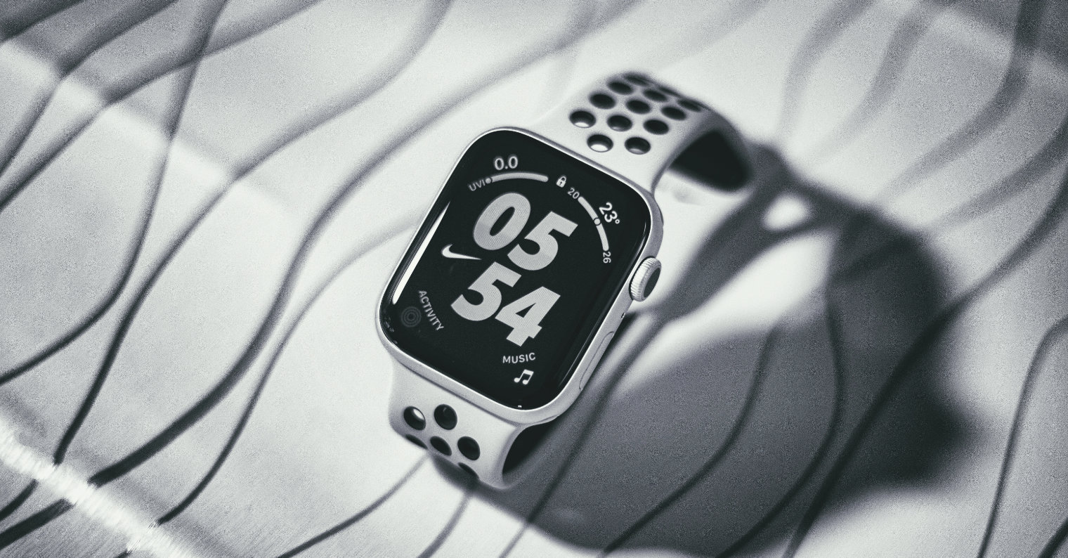
In 2015, the year Apple introduced the first Apple Watch, it really thought of it as a watch. If you look at the market for these classic timepieces, you will most often find steel, titanium (so actually silver in both cases), gold (more like gold-plated) and rose gold or black in the case of cases with PVD treatment. If we are not talking about the real gold, premium ceramic and real steel Apple Watch, which were not officially available in our country anyway, then these said color combinations imitated the aluminum models quite successfully.
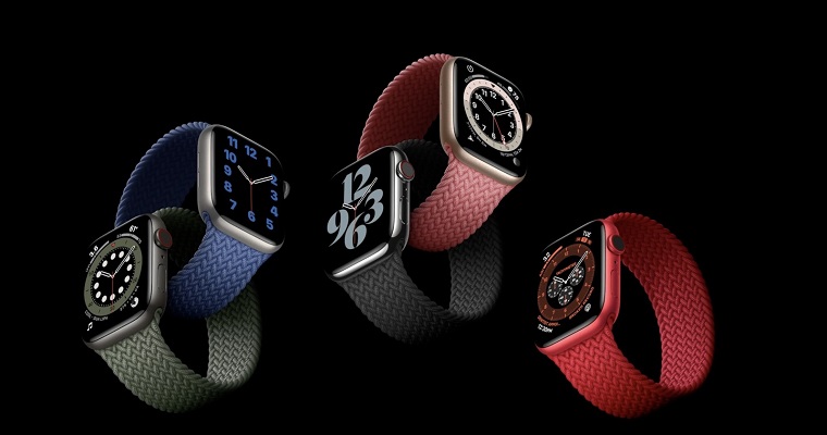
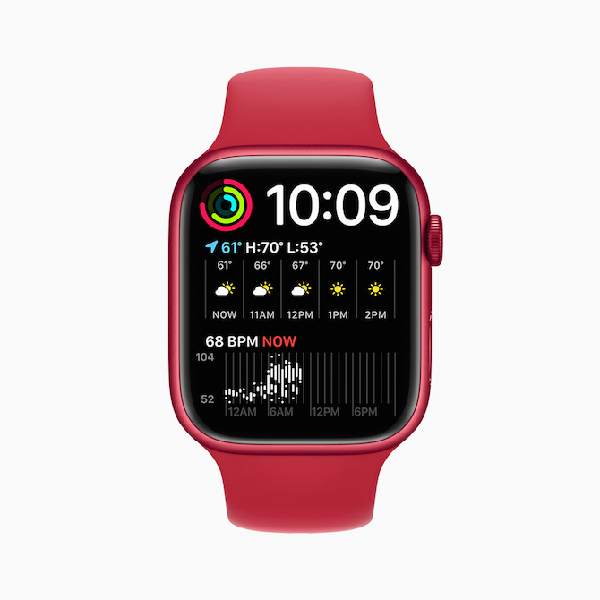
These colors stayed with us for quite a long time, or until last year, when Apple presented the Series 6 with a red (PRODUCT)RED and a blue case. With the former, it is understandable for the clear focus on charity and the support of various health funds, but blue? What was the blue meant to refer to? Yes, blue dials are popular with classic watches, but not so much their case. This year, Apple put a literal crown on it.
It could be interest you
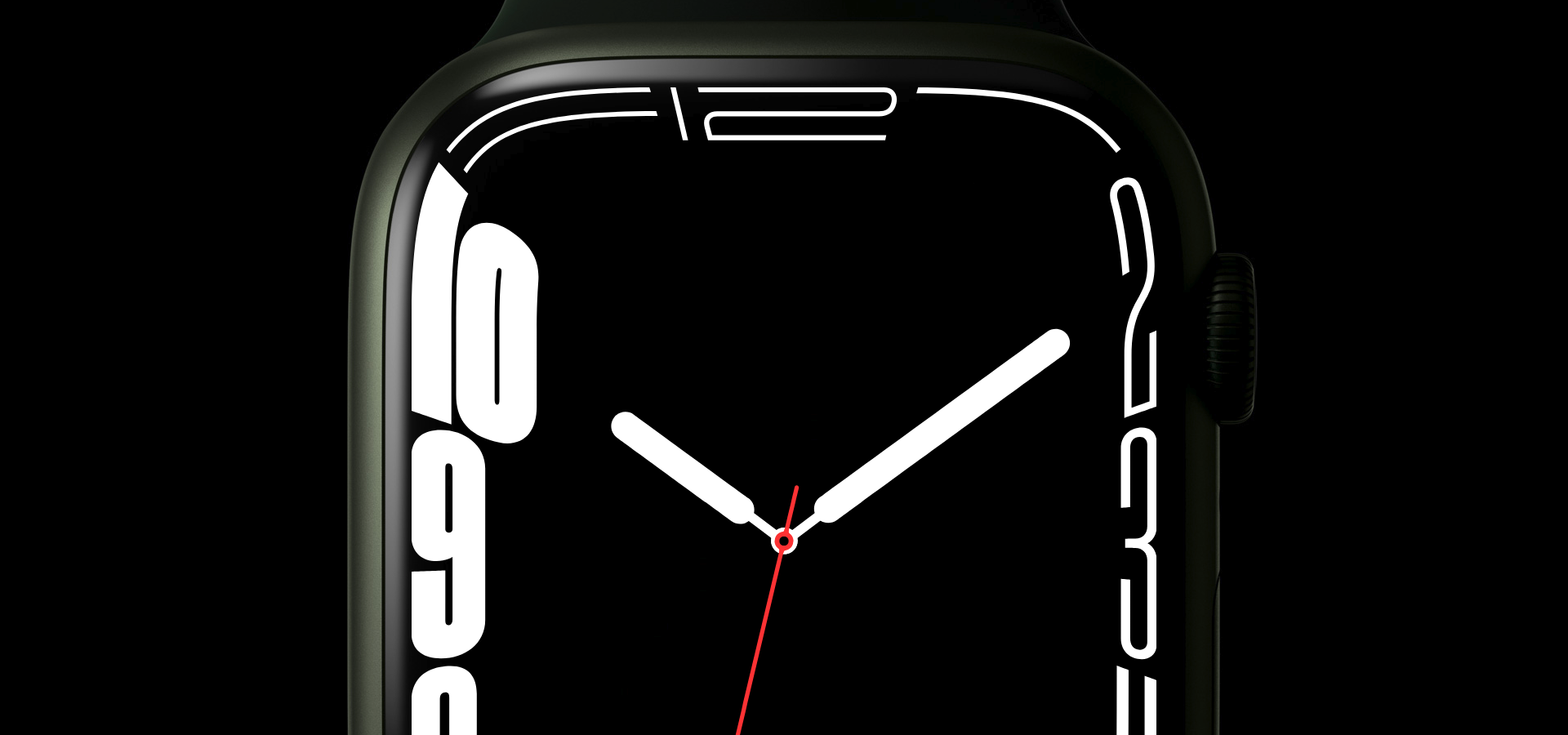
Green like Rolex
Green is iconic for the manufacturer of watches with a crown in its logo, i.e. Rolex. But again, we are talking about the color of the dial here, not the color of the case. So why did Apple switch to these colors? Perhaps precisely because it no longer needs to be compared to classic watches. After all, he overtook them a long time ago, because the Apple Watch is, after all, the best-selling watch in the world. So it's time for them to go their own way, and that's an original way, without unnecessarily dragging the ball on the leg in the wording that it's a "watch".
Steel models are already available in the country, which practically only differ from the aluminum ones in the material used, and which, after all, are more and more settled colors, i.e. the typical ones - silver, gold and graphite gray (although not cosmically, but at least still gray) . Apple could thus afford to separate the two series even more, when it can drive the aluminum one into more pleasant and less eye-catching lifestyle colors and offer the staid steel one more to old-timers. And it's good.
It could be interest you

It's good that there is finally a colorful Apple and not the precisely clean, but still rather boring one that was afraid of those colors in the last decade. It proves this not only in the Apple Watch series, in iPhones, but also in iPads and iMacs. We will see what we will see on Monday with the MacBook Pro, if it will have the courage to bring a little of that colorful joy to this work sector as well.
- The new Apple Watch 7 can be purchased for example at AlgeIn Mobile Emergency whether on iStores






 Adam Kos