Most of us don't even realize it anymore. At WWDC in 2013, Apple presented the seventh version of its mobile operating system, which was radically different in design from all previous ones. Today, few people doubt that the redesign into a modern form was necessary, but then there was also an unprecedented wave of criticism. There was even a website parodying the style of Jony Ive, Apple's in-house designer who was instrumental in transforming the system. What made iOS 7 possible and how would it turn out if Jony Ive redesigned the Star Wars poster, the Nike or Adidas logos or even the entire solar system?
Scott Fostall, symbol of old iOS
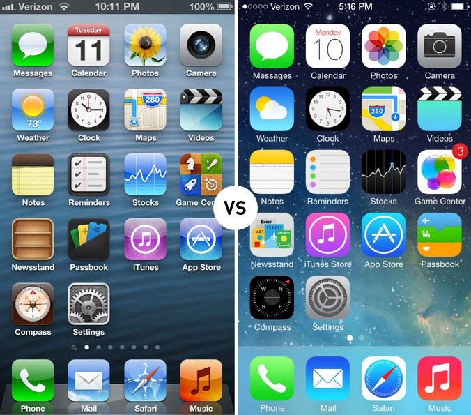
Scott Forstall, once an influential member of Apple's management, was in charge of iOS development. He was a staunch supporter of so-called skeuomorphism, i.e. imitating elements of real objects or materials even though it is no longer necessary for functionality. Examples were, for example, imitation of wood in the iBooks shelves, leather in the old Calendar application, or the green playing canvas in the background of the Game Center.
Examples of skeuomorphism:
New teams
Despite his great ambitions, Forstall was fired after the Apple Maps fiasco and his work was taken over by two well-coordinated teams of Jony Ive and Craig Federighi. Ive, until then primarily a hardware designer, also got space in the user interface field. He was finally able to realize his idea of iOS, which, as he stated for the CultOfMac server, he had since 2005. However, both men said in an interview with USAToday that skeuomorphism had its advantages in that it allowed for the concealment of technological flaws, but gradually began to lose its meaning.
“This is the first post-retina (meaning Retina display, ed.) user interface with amazing graphics thanks to the amazing performance of the GPU. This allowed us to use different tools to solve problems compared to seven years ago. Previously, the drop shadow effect we used was great for covering up the imperfections of the display. But with such a precise display there is nothing to hide. So we wanted clean typography," Craig Federighi told USAToday after the iOS 7 launch in 2013.
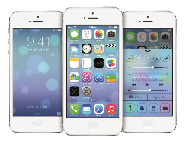
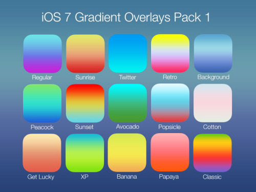
The change was considerable. The complex design with shadows, reflections and imitation of all kinds of materials has been replaced by flat and simple graphics, which according to some are too colorful. The ubiquitous color transitions seemed to be particularly striking.
Jony Ive redesigns
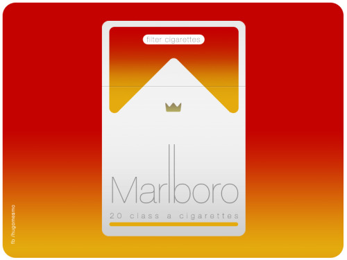
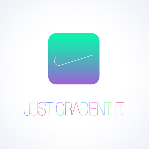
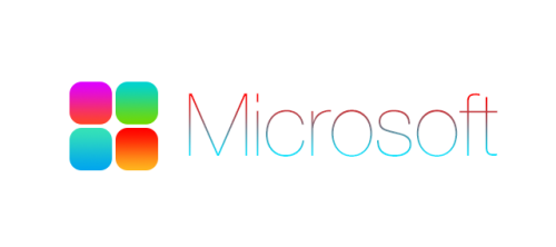
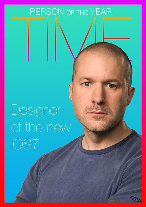
Flat design, simplicity, thin font, color transitions and other elements so characteristic for Ive became the reason for creating the site JonyIveRedesignsThings.com. It was created by web designer Sasha Agapov shortly after the introduction of the new system, and on eight pages it shows often very successful works parodying the style of iOS 7. On the page, you can find suggestions of what Jony Ive thought Time magazine, the Stop sign or the American flag could look like.
Today, few people perceive what a huge change the seventh version of iOS was. Criticism died down and people got used to the new design quite quickly. However, the iOS redesign had a huge impact outside of the Apple realm. Since its introduction, we have been able to observe how applications in the AppStore, as well as design in general, are gradually changing. All of a sudden, thin fonts, flat design, simplicity, color gradients, and other elements used in iOS began to appear much more often in graphics around the world. With the seventh version, Apple set a standard, similar to the style of its stores, that others began to aspire to.










iOS 7 was an abomination of purple, so good for girls with barbies. Nothing compares to the original design
Perhaps it would like to complete the whole story, what mess and controversy iOS 7 caused in the company and what really led to the firing of Forstall. I know that the article is mostly not about that, but since the article already mentions Forstall, I think it would be appropriate to mention it in its entirety and not portray him as a villain. It would also be good to mention (especially in the last paragraph) that in the latest versions, Apple retreats from key things from iOS 7 and reintroduces some original things that obviously work better.
I'll never forget when I booted up the new iPhone with iOS 7. Just a white screen and some Arial black text Welcome in the middle. I really didn't understand what anyone sees. Design at the level of someone who opens MS Word :(
iOS 7 was probably Apple's biggest design mistake. Compared to iOS 6, all other iOS versions are just garish, flat, white and unintuitive disasters with disgusting icons.
… with iOS 7, user simplicity was recommended. They nailed the colors, but the system is harder to control. The one who invented it should be crucified, or he poisoned the life of the entire apple community.