New Apple operating systems are around the corner. At least that's their introduction, because we won't see sharp versions until the fall. Speculations are gaining momentum and some are even talking about the fact that the design of macOS and iOS should be more unified. But is it a good idea?
The iOS operating system got its last really big redesign with iOS 7, which is a really long time ago. Since then, only a small thing has changed here and there. The macOS operating system then underwent several changes, especially in connection with the transition of chips from Intel to ARM, i.e. Apple Silicon. In macOS Big Sur, some icons and graphic elements have changed slightly. But both systems are still different. The unification of the design can then be viewed from two perspectives.
It could be interest you

From iOS to macOS
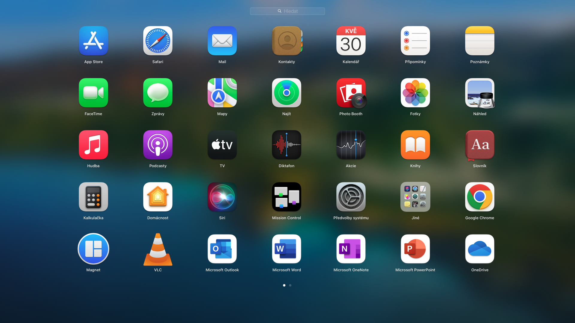
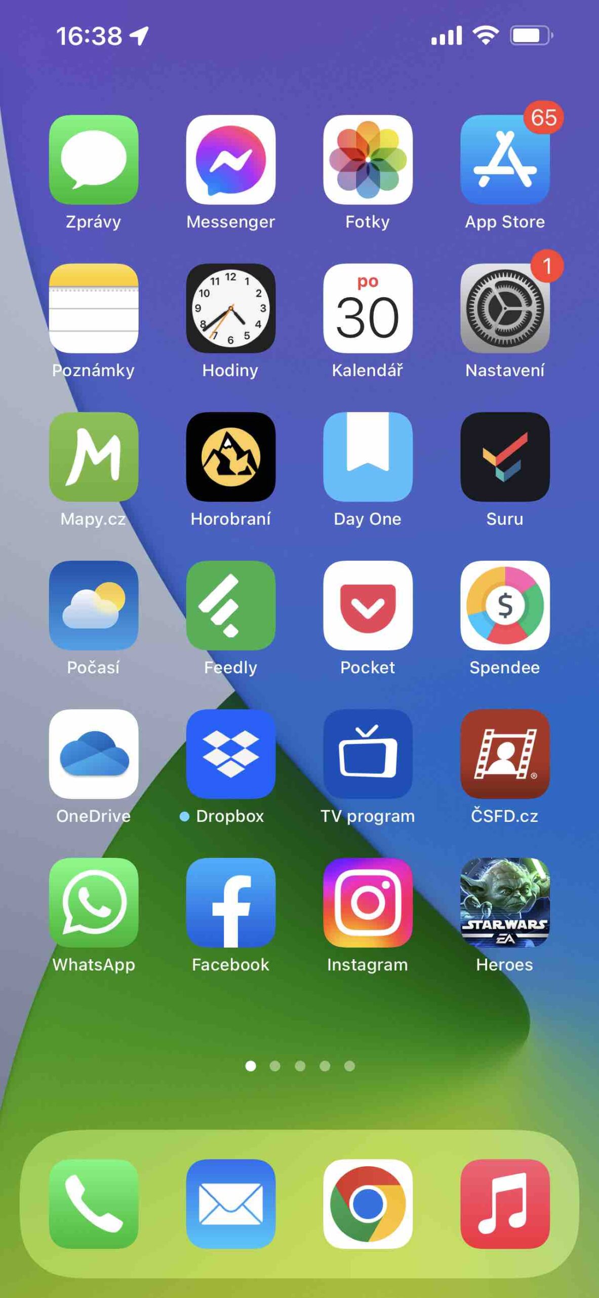
If you're an iPhone user and you don't have a Mac yet, if macOS were to take on a look closer to iOS, it would have certain advantages for you. You would immediately feel at home in his environment. Not that there are so many visual differences, but they are there. Some icons look different, Control Center or System Preferences, which "replace" Settings in iOS, etc. Of course, you can hardly confuse them, because Messages, Music, or Safari look very similar. But upon closer examination, they are simply different.

MacOS is more plastic, iOS still sticks to flat design. For design-obsessed Apple, it's a bit strange that it hasn't yet been able to unify such basic things. After all, it is Macs that are starting to move away from the iPhone system more recently. But since iPhones are owned by more users in the world, it would make sense that Apple would change macOS more in its image.
It could be interest you

From macOS to iOS
If Macs are to lead the way now, Apple may be trying to push more of these features to iPhone users and push their appearance slightly. It would mean that we could be in for a redesign of a few core icons. E.g. The calendar could have a top red bar indicating the month instead of the day as it is now in iOS. The message bubble would be more plastic, which would also apply to the App Store or Music icon. The contacts on the Mac are visually very different and still in a certain way refer to the skeuomorphism known before iOS 7. The control center on iOS is then criminally underutilized and there are many calls for its change, at least with regard to a better reorganization of its menus and the possibility of accessing third-party applications .
However, MacOS is a mature operating system that still offers significantly more options than iOS. But even with a visual unification, many users could expect the same possibilities from the mobile system as offered by the desktop system. Apple could thereby sew a whip on itself in the sense that a wave of criticism could fall on it, why two visually identical applications do not provide the same options and functions on both platforms. No radical redesign is expected from iOS 16, but such unification of appearance is not completely ruled out. We will soon find out how it turns out. The opening keynote for WWDC22 is already scheduled for Monday, June 6.
 Adam Kos


