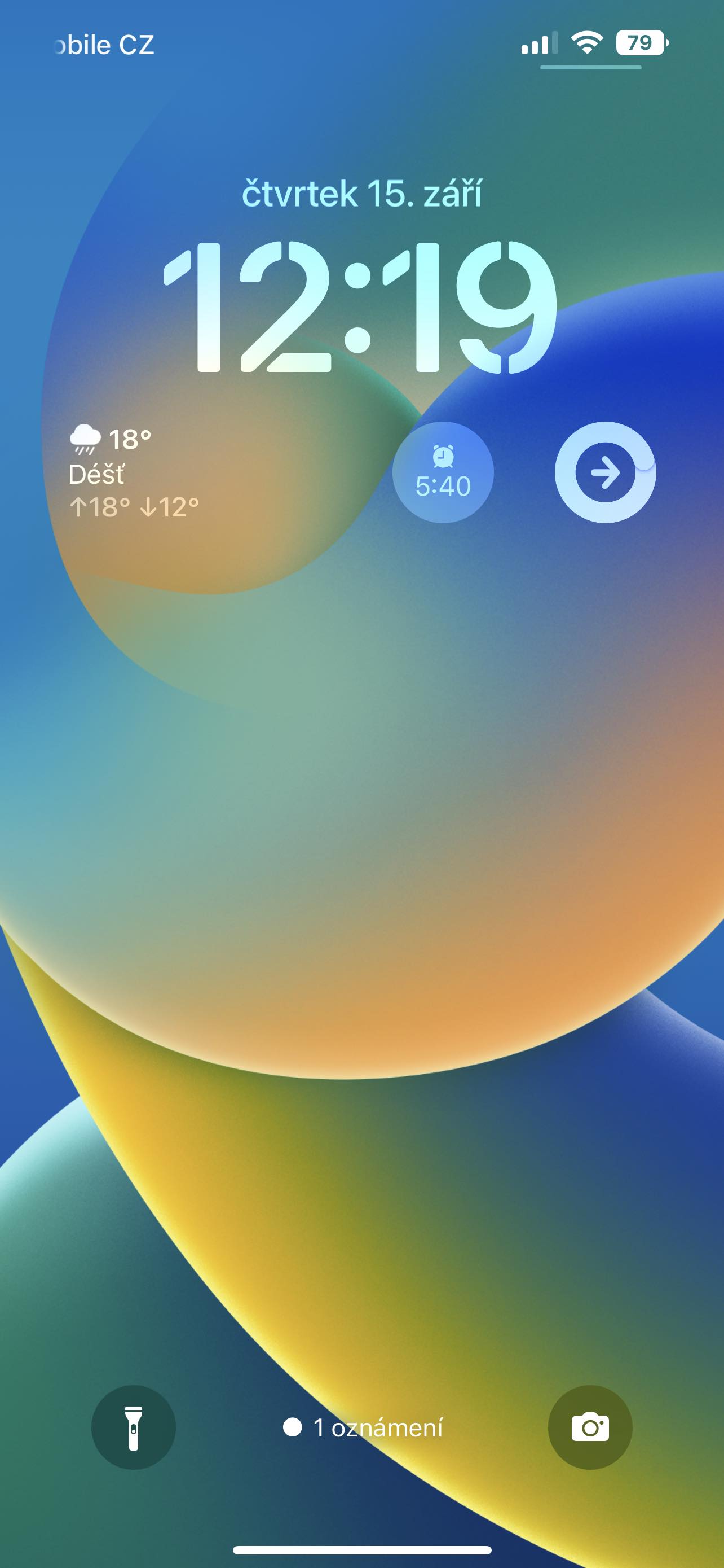
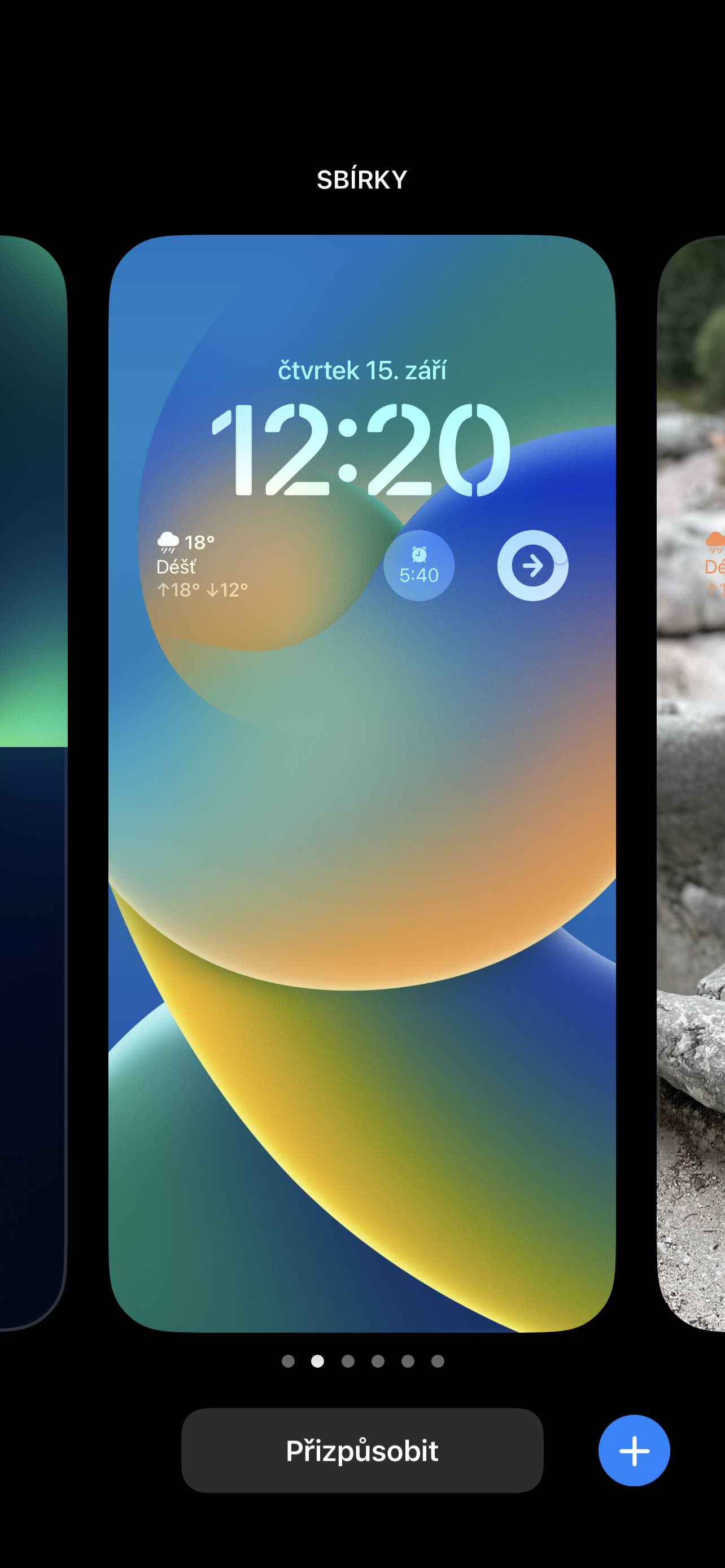
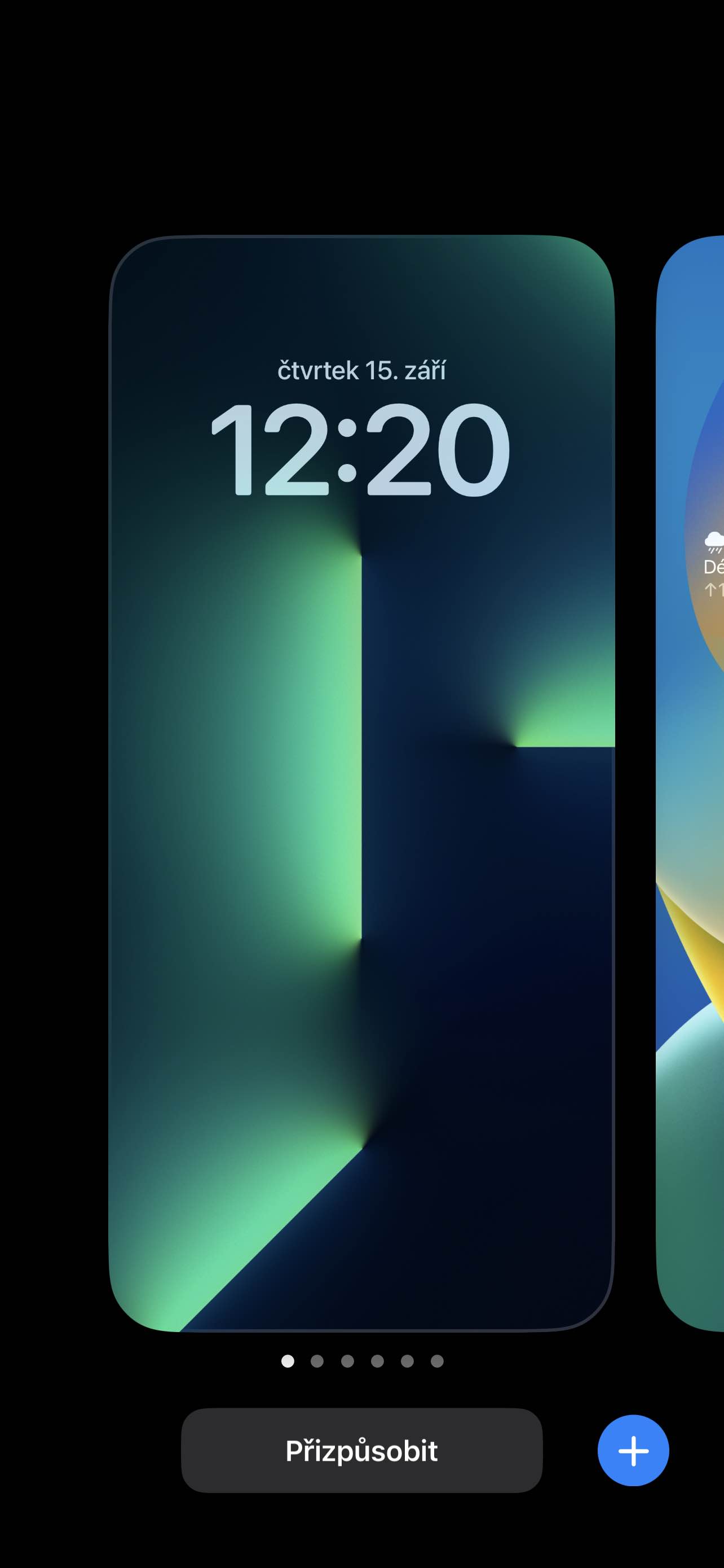
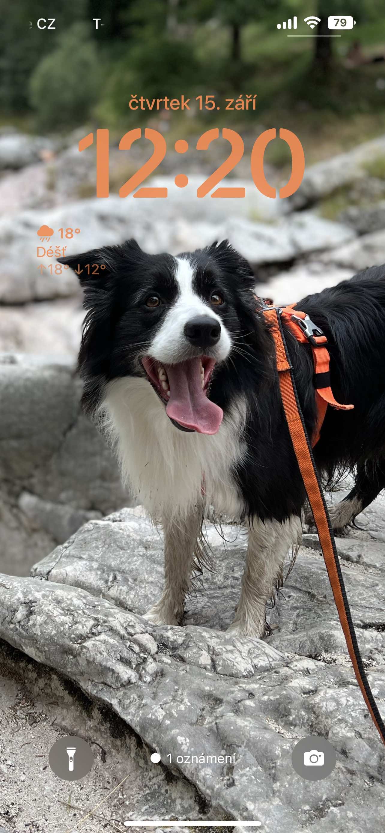
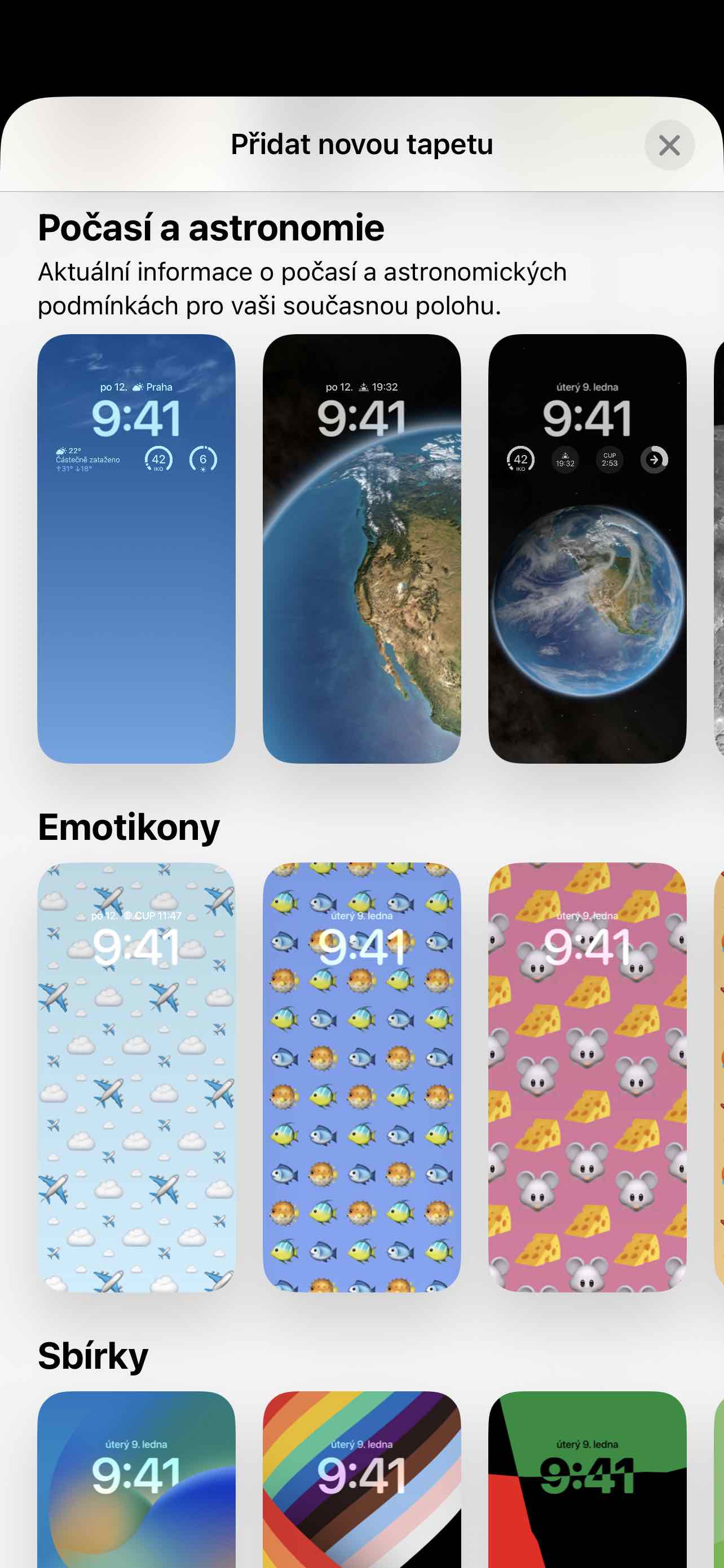
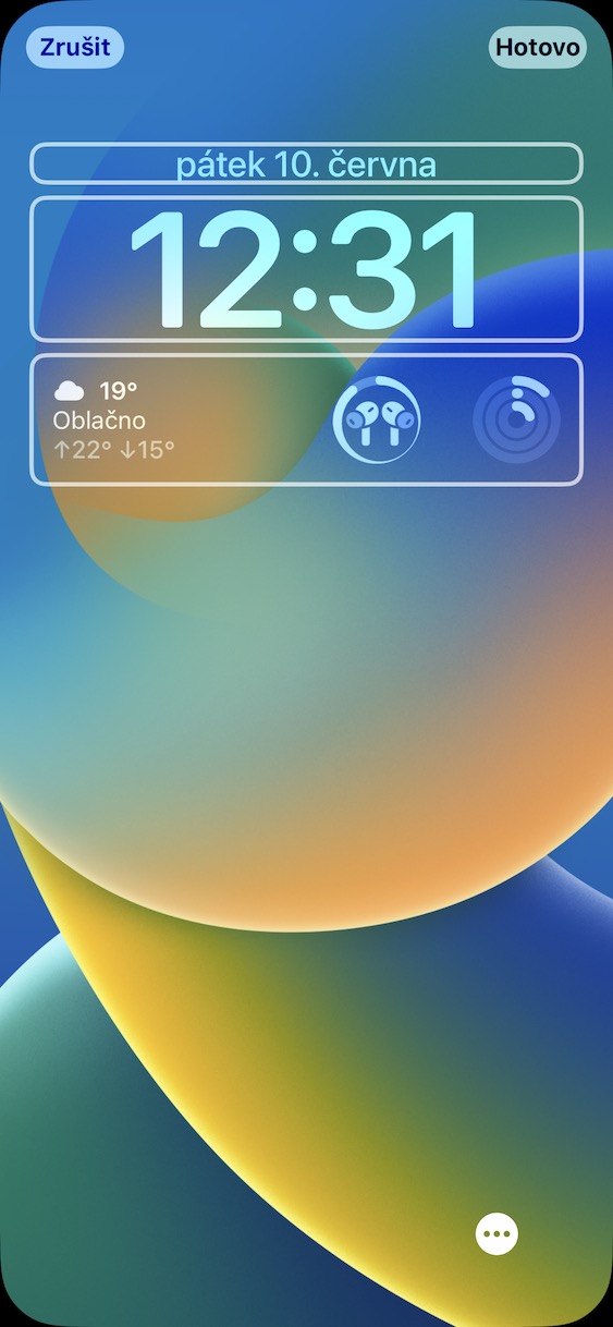
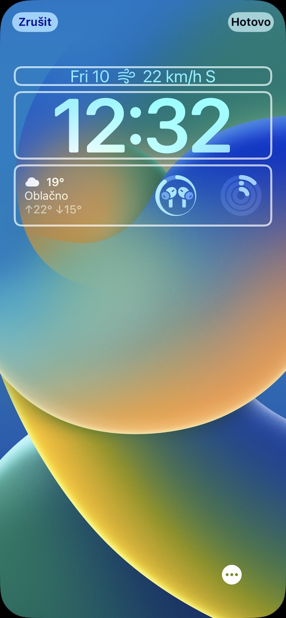
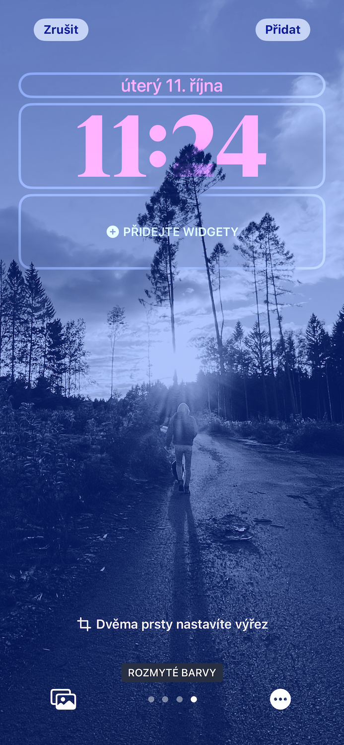
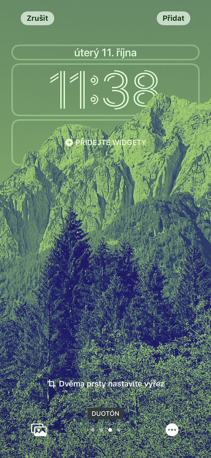
While they were originally the prerogative of Android primarily, Apple is embracing widgets more and more with each new iOS. With iOS 16, they are finally usable even on the locked screen, although of course with various restrictions. In June at WWDC23, we will know the shape of the new iOS 17 and we would like to see Apple come up with these widget improvements.
Last year, Apple finally gave us more lock screen customization with iOS 16. We can change colors and fonts on it or add clear widgets, the support of which is also constantly growing from third-party developers. In addition, the entire creation process is very simple. Since the lock screen is the first thing we see, it allows us to create a more personalized look that feels more personal after all. But it would take even more.
It could be interest you
Interactive widgets
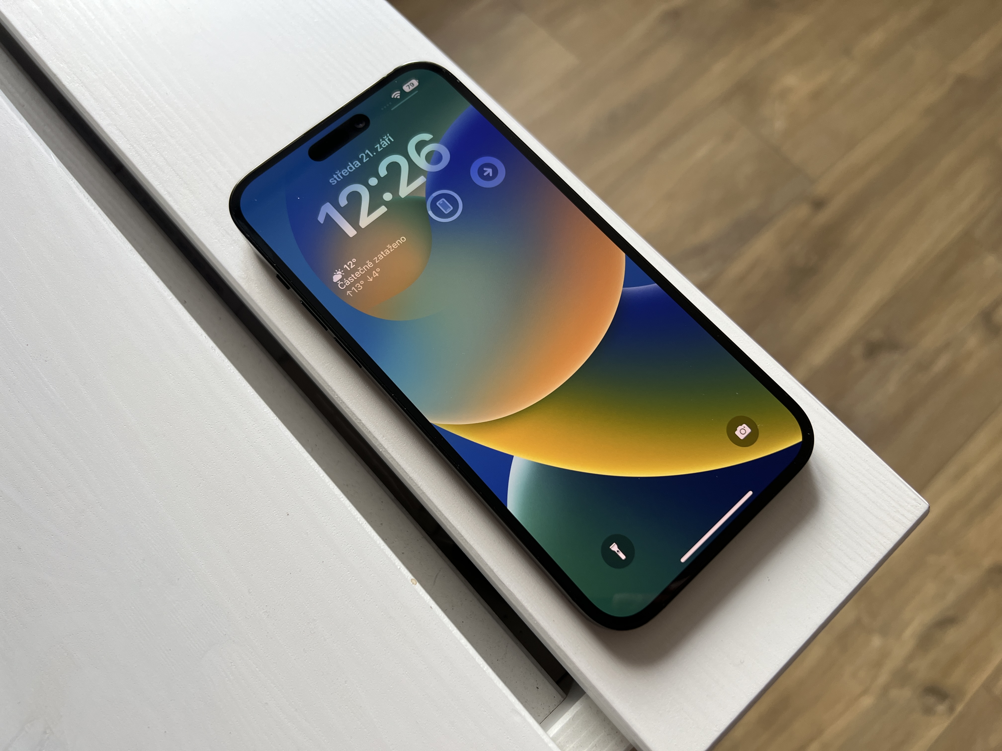
It's something that holds back widgets in iOS the most. It doesn't matter if they appear on the lock screen or on the desktop, in any case it's just a dead display of the given fact. Yes, when you tap on it, you'll be redirected to an app where you can continue working, but that's not what you want. You want to check off the given task directly in the widget, you want to look at other views in the calendar, switch to another city or days in the weather, also directly control your smart home from the widget, etc.
More space
We can certainly agree that the fewer widgets there are on the lock screen, the clearer it is. But there are also those who don't need to see their entire wallpaper, but want to see more widgets and the information they contain. One row is simply not enough - not only from the point of view of how many widgets you put next to each other, but also from the point of view of how big they are. As for the ones with more text, you can only fit two here, and that's just not satisfying. Then you only have the option to change the date to, for example, the weather or your activity in the Fitness application. Yes, but you will lose the day and date display.
Missed events icons
In my humble opinion, Apple's new announcements have failed miserably. You can call up the notification center with just a gesture of lifting your finger from the bottom of the display. If Apple added one more line of widgets that would only inform with icons about missed events, i.e. calls, messages and activity in social networks, it would still be clear but also useful. By clicking on the given widget, you would then be redirected to the relevant application, or better, a banner with a sample of the missed event would immediately appear on your screen.
More personalization
There's no denying that the lock screen layout is really pleasing. But do we really have to have so much time and do we have to have it in one single place? Precisely in connection with the limited space for widgets, it would not be out of the question to make the time half smaller, for example to put it on one of the sides and use the saved space again for widgets. It wouldn't be a bad thing to have the option to rearrange individual banners as you see fit. Since Apple has already provided us with personalization, it unnecessarily binds us with its limitations.
 Adam Kos