In recent years, maps have become an essential part of most smartphones, because every user needs to find from time to time, for example, where a particular business is located in a given location, while others use direct navigation several times a day. This logically solves the question of which maps to use. The big fight in this field is going on between Apple and Google.
A year ago I wrote an article about why (not) use Apple Maps and why in many cases it is more advantageous for a Czech user to bet on Google Maps, although everyone may prefer a slightly different set of functions. Year after year, both services developed in a certain way.
Google Maps remains the number one choice for me, however Justin O'Beirne in his text "A Year of Google & Apple Maps" provided an excellent graphical overview of what has changed in both Apple Maps and Google Maps over the past year.

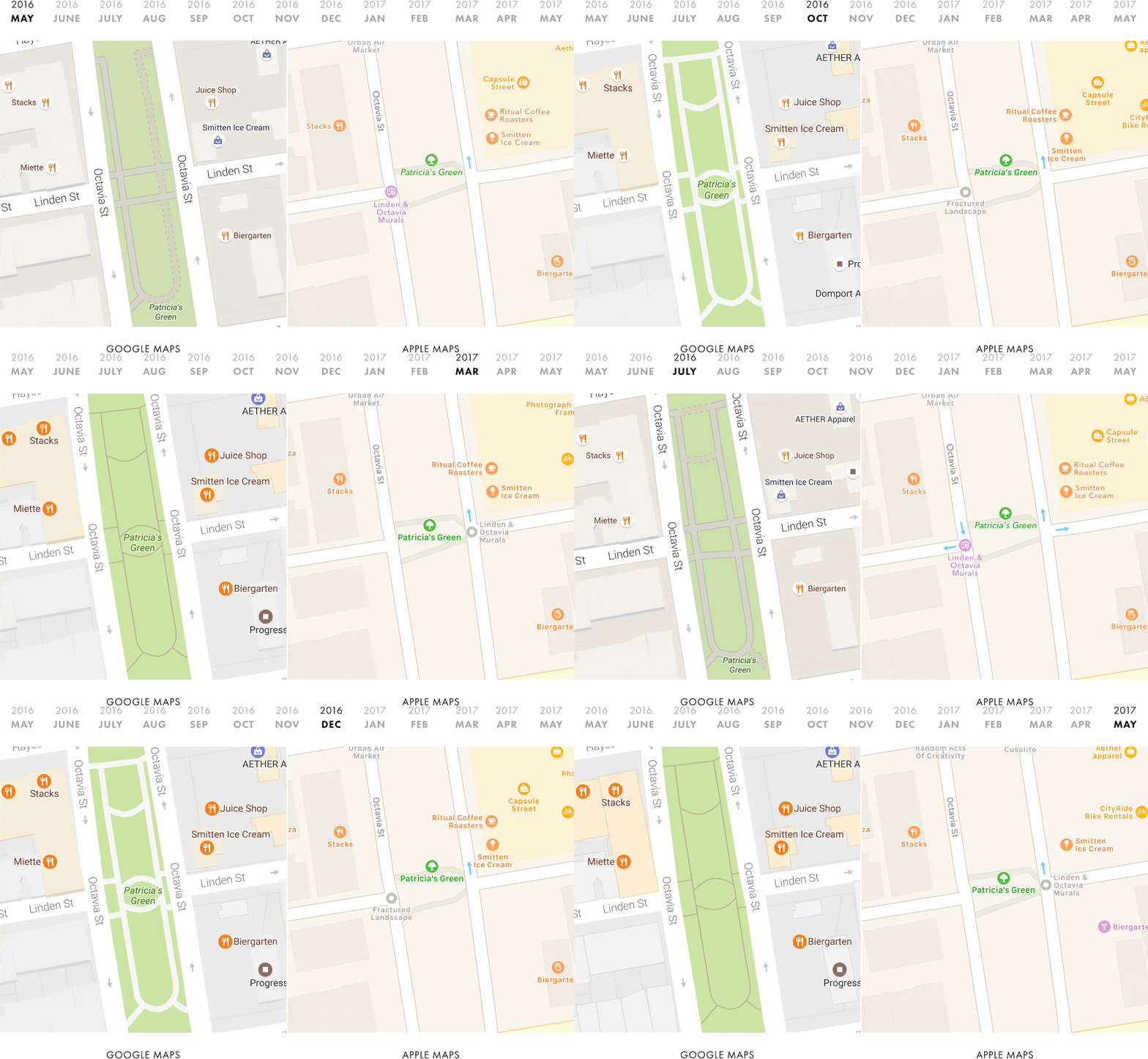
O'Beirne took pictures of specific areas regularly throughout the year so he could then compare them to see what had changed and where the two services were headed. So we can notice how the data on various points of interest has changed and updated over time, how Google has it - also thanks to Street View - more accurate in some ways, and how, on the contrary, Google was inspired by Apple in terms of graphic marks.
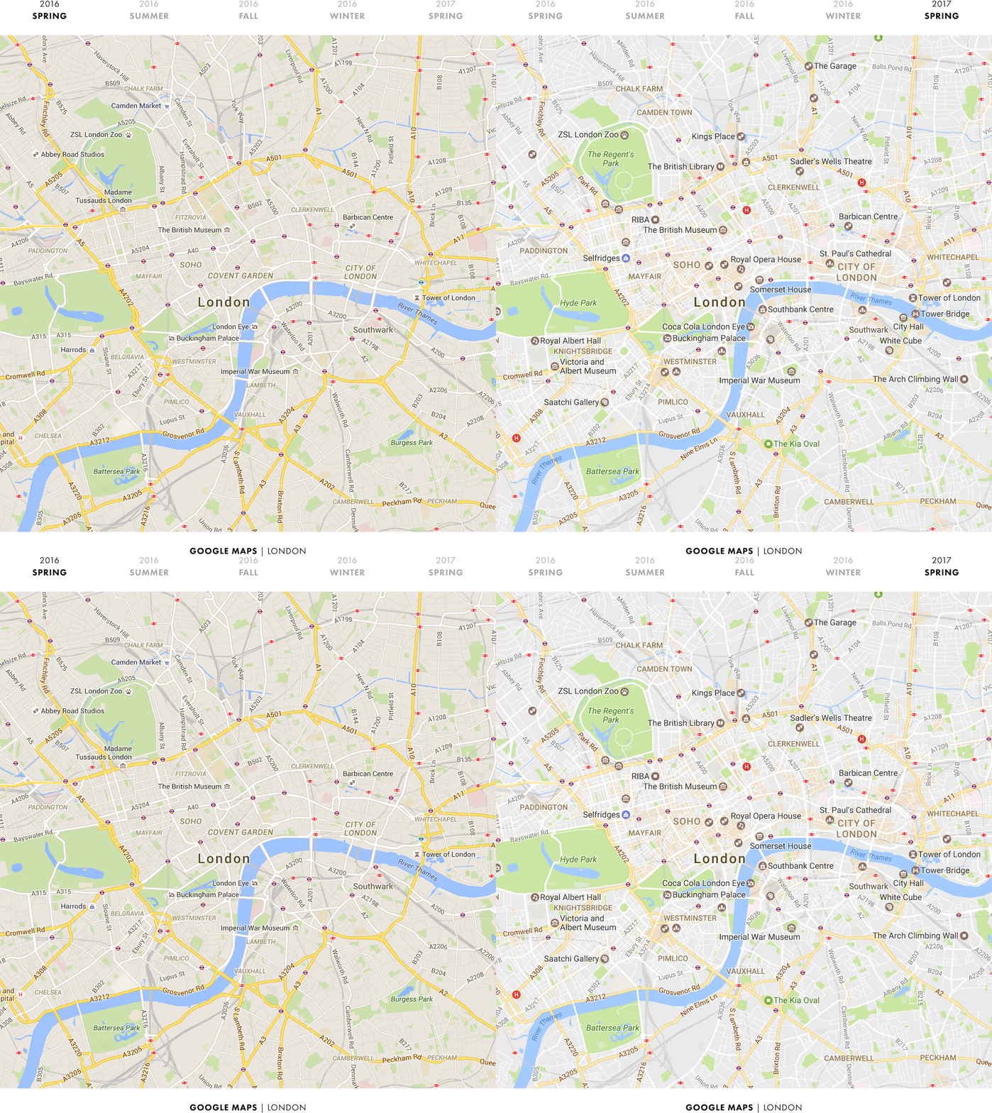
However, what is ultimately most interesting about the entire text - and what Google Map users will appreciate in particular - is the perfect explanation of how and for what purpose Google has fundamentally changed its maps over the last year. O'Beirne analyzes in detail the individual changes in the used colors and graphics and backs everything up again with images where we can clearly see the differences.
For example, a simple change of the background color in Google Maps may not seem like a big event at first glance, but combined with all the minor and major adjustments that Google has made over the last year, we end up with a completely different experience and, above all, a completely different focus of the entire Maps.
Since Google didn't officially announce several changes in that last year, as was the custom, there have been several debates as to why Google is deliberately making its maps more confusing, by using lighter, faded colors or by losing roads.

But it all had a clear purpose, as Justin O'Beirne explains: "Over the course of a year, Google quietly turned its maps upside down - transforming them from a roads on maps places. A year ago, roads were the most prominent part of the map - the first thing you noticed. Now they are places.'
It was precisely the so-called Areas of Interest (points of interest) that Google focused on, and today we can notice that various shops, restaurants, monuments and institutions are really the most visible.
While the situation may be somewhat different in the United States, it is the points of interest that in the Czech Republic still differentiate maps from Apple and Google in a large number of cases - Google has a much larger and more accurate database here, thanks to which you can easily find the vast majority of points. which you need. Their new prominent position just proves how Google cares about points of interest.

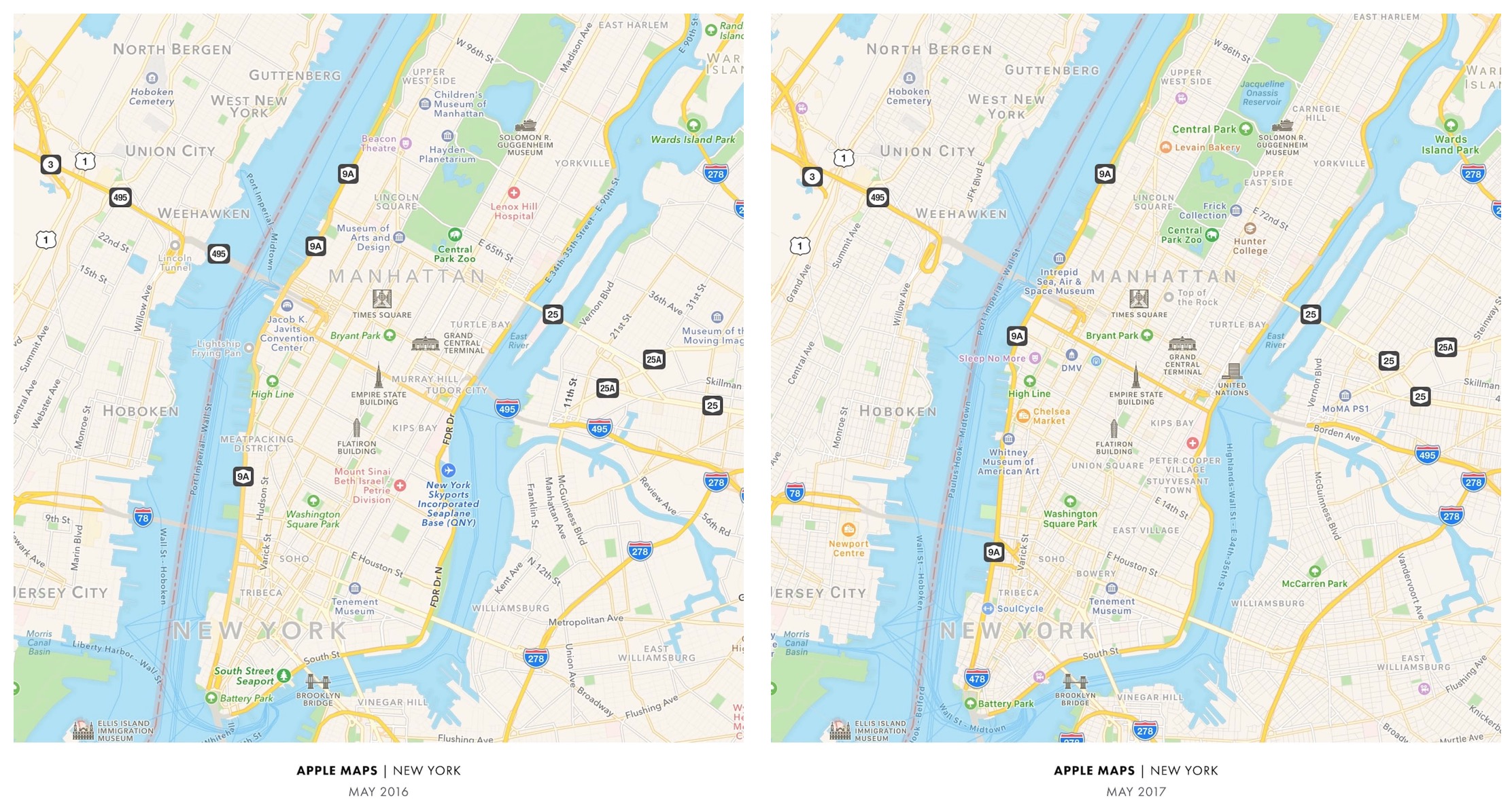
Apple Maps, on the other hand, has practically not changed during the past year, although the iPhone manufacturer announced a completely new design for its maps a year ago at WWDC. A look at the May 2016 and May 2017 apple charts leaves the same impression, as O'Beirne demonstrates again. In part, this may be due to the fact that Apple usually only updates its services once a year, at the developer conference.
At the same time, in such a dynamic environment as the maps undoubtedly are, much more regular care would be advisable. Especially when we see with Google Maps what can be done in a single year. In addition, this does not only apply to Apple's Maps, but also to other services. We can probably expect some news already next week at WWDC.
And what about mapy.cz...