Among Apple fans, you would probably look in vain for someone who does not know anything about the evolution of its logo. Everyone is certainly intimately familiar with its gradual transformation into its current form. The bitten apple is one of the most famous and very few people would not recognize it. However, during the existence of the apple company, it has changed several times - in today's article, we will look at the evolution of the apple logo in more detail.
In the beginning was Newton
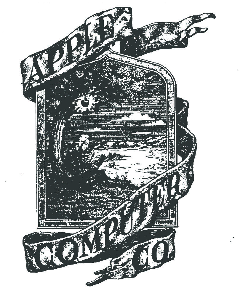
Apple didn't always have the iconic bitten apple in its logo. The designer of the first ever Apple logo was company co-founder Ronald Wayne. The logo, created in the 1970s, depicted Isaac Newton sitting under an apple tree. Perhaps everyone has come across the story of how Newton began to study gravity after an apple fell from a tree on his head. In addition to the aforementioned cartoon scene, the logo also contained within its frame a quote from the English poet William Wordsworth: "Newton ... a mind, ever wandering on strange waters of thought.".
Apple turnover
But the Isaac Newton logo didn't last very long. It probably won't surprise anyone that it was Steve Jobs who didn't like that it seemed outdated. So Jobs decided to hire graphic artist Rob Janoff, who laid the groundwork for the familiar bite-sized apple depiction. Jobs very quickly decided to replace the old logo with a new one, which in various variations has remained to this day.
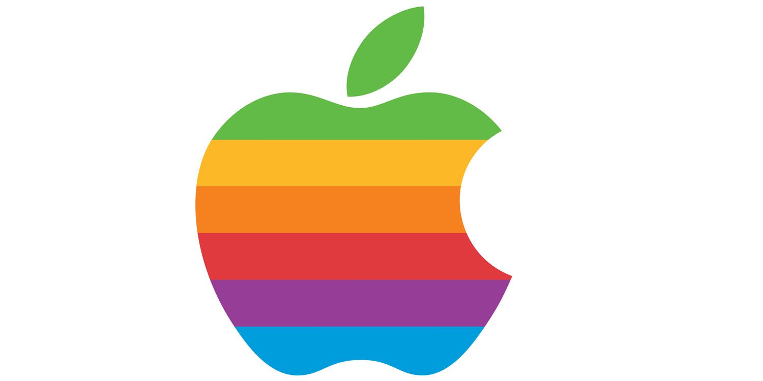
Originally designed by Rob Janoff, the logo featured the colors of the rainbow, referring to the Apple II computer, which was the first in history to feature a color display. The debut of the logo itself took place only shortly before the release of the computer. Janoff stated that there wasn't really any system to the way the colors were laid out per se – Steve Jobs just adamantly insisted that green be on top "because that's where the leaf is."
The arrival of the new logo was, of course, associated with a number of various speculations, rumors and guesses. Some people were of the opinion that the transition to an apple logo simply described the company's name better and suited it better, while others were convinced that the apple symbolized Alan Turing, the father of modern computing, who bit into an apple impregnated with cyanide before his death .¨
Everything has a reason
“One of the biggest mysteries to me is our logo, a symbol of desire and knowledge, bitten, decorated with the colors of the rainbow in the wrong order. A more fitting logo is hard to imagine: desire, knowledge, hope and anarchy," says Jean-Louis Gassée, former Apple executive and one of the designers of the BeOS operating system.
The colorful logo was used by the company for twenty-two years. When Jobs returned to Apple in the second half of the 1990s, he quickly decided on another logo change. The color stripes have been removed and the bitten apple logo has been given a modern, monochrome look. It has changed several times over the years, but the shape of the logo has remained the same. The world has managed to associate the bitten apple logo with the Apple company so strongly that there is no longer even a need for the company name to appear next to it.
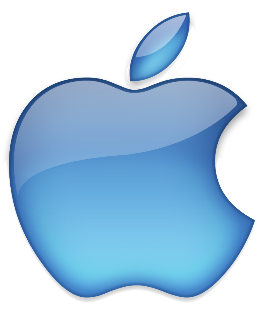
The bitten part also has its meaning. Steve Jobs chose a bitten apple not only for the reason that it is clear at first glance that it is really an apple and not, for example, a cherry or a cherry tomato, but also because of the pun on the words "bite" and "byte", pointing to the fact that Apple is a technology company. Even the color changes of the apple were not without reason - the "blue period" of the logo referred to the first iMac in the Bondi Blue color shade. Currently, the Apple logo can be silver, white, or black.


And what about the version of the logo without the bitten apple? If I'm already writing about something, I would like to study all the information and not just a part.