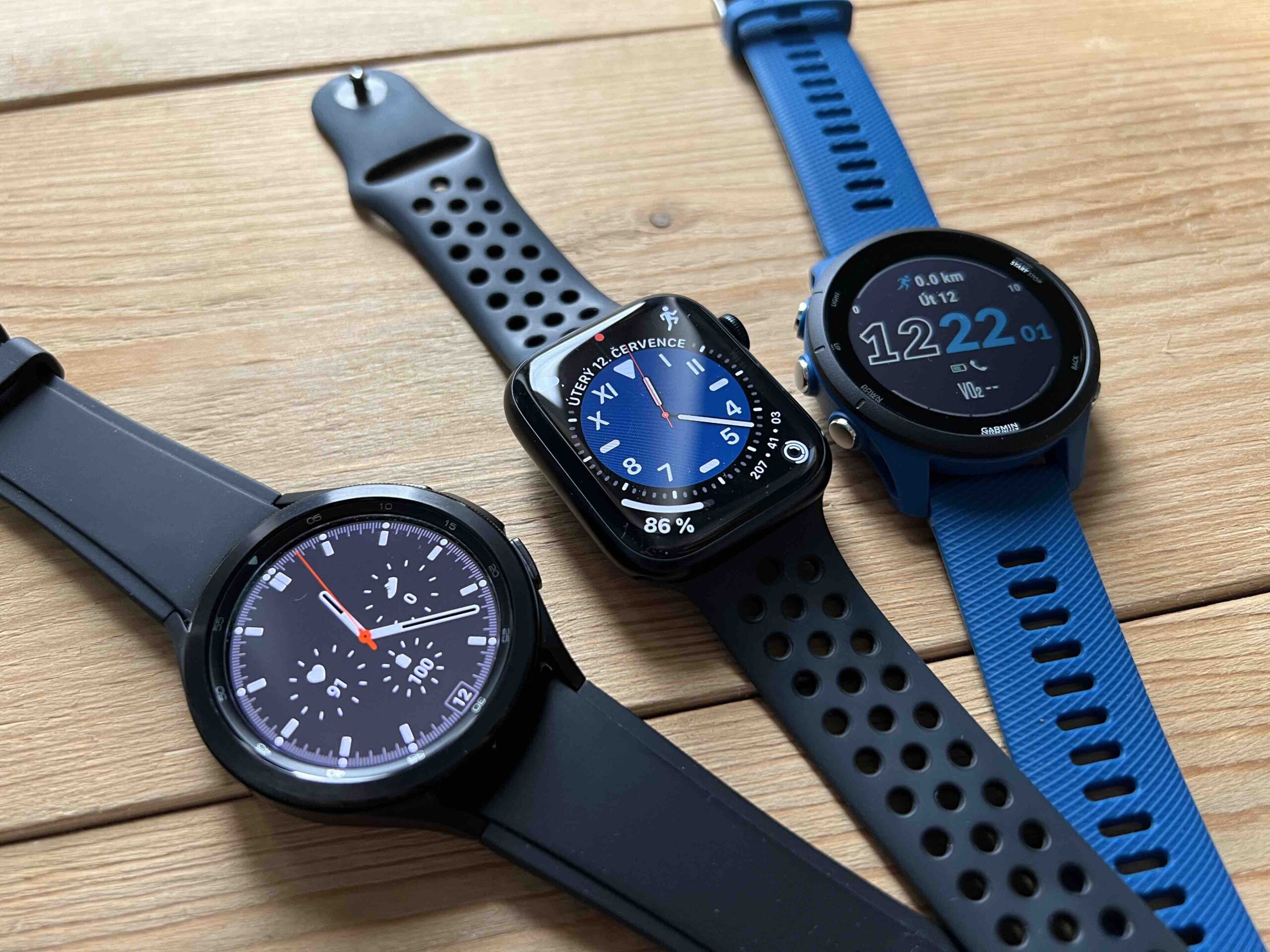
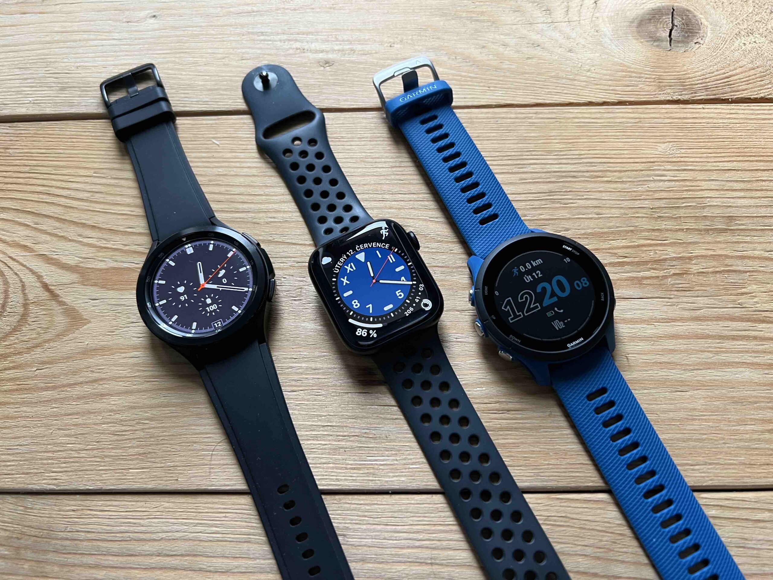
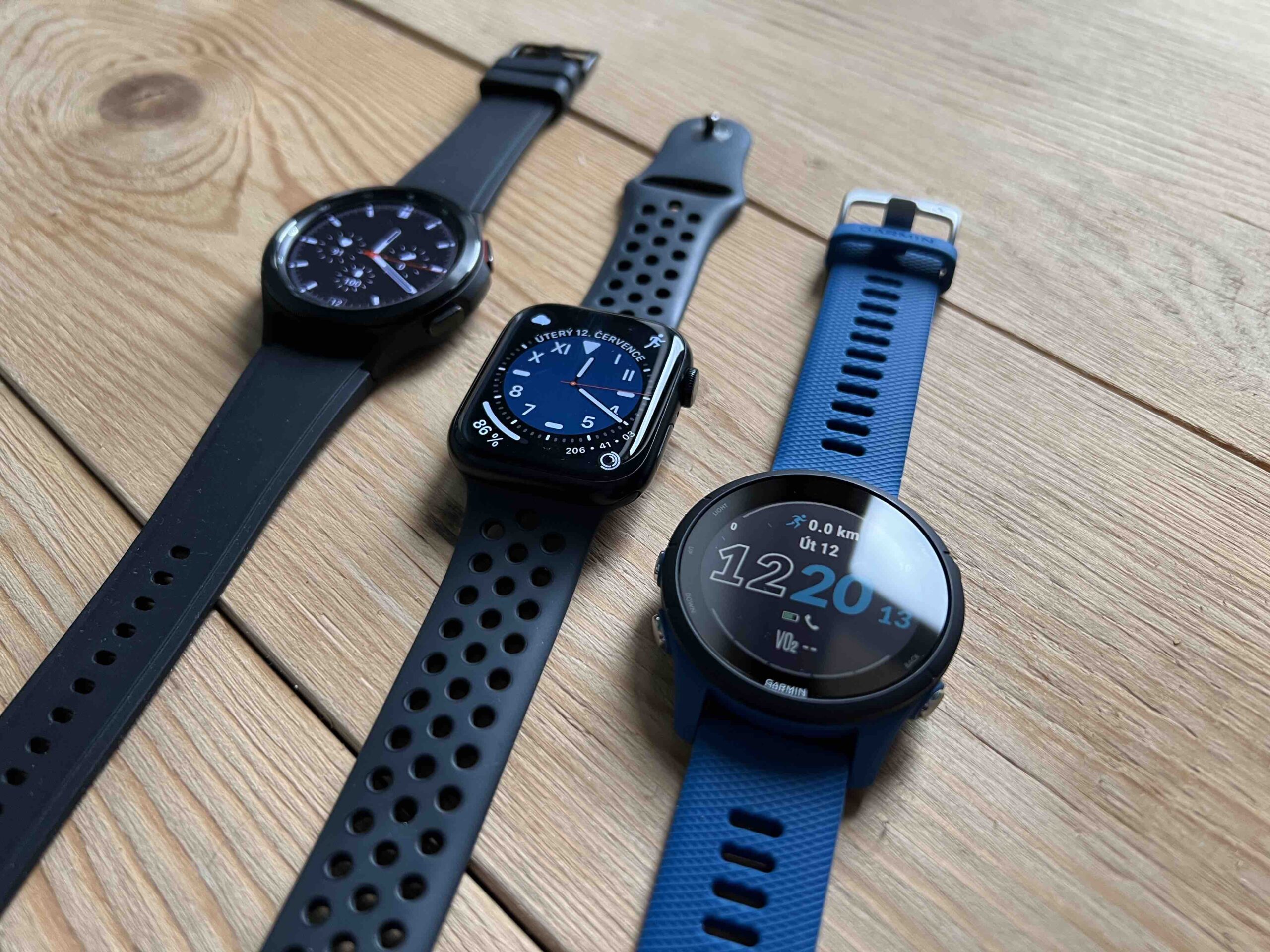
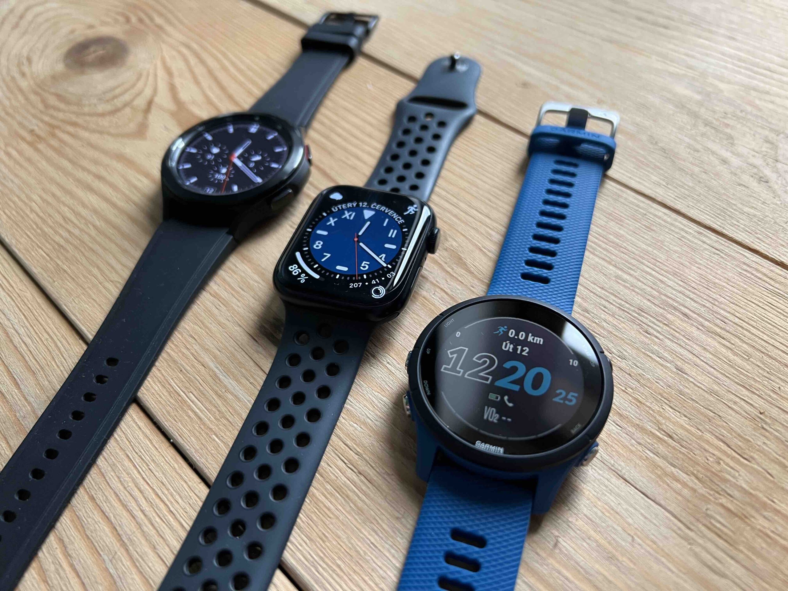
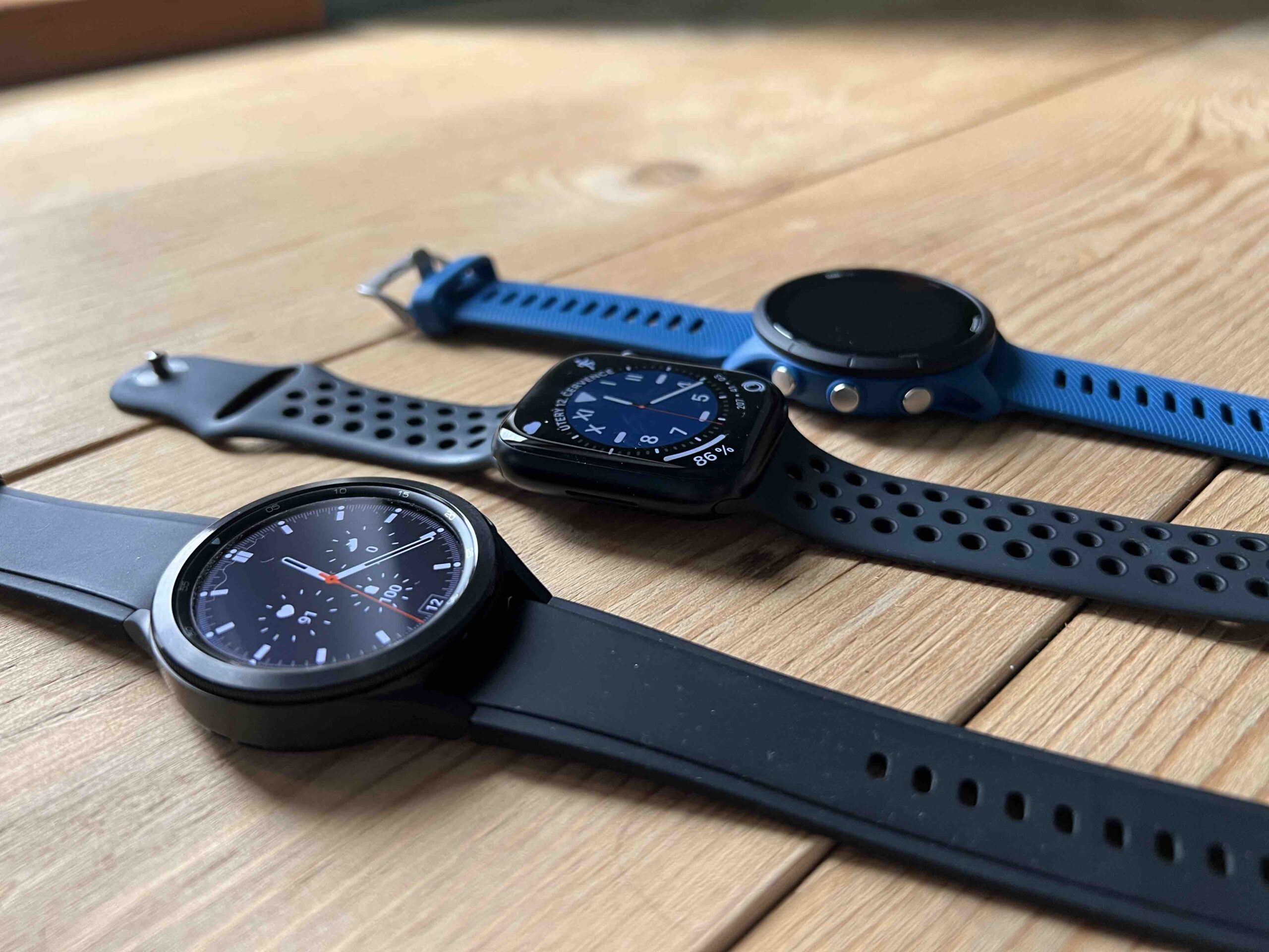
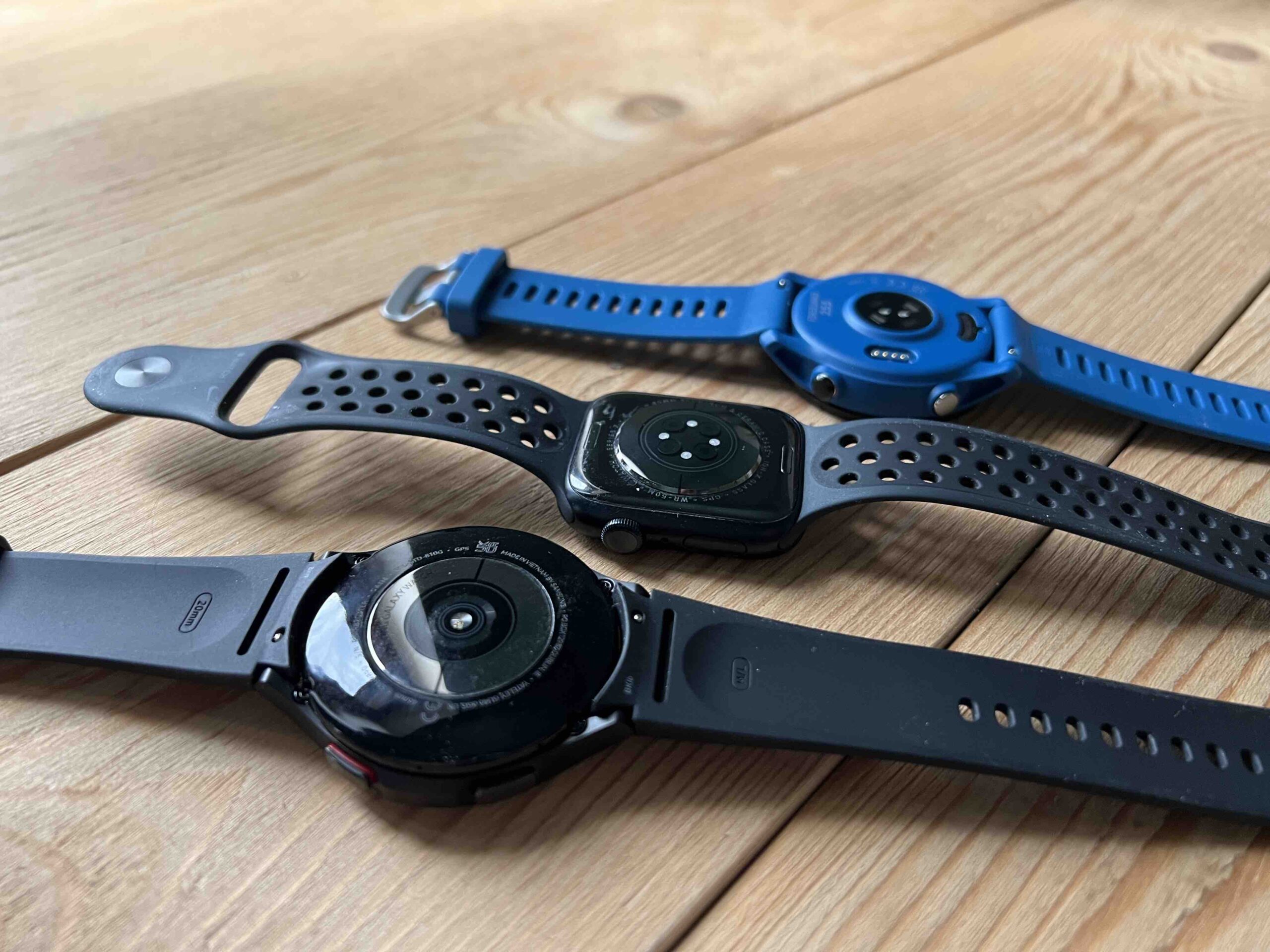
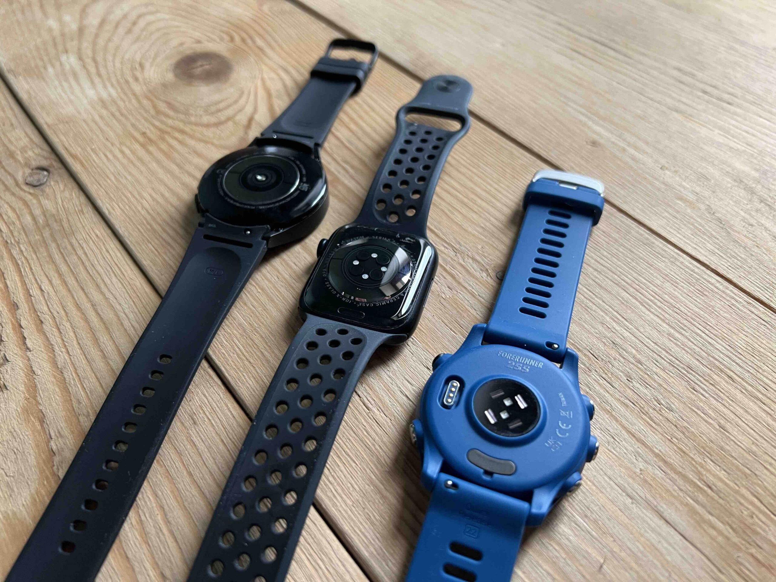
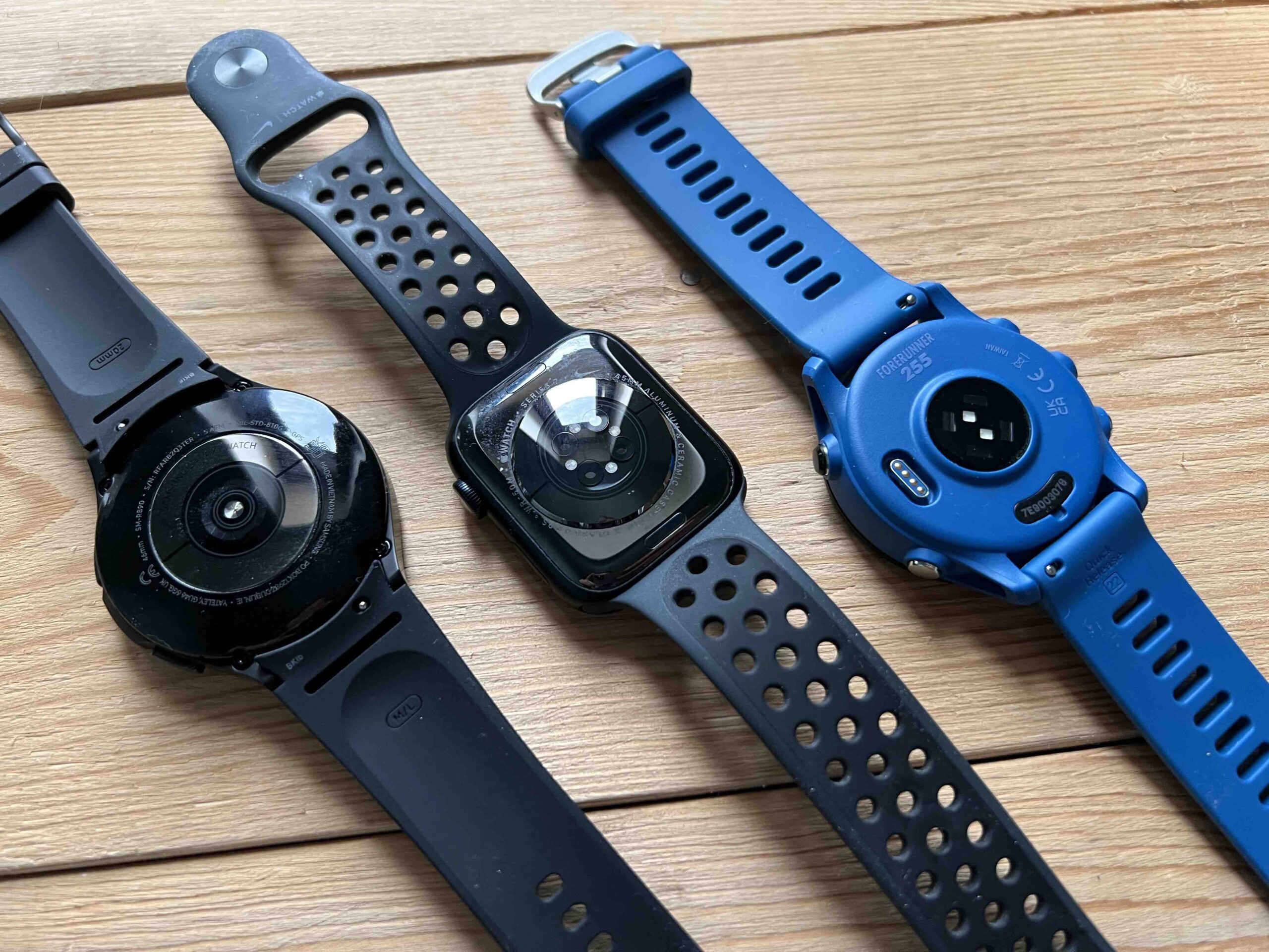
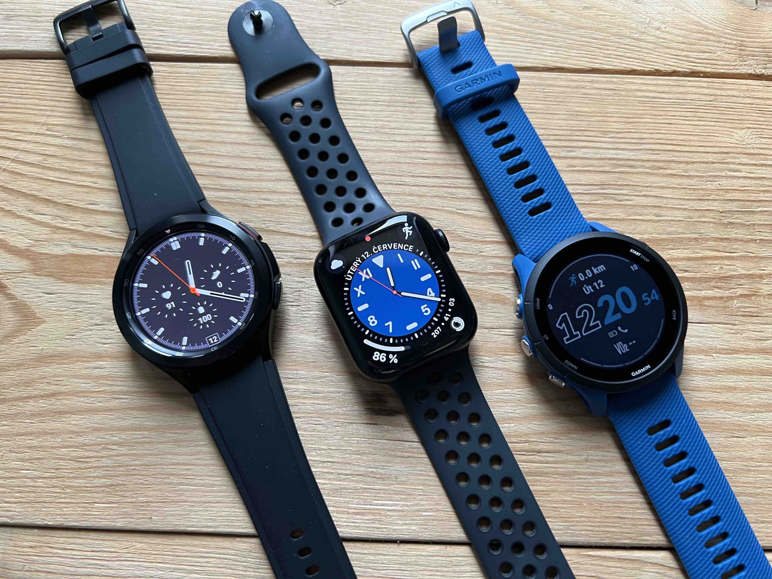
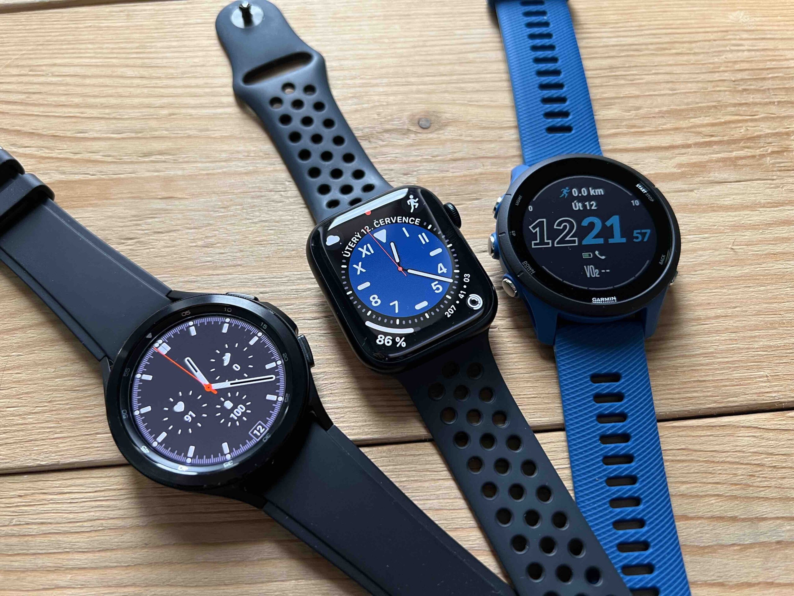
The layout of the clock face is already some kind of Friday with us here. When it comes to the time, there are usually 12 digits, but the 24-hour dial is not an exception, nor is the fact that only one hand shows the time. Although Apple did not invent anything new with the rectangular case in 2015, it ideally adapted the user experience to modern technologies.
Square dials also have a proper history, when they began to appear especially with the advent of digital time indicators. Their boom then occurred with the Quartz era, i.e. battery-powered watches, which instead of the classic dial with hour, minute and second hands contained displays showing numbers. The revolution in displaying time on the wrist was brought about by the Japanese company Seiko in 1969, which also started a crisis with that revolution. Quartz became cheap and available, and expensive Swiss brands began to disappear.
However, if we look at the current production of watches, the circular form factor of the dial clearly still prevails here (although there are still many exceptions). However, with its first Apple Watch, Apple was more inspired by digital watches, and it still holds this vision to this day. But with hindsight it can be said that even if the case shape could be faulted, it was a really well thought out move that still makes sense.
With regard to the text
Even if you put any watch faces on the Apple Watch, the circular ones still show the time in a classic way, even with the present hands. But those corners can now accommodate so many useful complications, making Apple Watch faces not only visually appealing, but also useful.
So, if we look at the competition in the form of the Samsung Galaxy Watch, for example, the South Korean manufacturer did not try to copy the Apple Watch to the letter, and is based more on the classic shape of the case and watch as such. So they have a circular dial, but they have to fit all the complications into it, which limits it in terms of overall playfulness and variability. Although this smart watch looks like a classic watch, it loses to the Apple Watch in a direct comparison of use.
It could be interest you
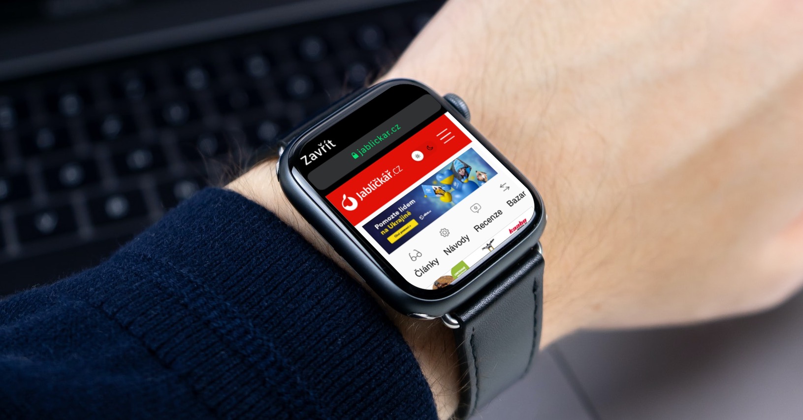
It is the rectangular display that can get more out of a wearable device, even with regard to displaying menus, text, etc. We can see this, for example, with Garmin as well. This is a purely digital watch focused mainly on tracking activities, but offering many smart functions, especially in combination with notifications from the phone or the installation of various accessories. A square display would actually suit them too, because checking the measured values in them is often not very friendly, especially when you only control the basic models with buttons, because they don't have a touch screen.
Why are apps round?
The Apple Watch design has become iconic. Other smartwatch manufacturers are copying it, as well as luxury Swiss brands. There is practically no point in changing it in any way, as well as adding buttons or removing the crown. Control is intuitive and easy, as well as fast. So the only illogical thing here is the application menu. Apple opted for a square design of the case, but somewhat inexplicably, the app and game icons in the Apple Watch have circular icons, and the control center menus are perhaps too unnecessarily rounded. Even so, it still works after seven years.
