A few days ago, she appeared on our sister magazine review of the latest 16″ MacBook Pro. For the most part, we've praised this machine to the skies – and it's certainly no wonder. It seems that Apple has finally started to listen to its customers and presents the kind of products that we want, not itself. At the moment, in addition to the 16″ MacBook, we also have a 14″ model in the editorial office, which also pleasantly surprised us. I personally have both of these models in my hands for the first time and I decided to try to tell you my first impressions through two articles. Specifically, in this article we will look at the 5 things I don't like about the MacBook Pro (2021) on our sister magazine, see the link below, then you will find the opposite article, which is about the 5 things I like.
This article is purely subjective.
It could be interest you
Blooming displays
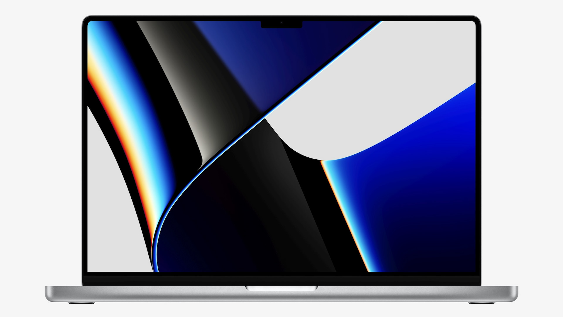
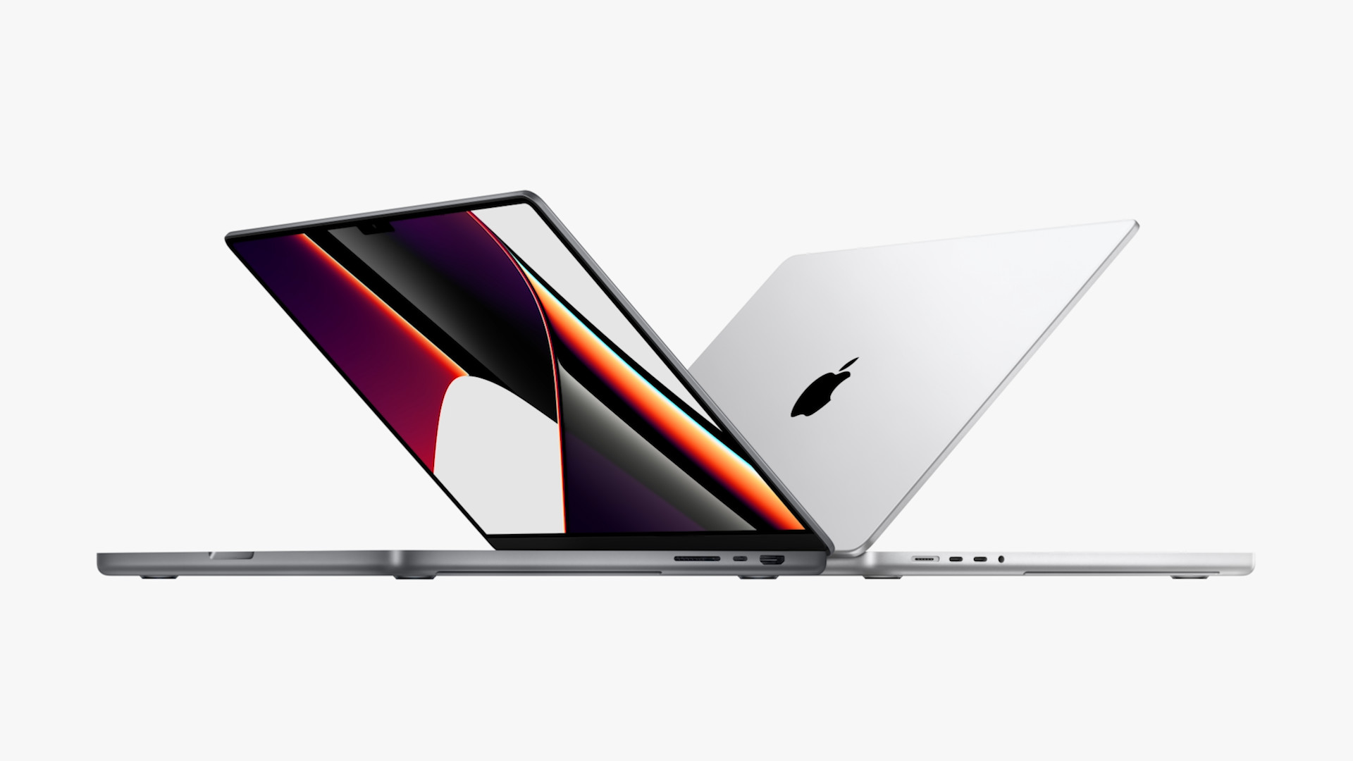
If you read the article mentioned in the introduction on our sister magazine, you surely know that I praised the display in it. I definitely don't want to contradict myself now, because the display on the new MacBook Pros is really absolutely great. But there is one thing that bothers me, and which also bothers countless other users - you probably already know about it. This is a phenomenon called "blooming". You can observe it when the screen is completely black and you display some white element on it. Blooming can be observed right from the start when the system starts, when a black screen appears, together with the logo and a progress bar. Because of the use of mini-LED technology, a kind of glow appears around these elements, which does not look very good. For example, with the OLED displays used by the iPhone, you would not notice blooming. This is a beauty flaw, but it is a tax for the use of mini-LED.
Black keyboard
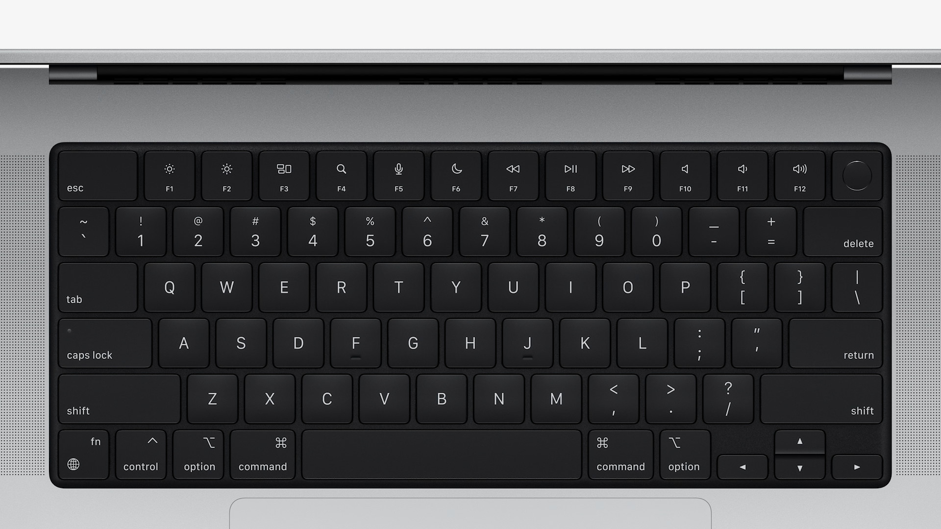
If you look at the new MacBook Pros from above, you will notice that there is a bit more black here - but at first glance, you might not be able to find out what is different. However, if you were to put the older MacBook Pro and the new one side by side, you would immediately recognize the difference. The space between the individual keys is colored black in the new models, while in the older generations this space has the color of the chassis. As for the keys, they are of course black in both cases. Personally, I don't like this change, especially with the silver coloring of the new MacBook Pros. The keyboard and the body create a contrast, which some may like, but for me it is unnecessarily large. But of course, this is a matter of habit and, above all, design is a purely subjective matter, so it is very likely that other users will like a completely black keyboard.
Silver coloring
On the previous page, I already teased the silver color of the new MacBook Pros. To put it into perspective, I've been using space gray MacBooks for a long time, but a year ago I made the switch and bought a silver MacBook Pro. As they say, change is life, and in this case it is perhaps doubly true. I'm really excited about the silver color on the original MacBook Pro and I currently like it better than space gray. But when the new silver MacBook Pros arrived, I have to say that I definitely don't like them that much. I don't know if it's the new shape or the black keyboard inside, but the new 14″ and 16″ MacBook Pro in silver looks a bit like a toy to me. The space gray coloring, which of course I also saw with my own eyes, is, in my opinion, really much more interesting and, above all, more luxurious. You can let us know which coloring you like more in the comments.
You will have to get used to the design
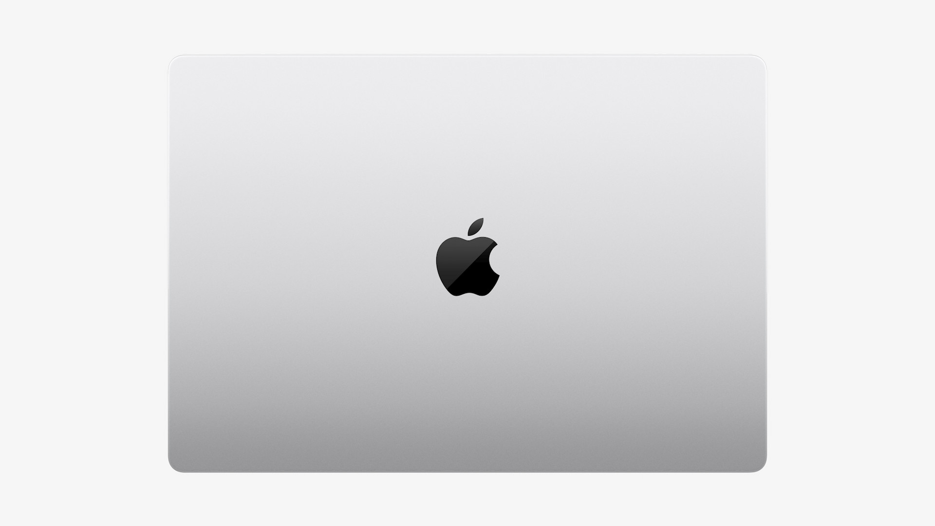
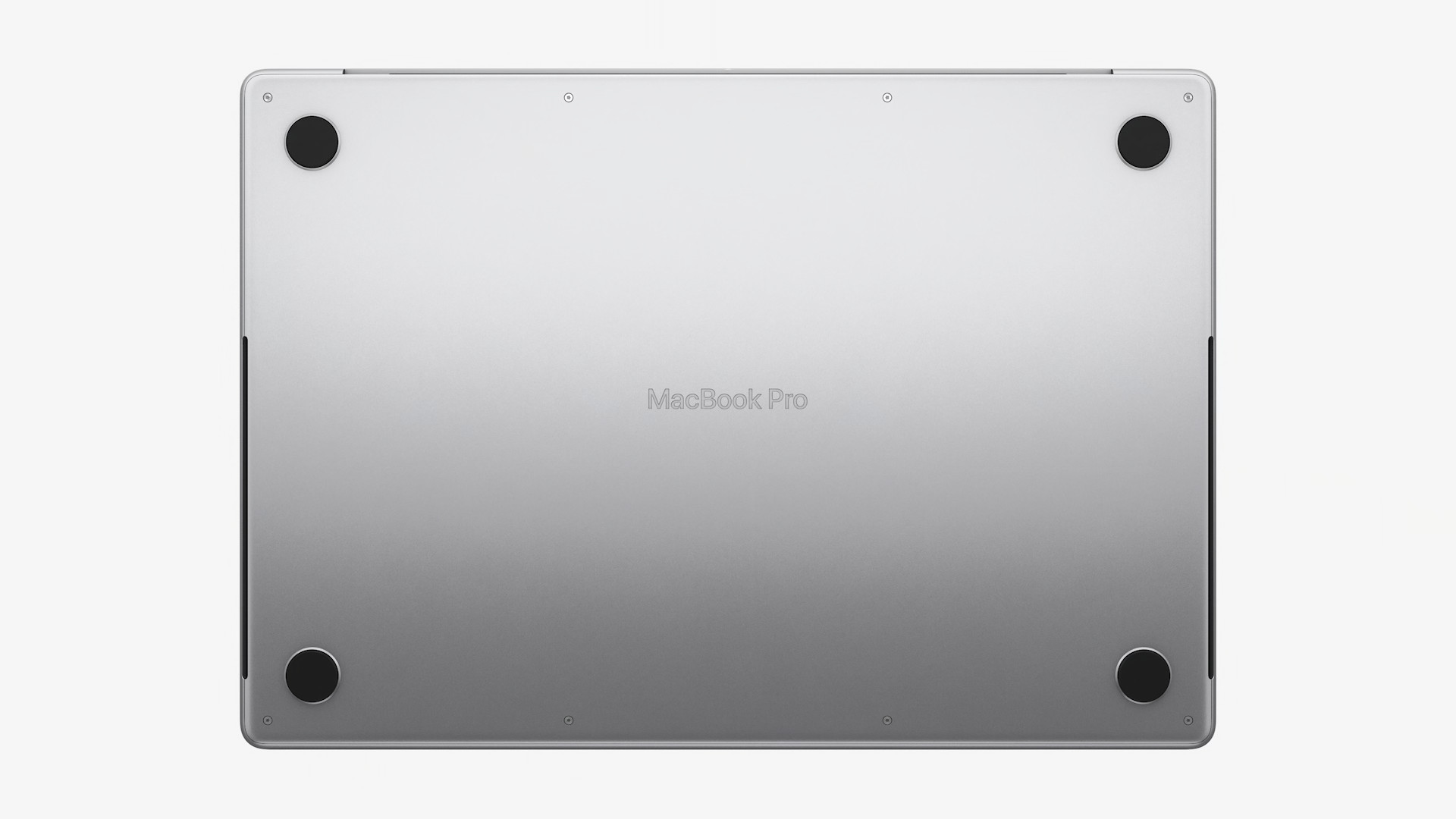
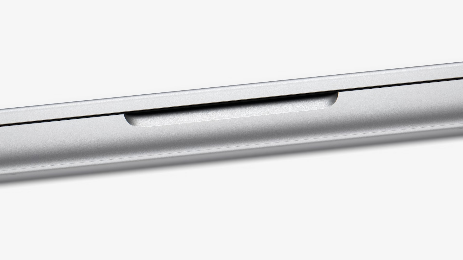
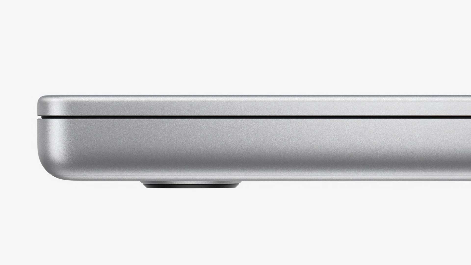
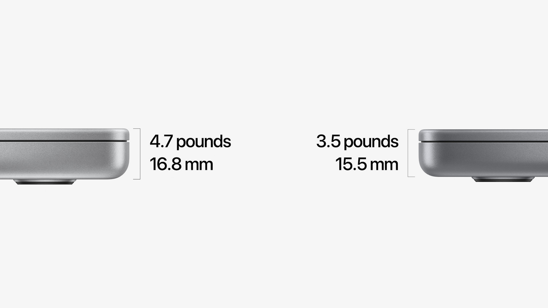
As most of you probably know, the new MacBook Pros have undergone a complete redesign. Apple opted for a slightly thicker and more professional design, which is more functional. Finally, we also have the proper connectivity that professional users needed so much. But if you now own an older MacBook Pro, believe me, you will definitely have to get used to the new design. I don't want to say that the design of the new "Proček" is ugly, but it is definitely something different... something that we are simply not used to. The shape of the body of the new MacBook Pro is even more angular than before, and together with the greater thickness, it can look a bit like a sturdy brick when closed. But as I say, this is certainly just a habit and I definitely don't want to complain - on the contrary, Apple has finally come up with a more functional design, which also ranks it among the other more angular products in its portfolio.

Higher storage edge for the hand
If you're reading this article on a MacBook and you look at where your hands are currently placed, it's more than clear that one of them is resting on the tray next to the trackpad, and the rest of your hand may be resting on the table. It is therefore necessary to take into account a kind of "staircase" that we are used to. However, due to the thicker body of the new MacBook Pro, this step is slightly higher, so it can be uncomfortable for the hand for some time. However, I have already come across a user on one forum who had to return a new MacBook Pro precisely because of this step. I believe that for most users this will not be such a problem and that it will be possible to try it.
 Flying around the world with Apple