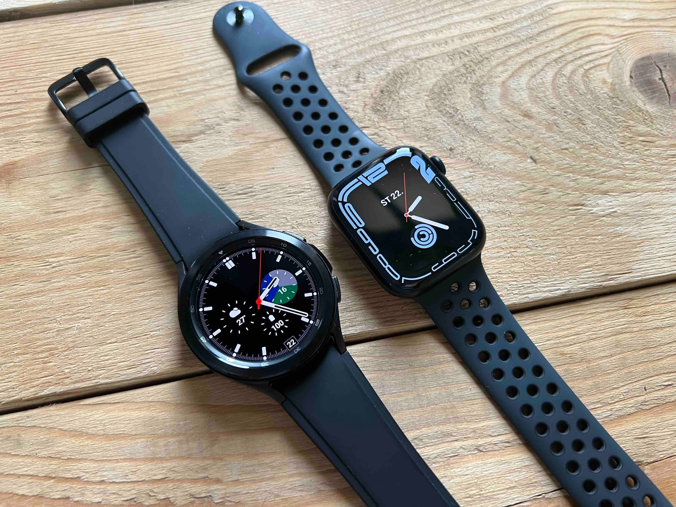
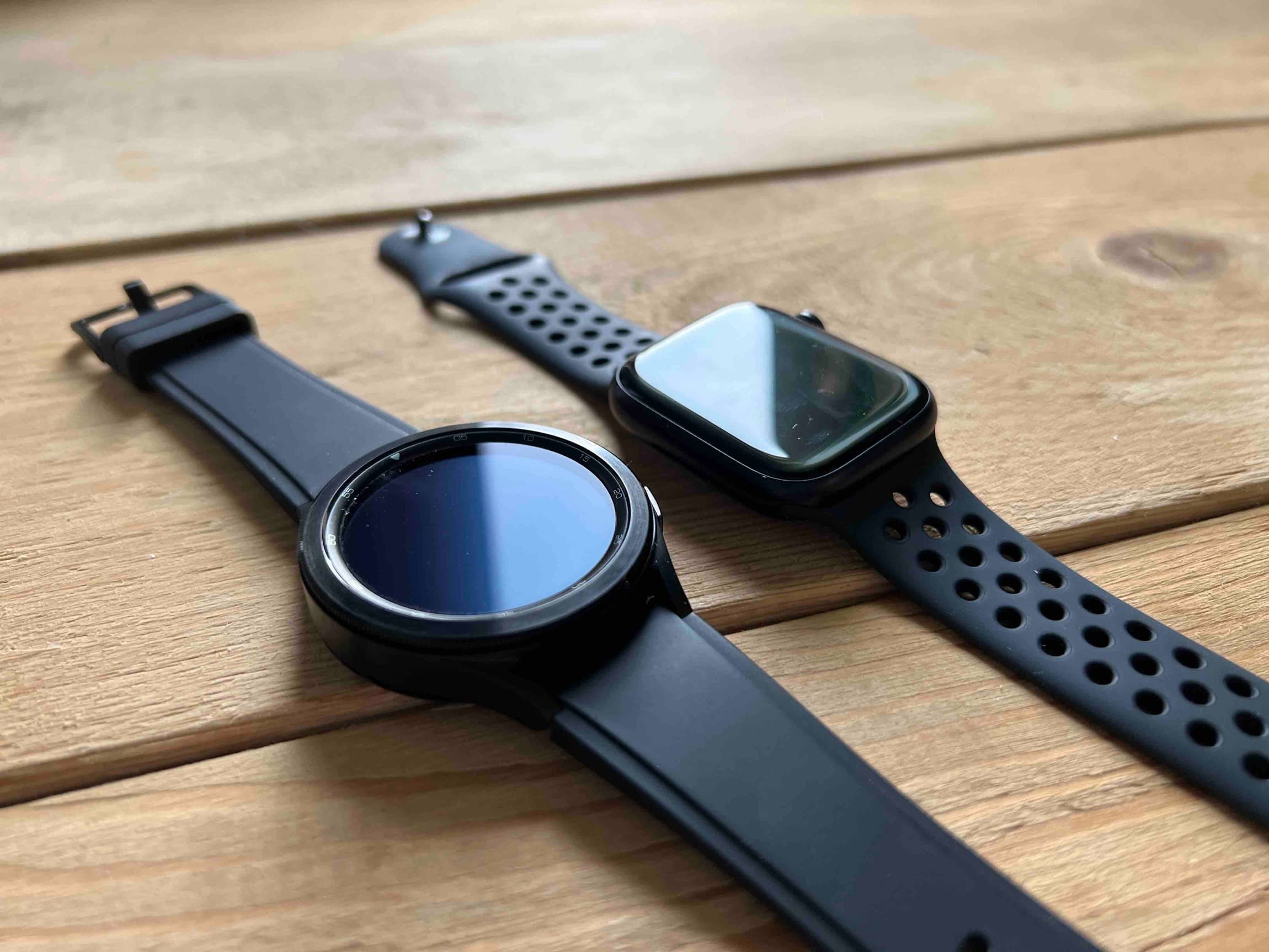
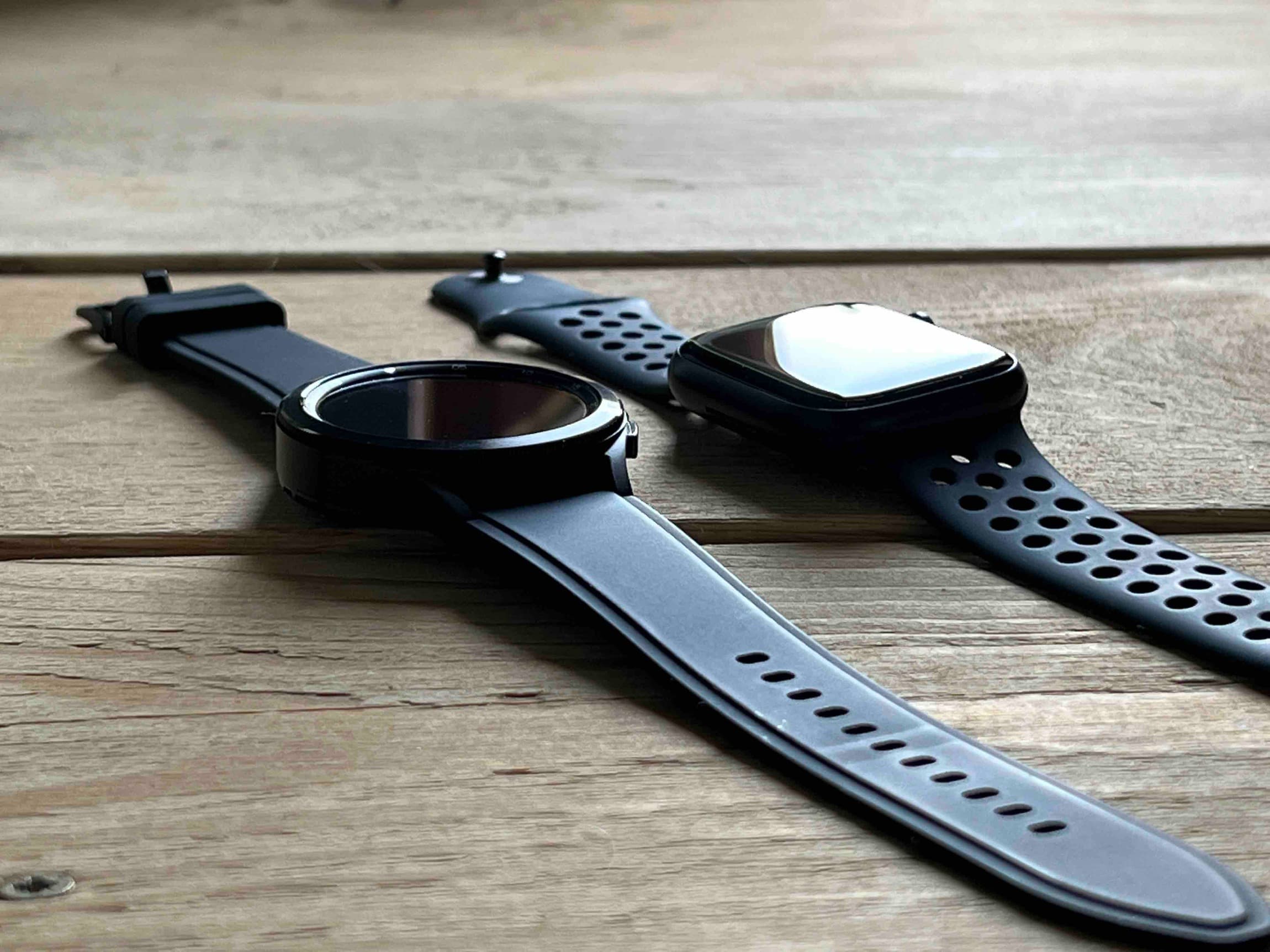
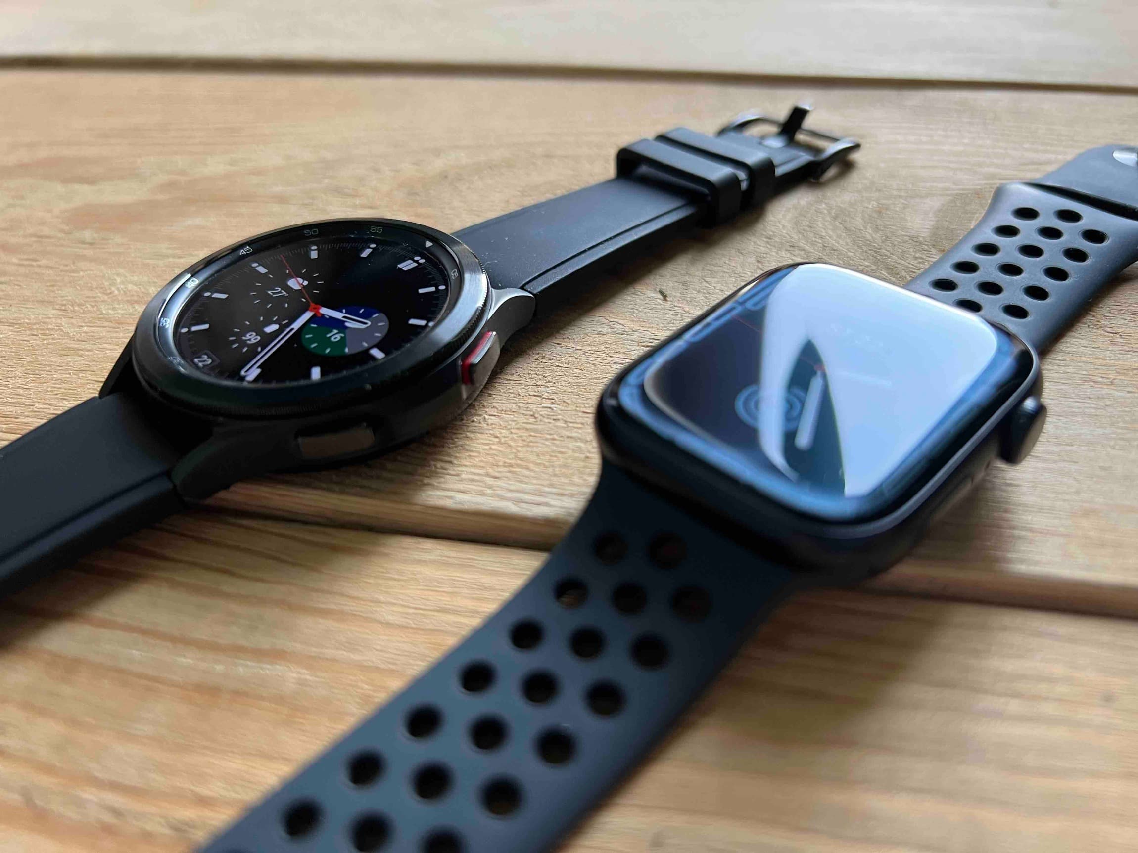
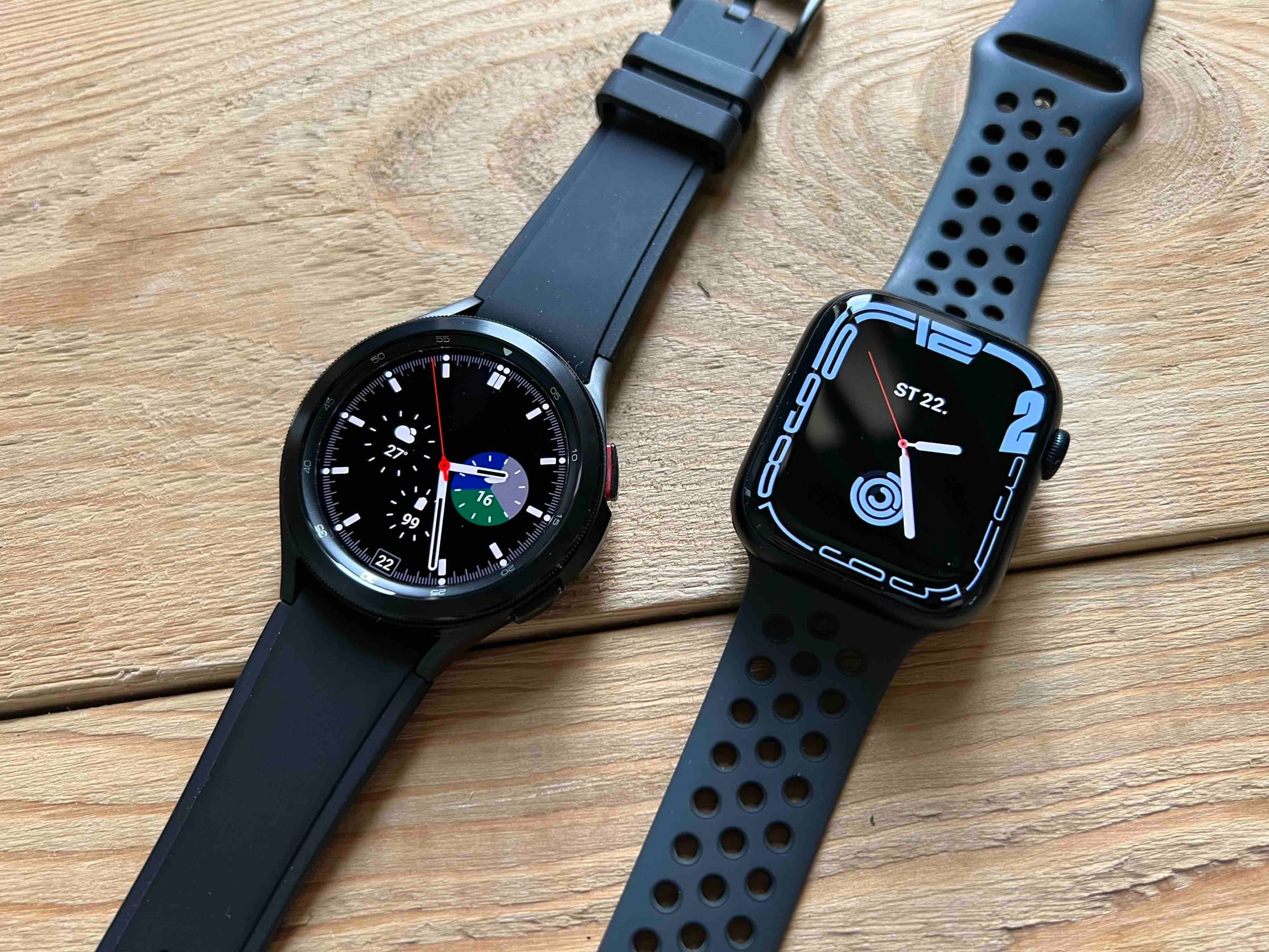
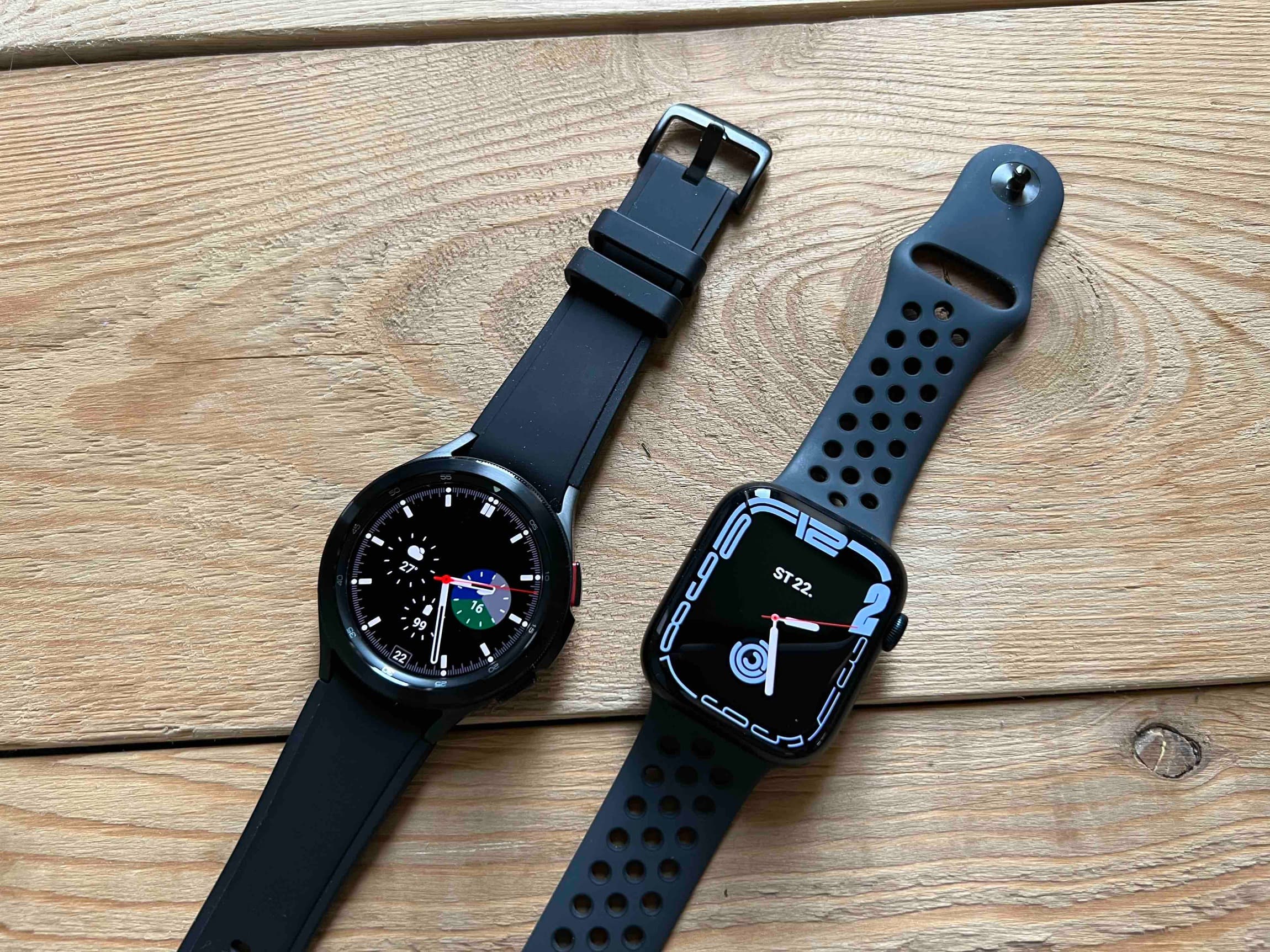
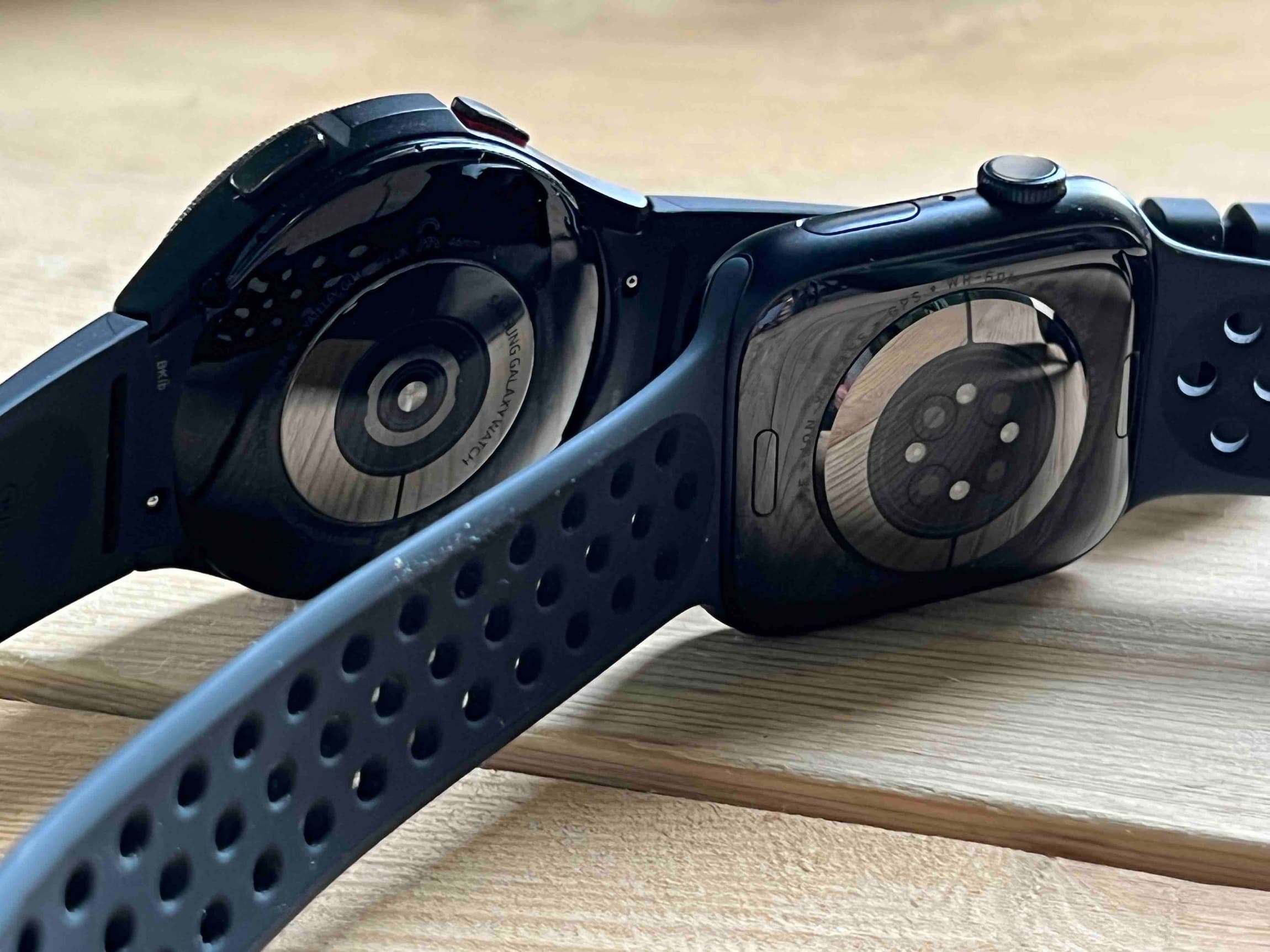
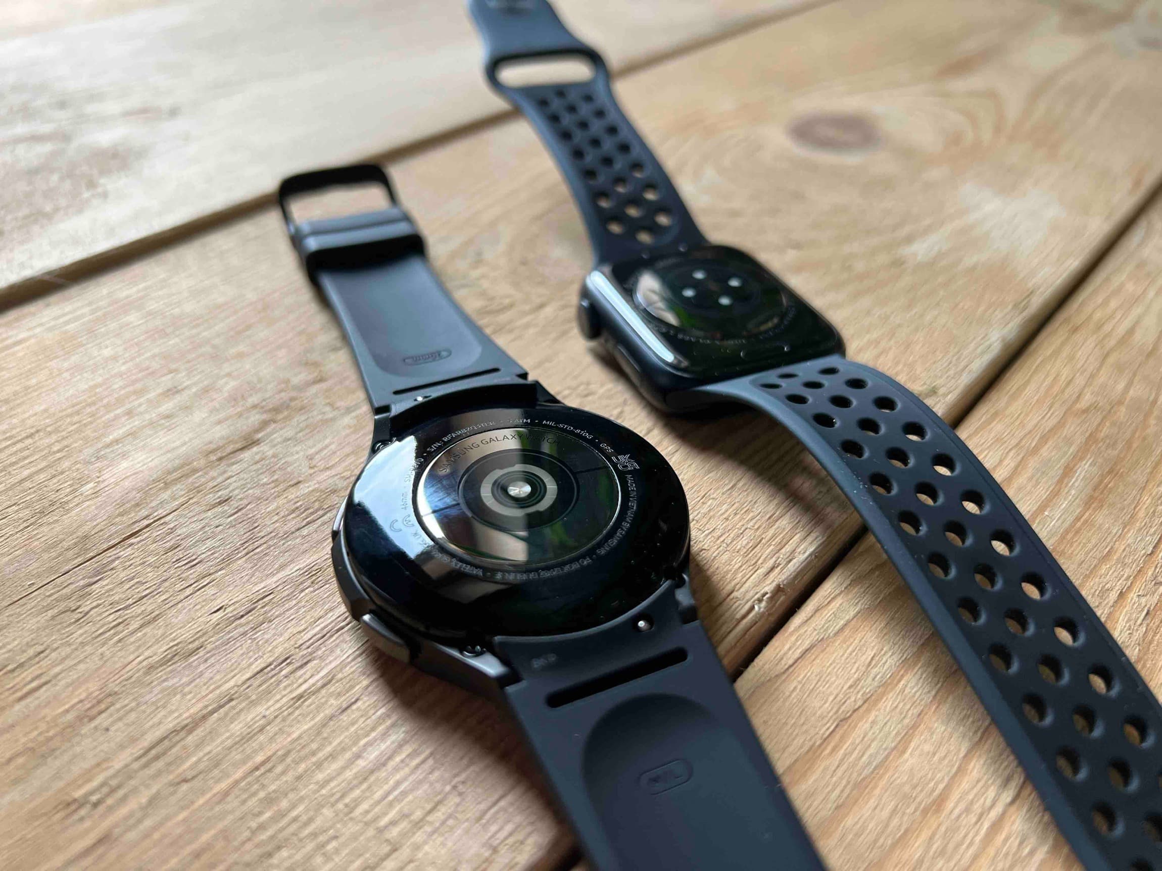
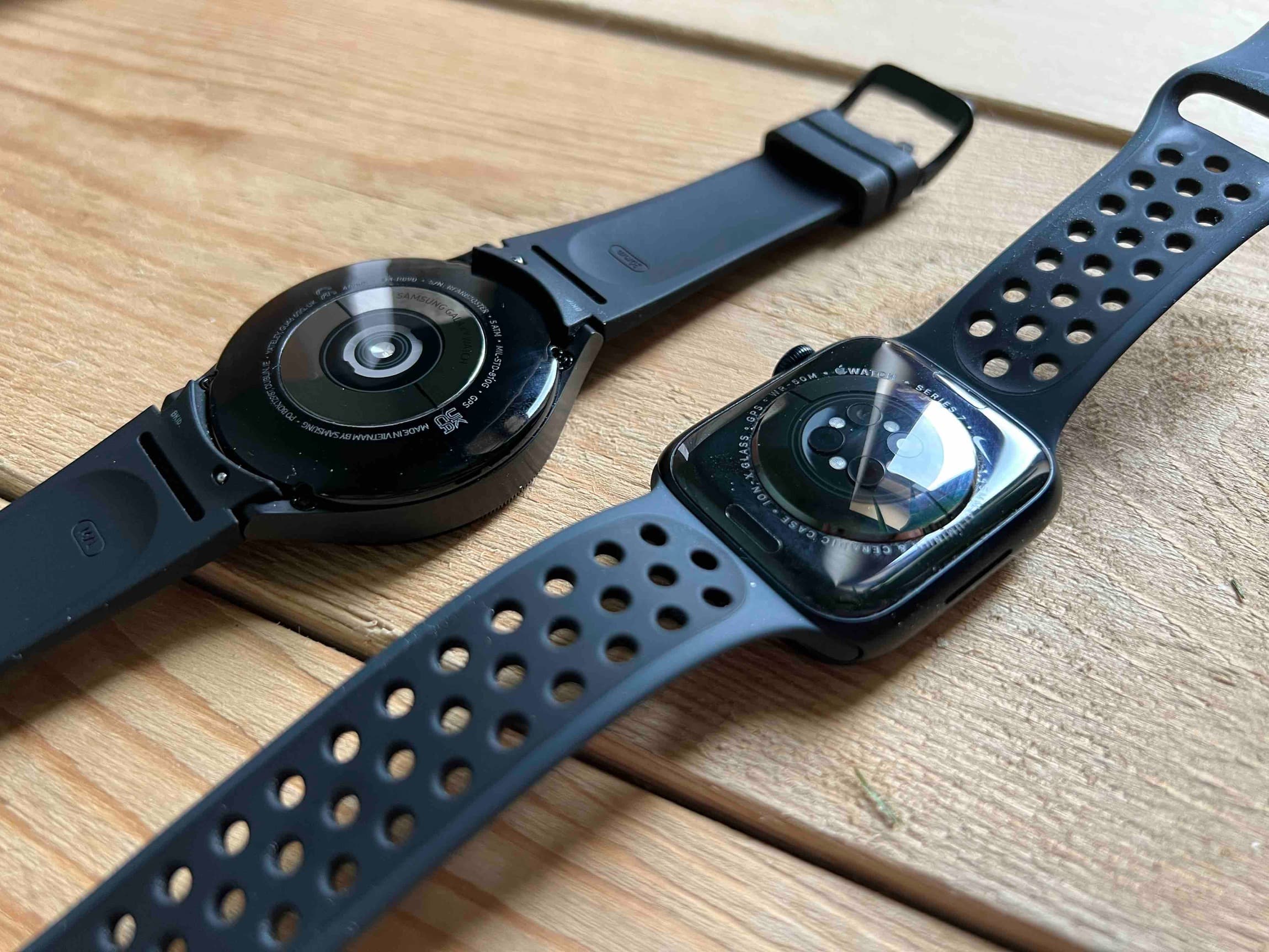
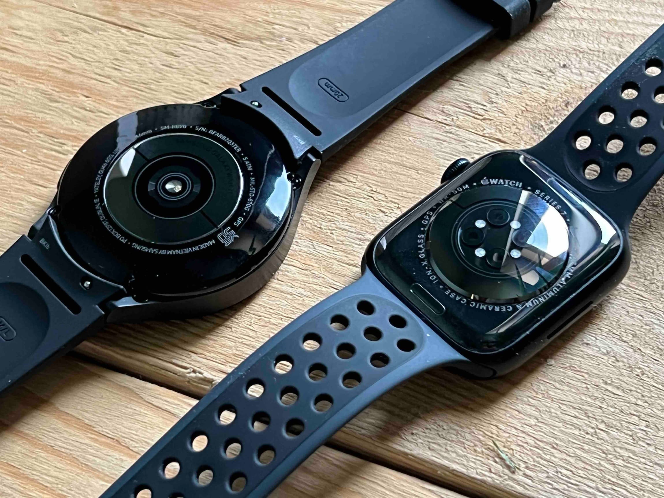
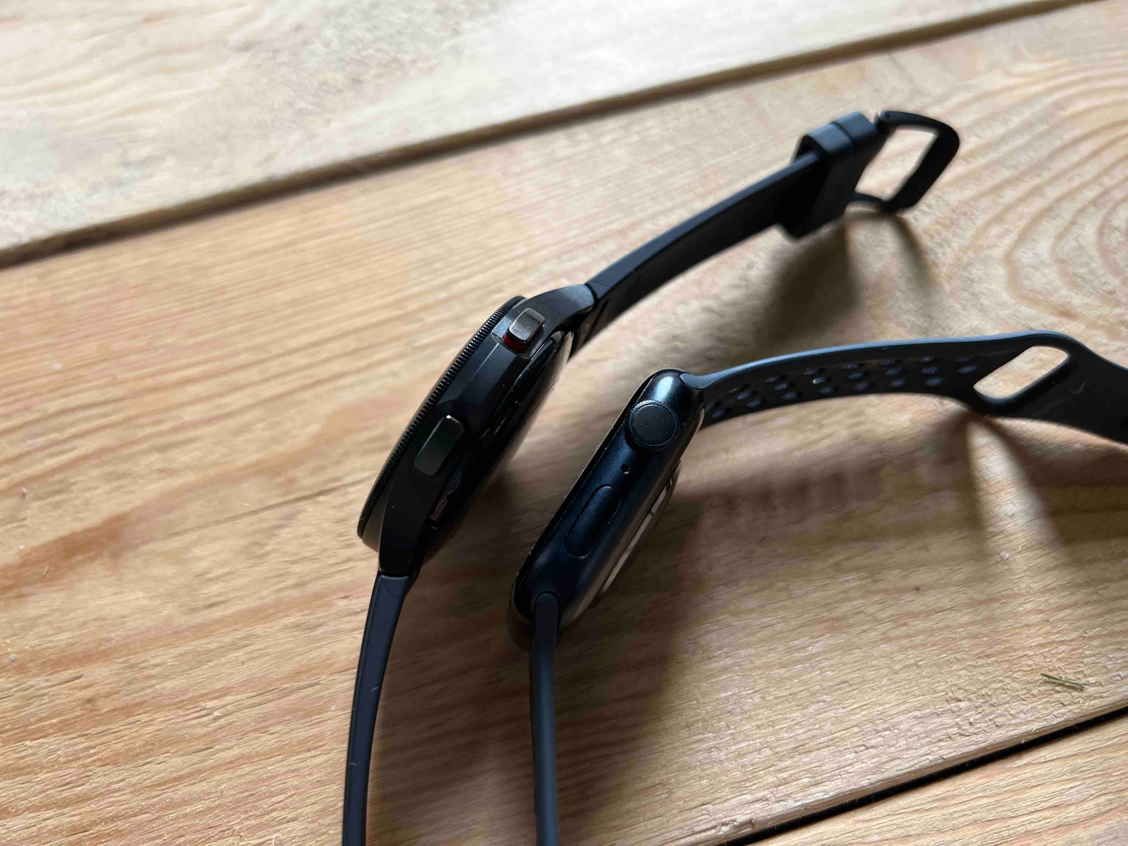
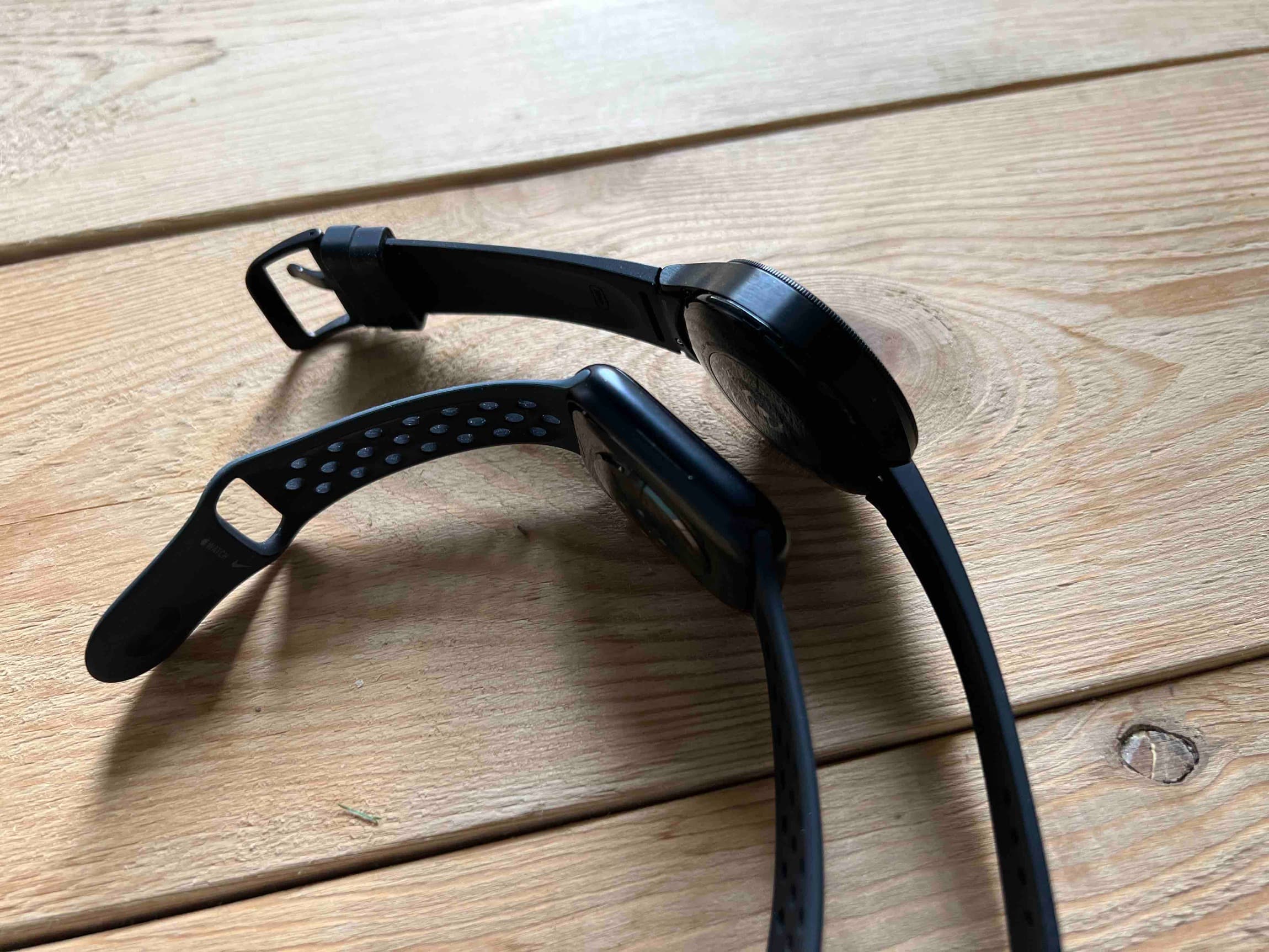
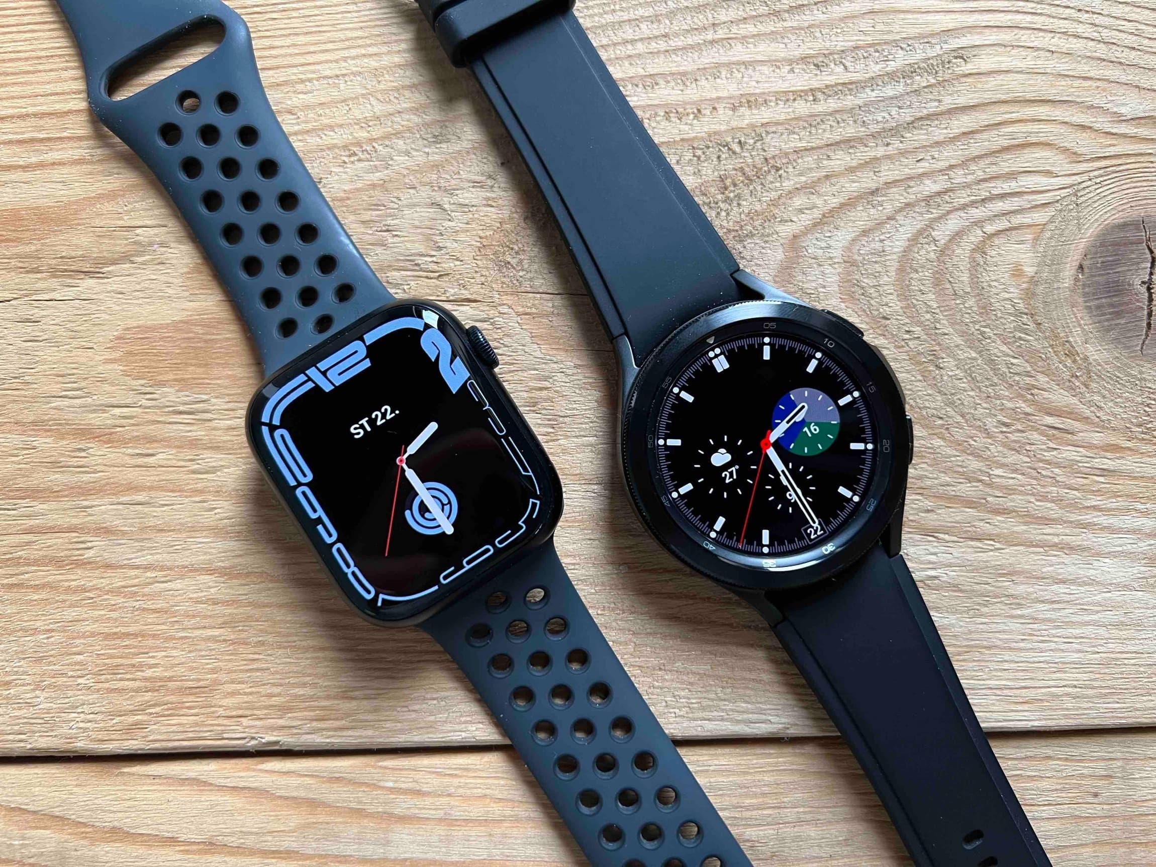
We received the Galaxy Watch4 Classic, which runs on the operating system Wear OS 3. In the previous article, the watch was compared with the Apple Watch Series 7 more in terms of appearance and how they are controlled with the help of buttons (and the crown and bezel). Now it's time to shine a light on the system.
Apple set the trend for smart wearables not only with regard to the form factor, which is still being copied by Chinese manufacturers, but also showed what such a smart watch on the wrist can actually do. Apple Watch tried to compete with many manufacturers, but they paid the price for the limitations of the operating system used, which was Tizen. However, it is Wear OS 3, which emerged from the collaboration between Samsung and Google, that is supposed to unlock the full potential of wearables connected to Android devices. Even after a year, however, it still hasn't spread much. Practically, only Samsung uses it in its Galaxy Watch4 series, and Google plans to use it in its Pixel Watch, due this fall. The only other manufacturer to report use in its watches is Montblanc.
It could be interest you
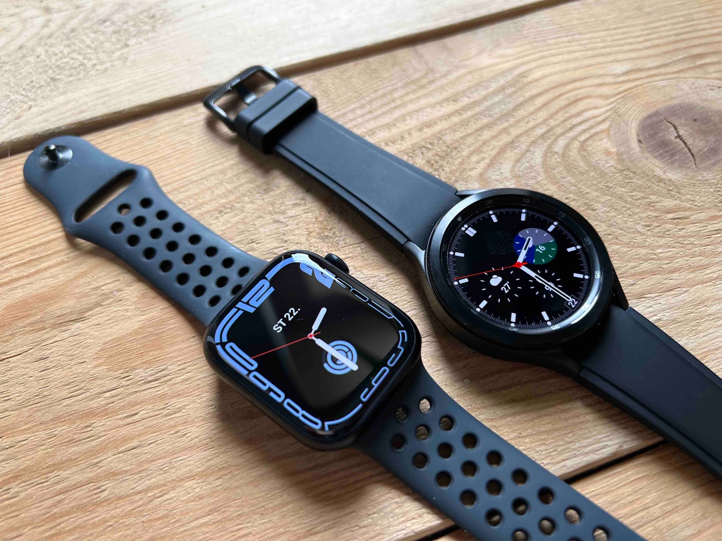
The resemblance cannot be purely coincidental
Why invent something that might work when we can take something that we already know works? This is probably how Samsung and Google agreed during the development of Wear OS 3. When you look at Wear OS 3 and compare it to watchOS 8 (and older systems, for that matter), it's clear that one copied from the other. But Apple is the smart one here. So that copying is not so messy, Wear OS at least opens all offers "in reverse". This is probably so that the companies can confuse potential switchers.
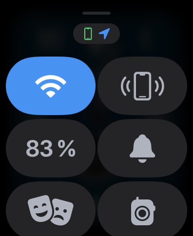
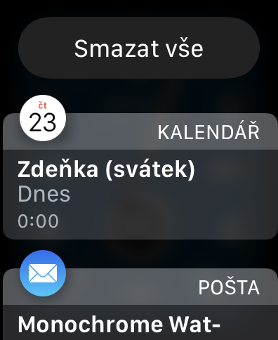
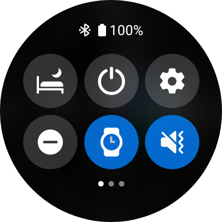
If we start with the simpler one. On the Galaxy Watch4, you call up the Control Center by sliding your finger from the top edge of the screen, on the Apple Watch it's from the bottom. Notifications on the Apple Watch can be accessed by swiping from the top, on the Galaxy Watch from the right. The missed range indicator also lights up in the same place, i.e. either at the top or on the right.
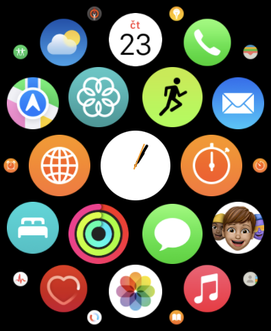
In the first case, you can access the applications by pressing the crown, in the second case, by pulling the list from the bottom edge of the display. As in the Apple Watch, the icons in Wear OS 3 are circular. However, they are not arranged in a matrix, as is the case in the basic watchOS settings, but it is a kind of list where you can always find three application icons next to each other and scroll down in it. So you should have the most used titles at the top, in the case of watchOS you have them more in the middle if you are not using the list layout.
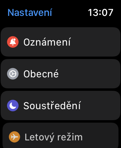
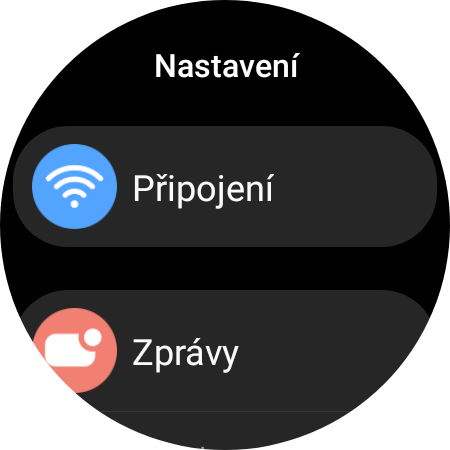
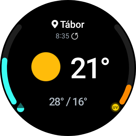
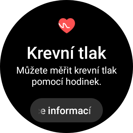
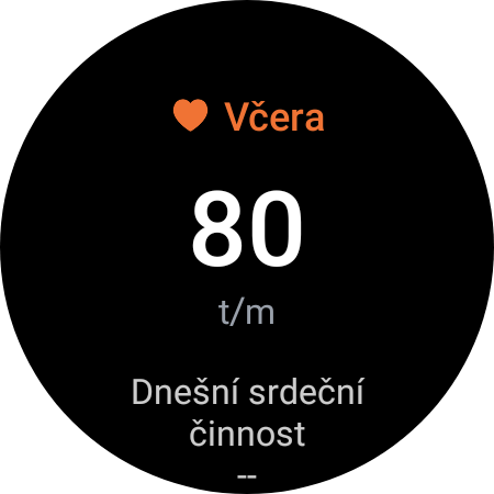
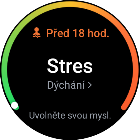
Graphically, all the menus, for example Settings, are similar. They not only look the same, but also have the same dark colored background. However, the appearance of individual applications is already slightly different. Those on the Apple Watch are of course due to the appearance of applications in iPhones, on the Galaxy Watch they refer to Galaxy phones. Samsung's smart watch and the whole of Wear OS 3 thus brings one change in particular, which is the tiles, which you can access by moving the bezel or from the right of the display. These are actually quick shortcuts to applications that you don't have to look for. At the same time, they show you the given values directly. You can not only edit these tiles, but also add more. You won't find anything similar with watchOS, you have to use watch face complications for that. But wearOS can do that too.
It could be interest you

Wear OS 3 is a great system
After using the Galaxy Watch4 Classic for a while, I have to say that the system really worked. Not even if it is more or less described by the competition. However, the tiles that it offers in addition are quite useful and it is true that people use them every day. With the Apple Watch, there are unused gestures to the right and left when you just switch between watch faces. If you only use one, it's a blind spot for you.
One more note here. Many mock Wear OS 3 for how it can display text and other rather square content on a circular display. I have to say it's totally cool. The text shrinks and expands seamlessly, whether you're reading messages or scrolling through settings. After all, Apple did the same, which reduces the text and individual interface elements at the top and bottom edges so that the content is not hidden behind the rounding.
 Adam Kos




Samsung has had the same gestures for years. The common feature of these watches is poor endurance per charge in normal use and even worse when navigating in nature. It is for this reason that they are useless to me.