When I found out a while ago that Things 3 was finally coming out, I was filled with nostalgia. Word finally is often not used quite right, but in the case of a very popular and once pioneering task manager, it fits perfectly. Developer studio Cultured Code has brought the long-awaited third version of Things to a successful conclusion, and the question here is very simple: was the wait worth it?
Things have been with us practically since Apple opened up the iOS platform to third-party developers. Already in 2008, Things became one of the leading applications for task management, gradually expanded to iPad and Mac, and dominated the field of task planners for a long time.
The reasons were simple, the developers from Cultured Code are absolutely precise, they emphasize detail, user experience, they have a sense for design and, last but not least, they are no strangers to new technologies. All of this once gave rise to Things, but the problem was that, unfortunately, the speed of development slowed down over time.
[su_youtube url=“https://youtu.be/2R6o5t0VK_A“ width=“640″]
Things 3, which came out last week, was announced several years ago, which is an unimaginably long time in the app world, and there were many users who were tired of waiting any longer. In addition, during those years, the market for task books and similar applications has become significantly saturated and competition is high. You often only get one chance.
So now, four years after Things 2, Cultured Code faced a challenging task - to justify such a long waiting time with users, which they could do, at least partially, only by making Things 3 perfect.
There is no such thing as the best to-do list
However, this is where we come to the first and biggest stumbling block, because there is no such thing as a "best taskmaster". The needs of a to-do app are different for each user, because everyone works a little differently, has different habits, and just because someone is comfortable with managing tasks in one way, it does not mean that they will be comfortable with the other.
That's why there are dozens of exercise books that differ in terms of user experience, functionality, philosophy - in short, according to current trends or what users want. I mention this well-known fact mainly because the following text about Things 3 must logically be subjective. In the following lines, however, I will try to describe my own anabasis and why I humbly returned to Things in the end. Everyone can then take their own from it.
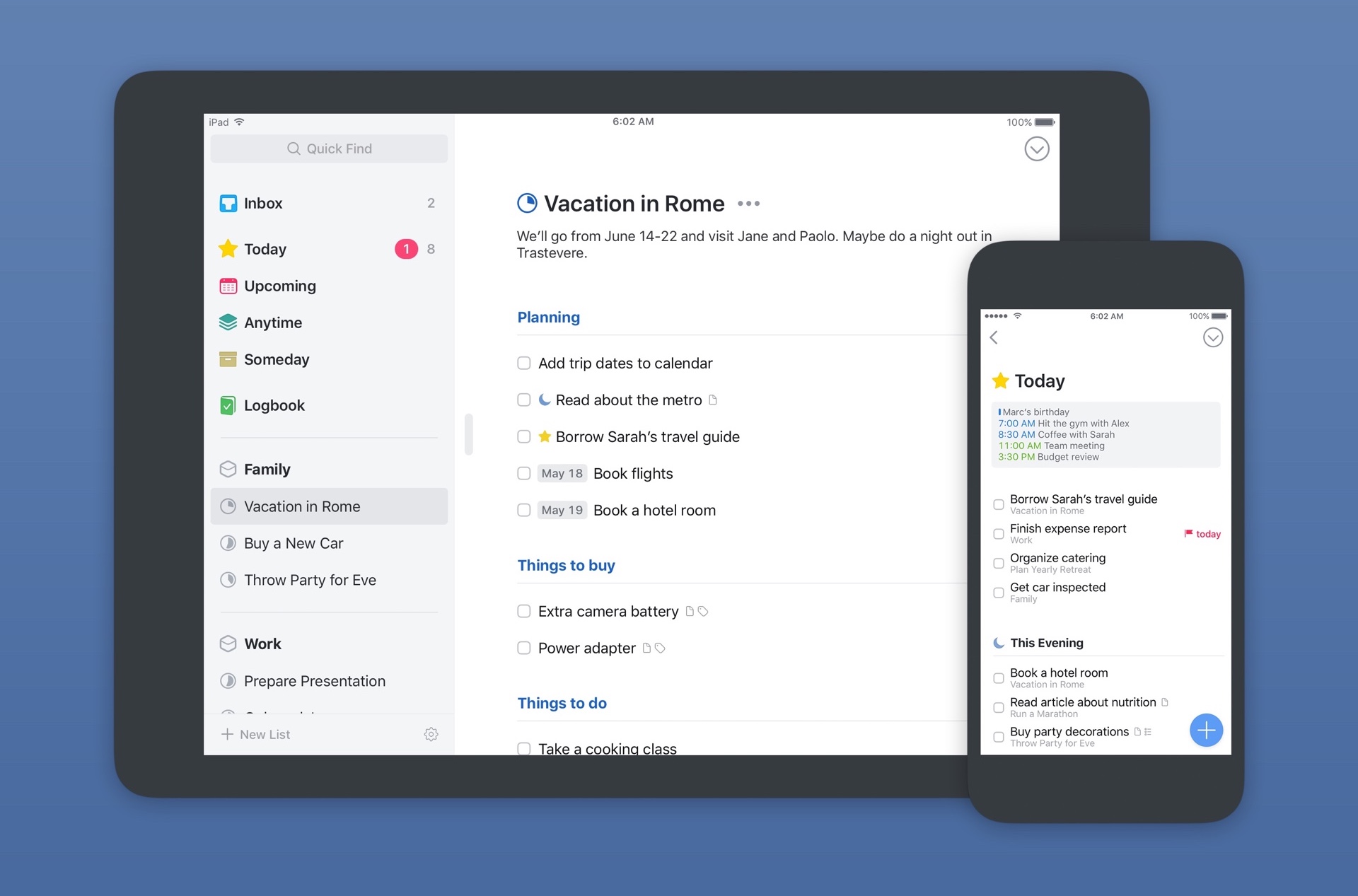
There and back again
Things used to be—like many others—my first real electronic to-do list. Back then, still on the GTD wave, I learned to manage my tasks more efficiently and over time I adopted my own mode that suited me. But I especially liked the application itself, because even if it didn't look like that at first glance, Things were, in principle, incredibly simple.
What a pleasant discovery it was when I opened the brand new Things 3 for the first time and found that practically nothing had changed in almost ten years, and I definitely mean that in a good way, because I mean the philosophy of the whole application. Of course, a lot of other things have changed.
Although I've been a long-time advocate of Cultured Code, I finally got tired of waiting for new versions a few years ago and decided to leave. After various escapades, I ended up with 2Do, which I ended up customizing very similarly to how I worked with Things, but I felt it was never quite perfect. Definitive confirmation was then given to me when I "picked up" Things again and just the new three.
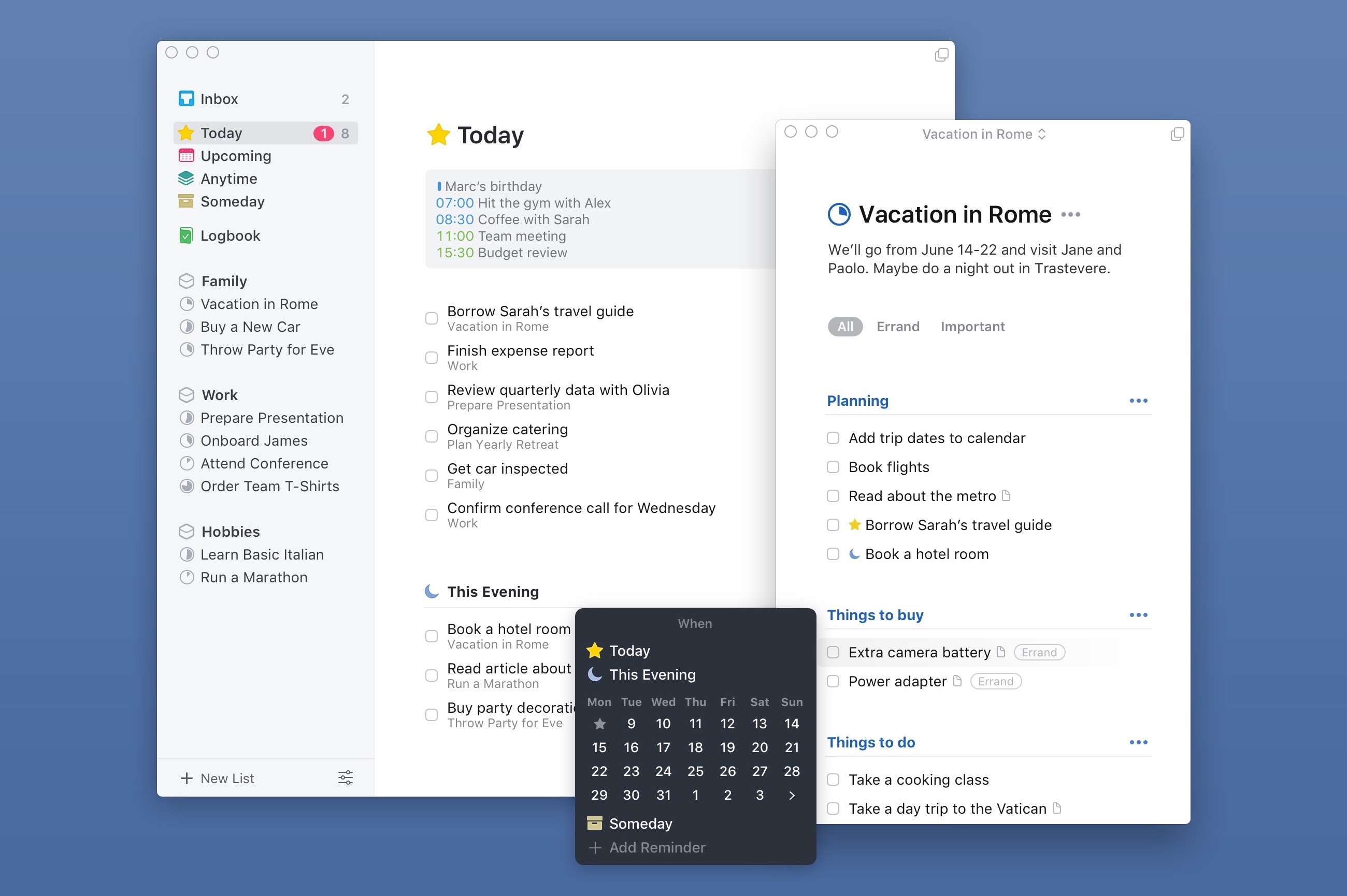
Strength is in simplicity
I generally don't need anything complicated to write down and manage tasks, no complex views, perspectives, sorting, but at the same time, I've never fully understood the system Reminders. They were too simple. As I've tested more apps over time, I've found that Things are just that much more complex than Reminders for what I need. Even the aforementioned task book 2Do was too much for me in the final.
I just sit down with Things and use them from A to Z, nothing remains, nothing is missing. It's certainly partly due to the fact that it was this app that shaped me in learning my own method of time management, if I wanted to call it that, but the most important thing in all of this now is that Things 3 is still exactly what it always was. The only difference is that it is now the most modern application for both iOS and macOS, which offers a great design with a completely fine-tuned user interface and several novelties that once again put it among the cream of the crop not only in its own field.
At first glance, Things 3 may not look simple, but once you get into their system, you will understand that the developers have really thought here. Every detail is thought out, whether it's interaction with the application as such or the task management system and their organization and fulfillment. Anyone who has ever come into contact with Things knows what we are talking about.
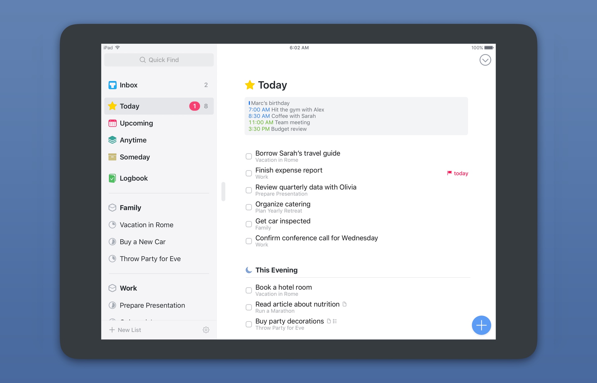
High design standard
When you look at Things 3, you must immediately be attracted by the modern and fresh design, but it is far from just for the eye. The design and overall graphic design of the application is closely related to its functioning - every button and object has its position, its color, and everything thus receives a clear order.
The largely white environment may not suit everyone, but the important thing is that the GUI for Things 3 has been developed with the utmost emphasis on making the tasks play a central role, which is ultimately what the taskmaster is all about. Tasks are complemented by various colored signs and icons, which help with orientation or draw attention to certain actions, and then there are only bolder headings, which in turn help with sorting and dividing projects or individual tasks. Getting started with creating tasks is very easy.
Although Things 3 works basically the same on iPhone, iPad and Mac, the developers have taken great care to make the most of each platform, even at the cost of some features being exclusive to just one device. As a result, the user gets real comfort, because everything is solved on each device in the simplest possible way.
It's all about tasks
What is uniform on the iPhone, iPad and Mac is the form and format of the individual tasks. They behave like classic items in the lists, but each task is actually a card, hiding all the details about the given task, which is an important insight that will help in understanding the interaction with Things 3.
Entering tasks is a key part of any to-do list, as it's one of the most common tasks you'll do throughout the day. During the day, I mainly use the Inbox, where I add tasks that come up during the day, and when I have a moment of time, I sort them further. A simple and, above all, quick entry is important to me.
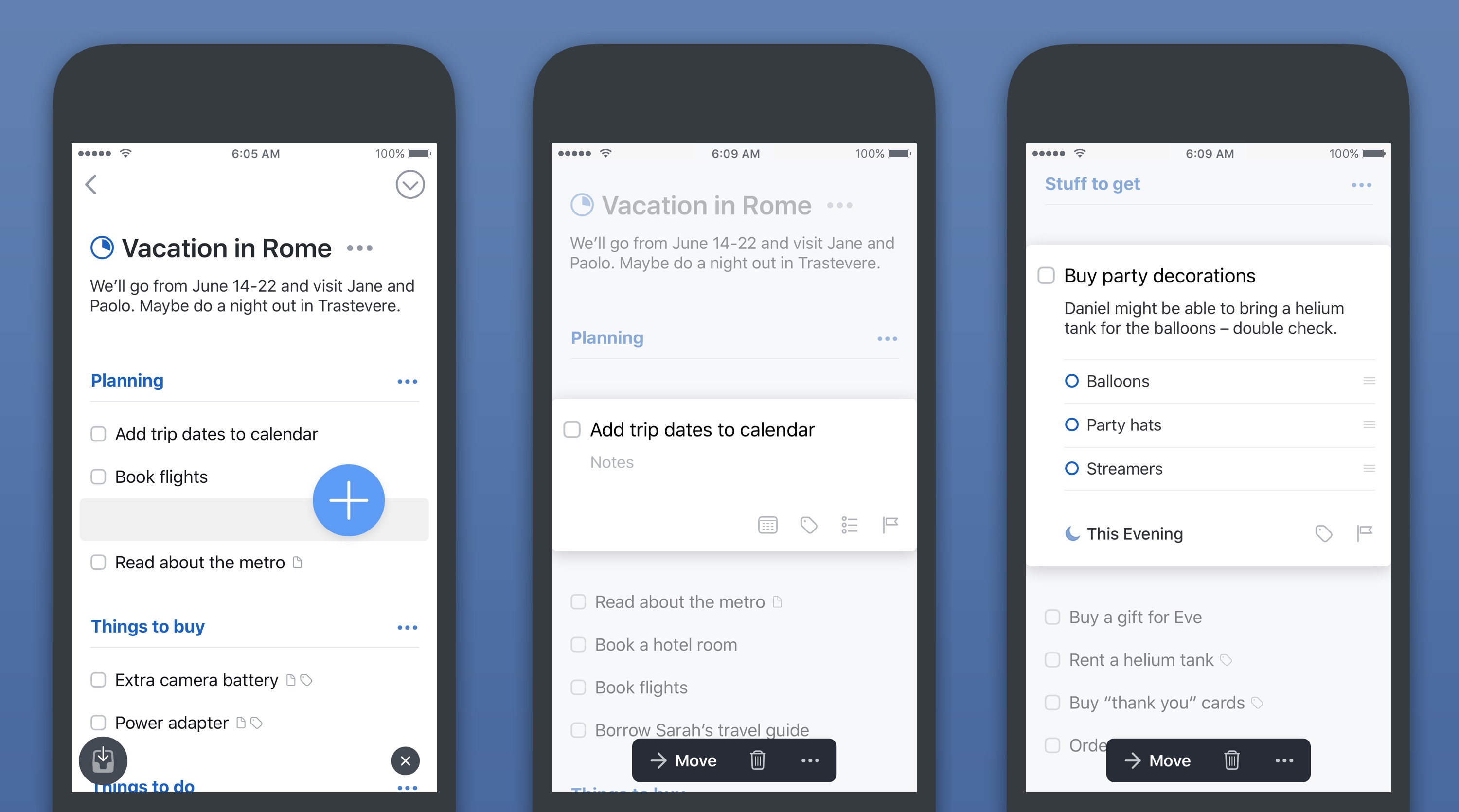
And here we come to the first differences between iOS and macOS. On iOS, developers for Things 3 developed a special button that they called the Magic Plus Button. You can always find this in the lower right corner on iPhone and iPad, and when you click on it, you get the option to create a new to-do (task), a project or an entire area. That's why this button isn't magic - the trick is that you can swipe anywhere you need with the Magic Plus Button and wherever you end up, you immediately create a new task or project.
If you currently have a list of tasks open and want to add another one, just go to the desired place with the blue button and start writing the name of the task. At that moment you are actually creating a whole new card and at the same time you can organize everything as needed. This way of entering new inputs is very addictive. You will quickly get used to not having to choose whether you want to create a project or just a task; you just go there with the magic button and Things 3 will handle it.
If you want to leave a task in the Inbox for later processing, you move the button (wherever you are in the application) to the lower left corner and immediately fill in a new card. Opening the application and clicking on some Magic Plus Button is certainly not the fastest way to create a new task. You can therefore act more quickly on the iPhone via the icon and 3D Touch or via the widget in the Notification Center, which of course can also be done on the iPad. Perhaps the fastest way is via Watch.
On the Mac, creating tasks is quite traditional, and as expected, a universal keyboard shortcut works here, allowing you to enter a new to-do wherever you are. You just press the shortcut, fill in the name and send the task to the Inbox.
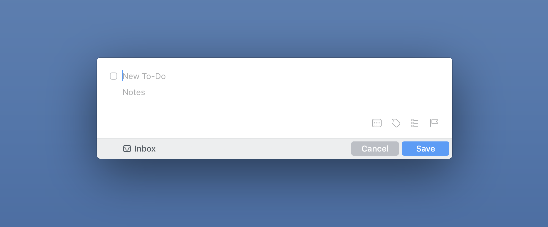
Tasks as cards
When you want to add all the necessary details to the task, open the card with the given task and fill it out. Since you don't need things like tags, lists or deadlines for every task, these matters are hidden in the card itself so that they don't distract you unnecessarily. You only fill them in when necessary, which makes them instantly visible.
You can add a text note to each task (attaching media files is not possible). If you do, a small icon will appear in the task overview for that task to remind you that you have a note for it. After all, graphic signaling always appears – when you assign a tag, start date, notification, list of subtasks or a deadline.
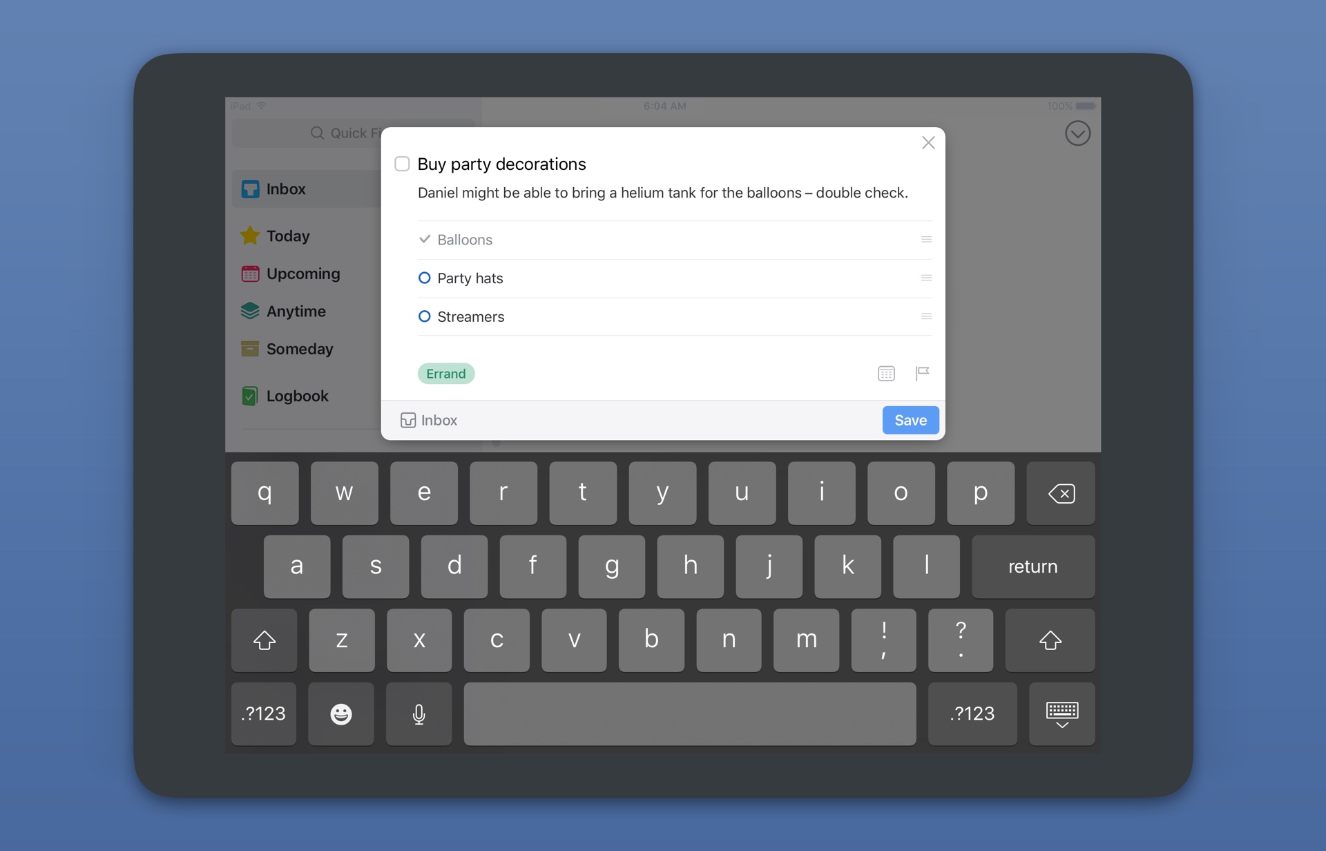
You can assign all this to each task. What is new is the notification on the selected date and time when you receive the notification. Now standard, but Things 2 couldn't do it. However, Things 3 cannot, for example, remind you of a task based on location, compared to system Reminders. Also interesting is the list of subtasks that you easily create within the notes for the main task and then cross them off until you have completed the task as a whole.
The division into start and end dates is also key to task management in Things 3. A start date means that a task appears in the Today tab on that day and sits there until you complete it. However, if you also add a deadline to the task, the application will also notify you by when this action must be completed. Do you need more days to complete the task? Set your start date a few days before you need to submit.
Graphics play a role here again. Every task that has been scheduled for today, has a yellow star (like the Today tab). The deadline, which tends to be more important, has a red mark with a flag. In the overview of tasks, you can clearly see which tasks have priority, etc. This brings us to the last essential part of Things 3 – the organization of tasks.
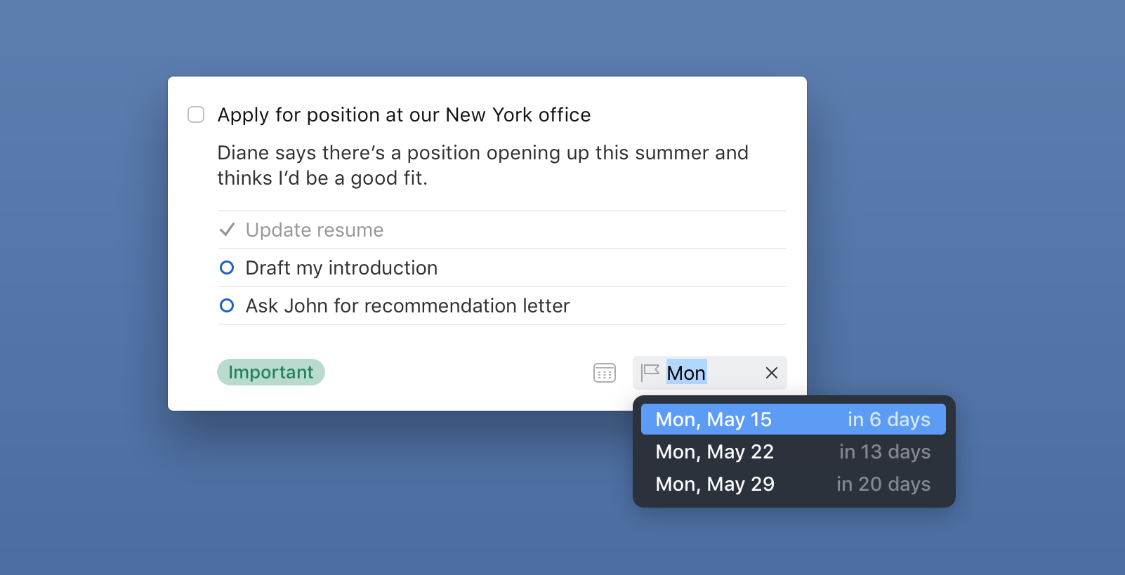
However, I still have to briefly return to creating new to-dos. It's a little disappointing that Things 3 doesn't understand (like the Fantastical calendar for example) natural language, so you can't create a task by typing in a single line, e.g. "Take out the bin tommorow at 15:00 tag Household" and the task will be created straight away " Take out the basket" with filling tomorrow and a notification at three o'clock in the afternoon, complete with the tag "Household". Nevertheless, at Cultured Code, they tried to make input as simple as possible. A similar natural insertion thus works at least in the calendar, where you only need to write the relevant day/date and by adding a specific time you will immediately create a notification.
Organization as streamlining of administration
I already described the Inbox above as a universal mailbox for all tasks, from where it is then sorted and sorted. And this is of course also important in Things 3 and again very well thought out. The developers took everything good from the previous versions and tweaked the whole experience to make the organization of tasks both more logical and efficient.
That's why in Things 3 we find three big categories: Areas, Projects and then the tasks themselves. It is the difference between areas and projects that was not completely clear in Things before, which has now changed - this means not only easier understanding of the concept, but also more convenient use of it. Areas are bold and clearly superior to projects, which can stand on their own or just below individual areas.
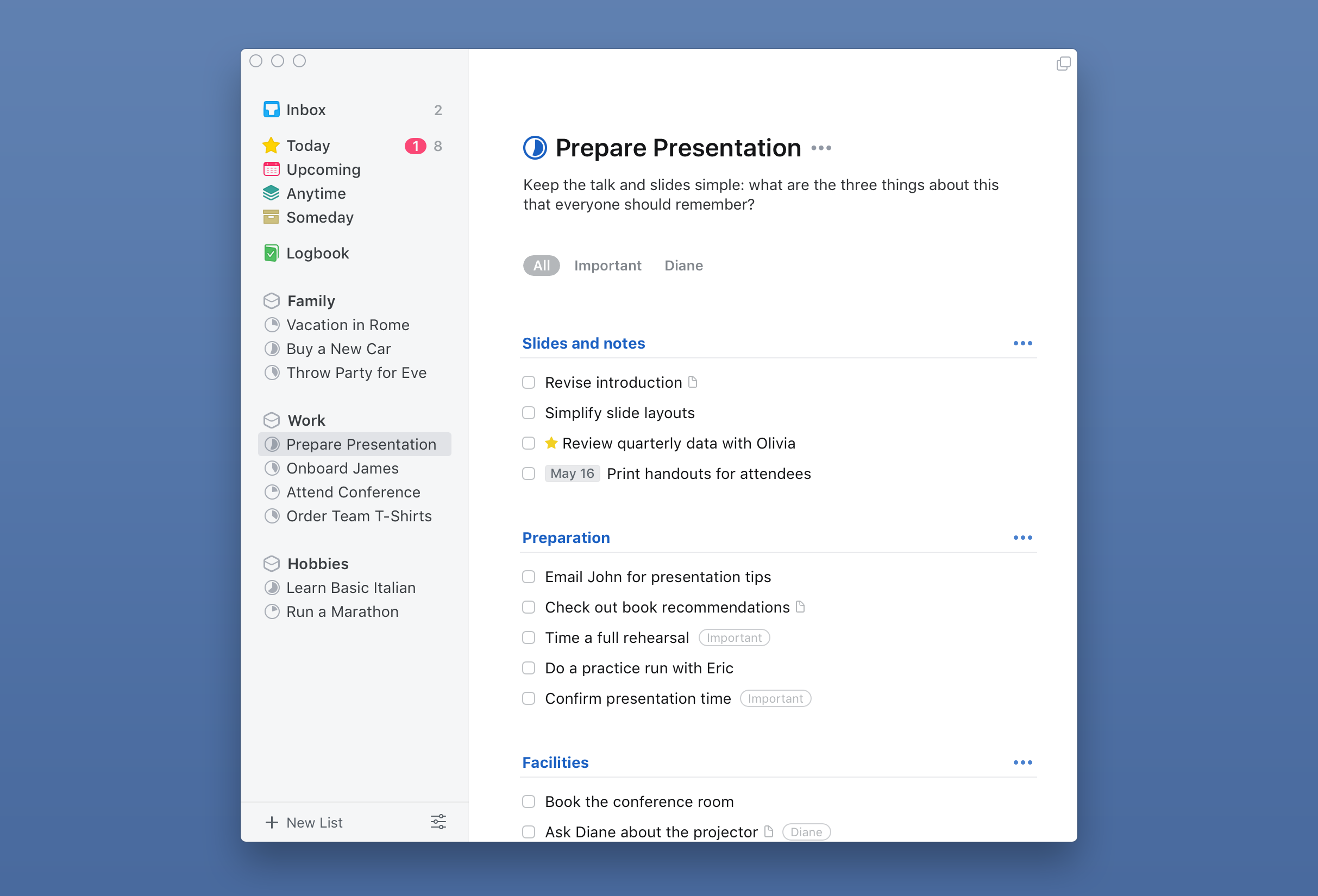
As examples of areas, you can imagine Work, Family or Household, under which both individual tasks and entire projects can be hidden. Maybe it sounds more complicated than it really is, but again, it takes a moment and you will quickly understand everything.
When you then open an area, you will find a list of projects under it, followed by a list of separate tasks without a deadline and below them tasks with a deadline. For each project, you can see how many tasks are hidden in it, and the filled circle graphically indicates how many of them have been completed.
You can arbitrarily regroup tasks and projects within areas, as well as tasks under projects, not only at a given location, but also arbitrarily between each other. On Mac, you can use the sidebar for this, where you have all the areas and projects clearly listed. On iOS, you either grab the selected task/project and drag it, or swipe it from left to right, check marks appear and you can move any number of tasks/projects, set deadlines for them, or delete them. You can also quickly select a deadline for a task on your iPhone or iPad by swiping your finger to the other side, i.e. from left to right.
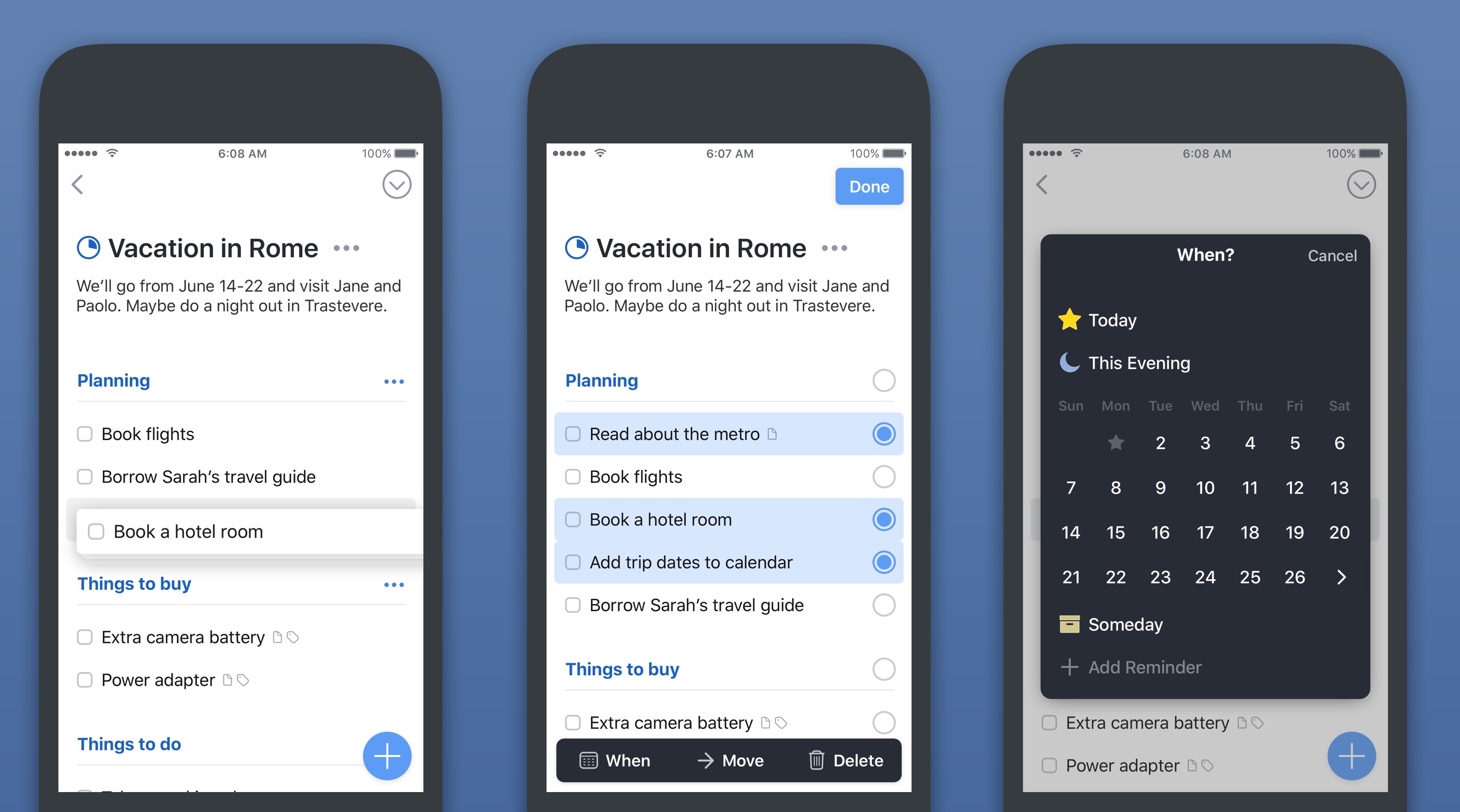
On iOS, you can use the mentioned Magic Plus Button in each such list (area, project), depending on what you need to create and where. In addition, it is not only about new projects or tasks, but also about headings, which is another handy novelty in Things 3. Since individual areas, as well as larger projects, can swell very easily, in Things 3 you have the option to break everything down with headings. Everyone can use them in a different style, but this is another distinguishing graphic element that does not disturb, but adds order.
But not to forget to mention the very basic organization in Things 3, which has undergone a slight evolution, again for the better. The Inbox is followed by the Today tab, where all current tasks are located. New is the Upcoming tab, in which you have a detailed view of tasks in the following week, including recurring ones, and then a certain summary for the more distant future. However, what I find to be one of the most useful new features in Things 3 is the ability to integrate your calendar into it.
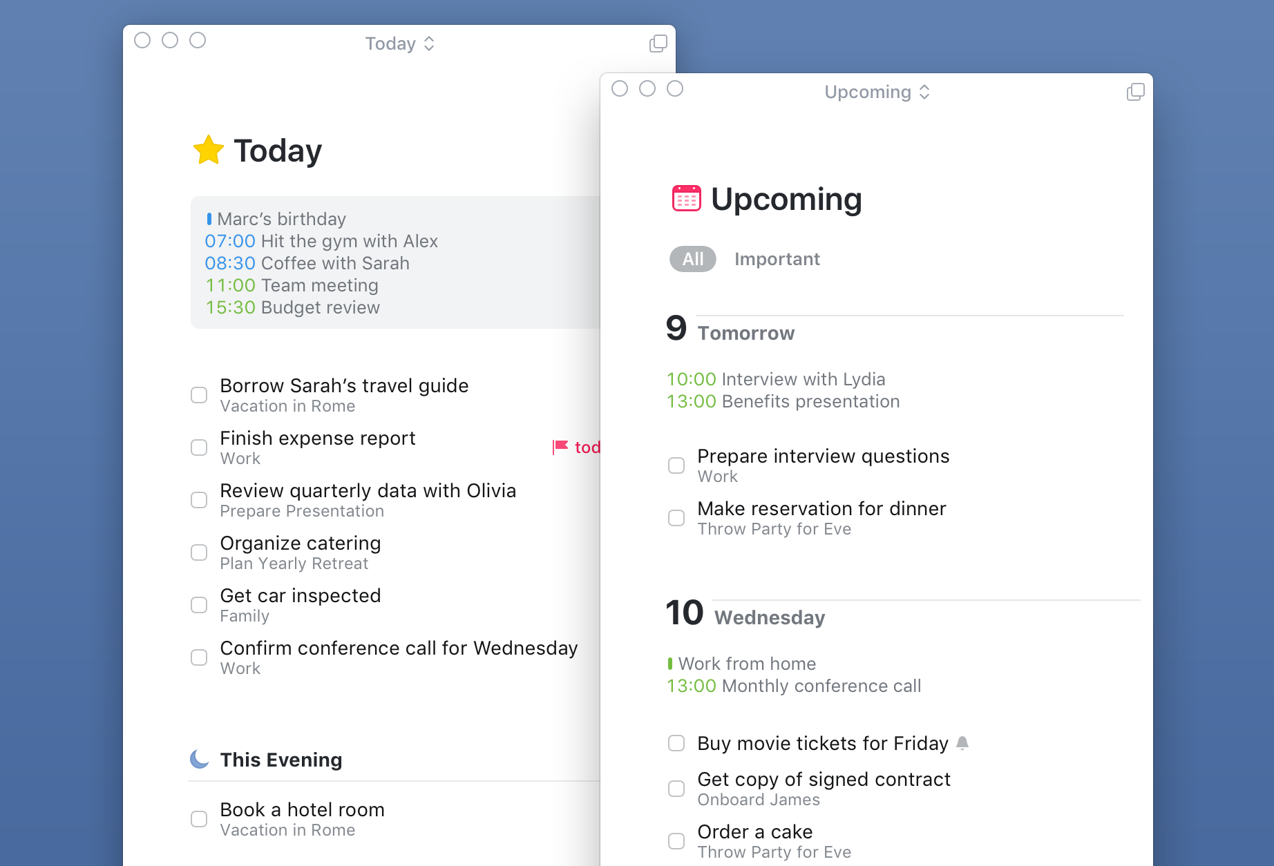
In practice, this means that you can always see your events from the calendar in the Upcoming and Today tabs, so you don't necessarily have to look at the calendar when planning if you don't have something. This makes planning a little easier and I quickly got used to it. In addition, when organizing your day, you have the option in Things 3 to schedule a task until the evening, thus separating it from the rest. Another graphic aid for greater efficiency, which the new Things are really full of.
In the Anytime tab, you will find all the tasks that do not have a due date, except for those that you place in the Someday tab. There tend to be tasks that have a very low priority, they can be, for example, some long-term goals, etc. There are more uses.
In conclusion, we should mention one more new feature in Things 3, which makes a lot of sense to me and I learned to use it again very quickly. Universal search works within the application, when on iOS you just need to pull down the screen anywhere and a search box will pop up. Things 3 searches across the entire database, so you can quickly get to areas or directly to specific tasks. On a Mac, everything is even easier because you don't have to press anything, you just have to start typing what you're looking for.
Personal manager only
From the above it follows indirectly that this is an essential thing – Things 3 are built for personal use. It's a to-do list that you won't use for teamwork, you won't access it via the web, and you're reliant on its own cloud-based sync solution (which is one of the best in the business, though). These are the facts and nothing will change in the future.
It all again depends on the preferences and needs of each user. Someone needs a task list with certain overviews, while others cannot do without the possibility of sharing tasks with colleagues. Things have a clear profile and the development studio Cultured Code does not compromise. There are many features that users have been calling for over the years but didn't get there because it fell outside the Things philosophy or simply couldn't be implemented for various reasons.
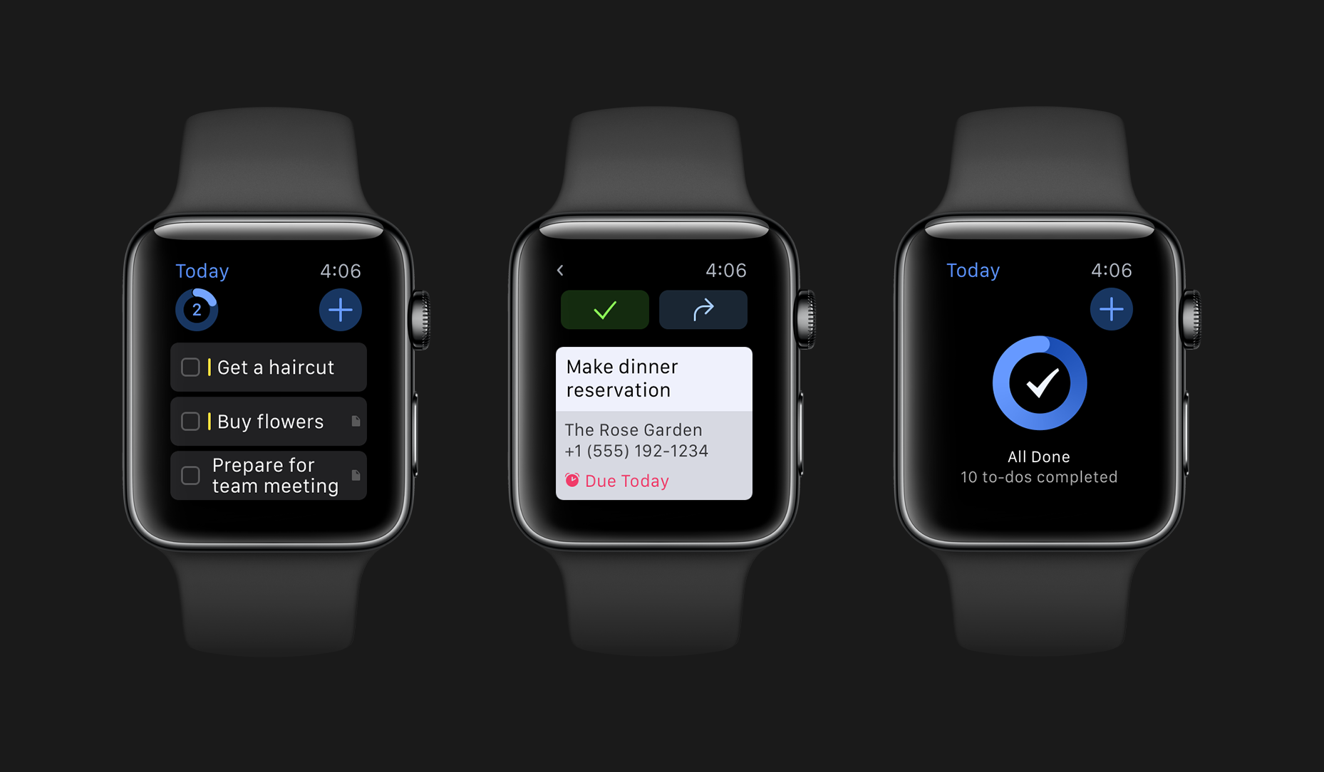
As I posted at the beginning, my rating must be at least partially subjective, but I still consider Things 3 to be one of the best apps for Apple platforms. And now I don't mean the best task manager, but the application as such - its design, functionality, modernity and the fact that it is at home on any platform, whether it is iPhone, iPad, Mac or Watch.
There is no point in shaking your head over how it is possible that such an application nowadays cannot, for example, work in a team. He can't because he doesn't want to. And that's why there are so many other and varied alternatives for those who need something similar. Things 3 is a personal to-do list for iPhone, iPad, Mac and Watch. Dot.
Those who appreciate Things 3 don't mind the price
Which brings us to the last one, which has become quite an important topic and therefore the target of criticism, and that is the price. Cultured Code bet on a traditional, proven model and sells Things 3 at the same price as Things 2: currently with a 20% discount (lasting until June 1) for 6 crowns for iPhone, 249 crowns for iPad and 479 crowns for Mac. In total, a package of new Things 1 can cost you up to almost two thousand crowns. Is it too much?
Many users immediately respond to this question: yes! And yes, Things 3 is certainly not cheap, especially as a whole package, but Things have never been cheap, and no one could have expected that Cultured Code would come up with apps for nothing. A job well done has always been rewarded, and this is clearly the case here.
It's definitely not the case that the developers thought it wouldn't be bad to turn their loyal customers for some money once in a while, and that's why they have to pay again for a new update. Things 3 is an update, but in its essence it is really a completely new application, on which the developers have been working hard for more than five years.
It's not sustainable that they've only talked about money once or twice in the nearly ten years that Things have been around. Which, of course, is not only true of Cultured Code, but of all other developers and applications. And that's why subscription is becoming more and more popular and it's perhaps a shame that Things didn't switch to him as well. Psychologically, it would be easier for some users to pay a monthly fee than to suddenly invest a few thousand crowns.
But that's not the point after all. This lies in the fact that you will use Things 3 as a to-do list on a daily basis, it will be your irreplaceable helper in organizing your day and managing tasks, and simply cannot do without it. Is roughly 170 crowns a month too much for such a service? I don't think so. If Things 3 fits you like I do, it's a definite investment. Similar to how I pay for Spotify or mobile internet.
And I just add that you only pay the 170 crowns a month for one year. It is assumed that you will use Things 3 for at least five years. Then you ride for free for four years, or for 8 crowns a month. A one-time price broken down like this might not sound so crazy anymore, right? And maybe even better than any subscription you'd pay forever.
For me, Things 3 is a very simple investment because it will pay back many times over. There are few applications that I can use as much as Things, which I described above, and if some of you can find yourself in my words, I believe that you will feel the same way about it. Whether you end up buying Things 3 or not. After all, the rankings in the App Store show that the price may not even be such a big issue after all...
[appbox app store 904237743]
[appbox app store 904244226]
[appbox app store 904280696]
The application has a great design. No doubt about it. And by design I don't just mean looks. However, unfortunately, as the article says - only a personal task manager with its own sync platform and not yet cross-platform - these are the things that make it unusable for many users. Btw. writing to Fantastical on the iPhone is something that one may not be able to leave. I always enjoy it a lot when I see my colleagues putting tasks and events in boxes at meetings, and I already have my iPhone in my pocket with the tasks written down. The creators of Things should definitely integrate this. It increases the usability of applications by one hundred percent.
He was still waiting for nova Things. For now, I write everything in Fantastical. But those are separate tasks. I was looking for something for long-term tasks and also thematically divided. So I downloaded the demo on Mac and bought Things for Iphone. Well, now the experience. I don't really like it design-wise, but I was ready to get used to it. I was also struck that it syncs with some sort of Things account, I would expect to use iCloud (or I didn't figure that out). Although there is a display of data from the calendar, it is only a display, I would expect the calendar to be integrated into the application. Subsequently, I turned on import reminders and I shouldn't have done that. Everything disappeared from my comments without any warning, I've never experienced that before. Reminders was imported, but incorrectly. There was only text. The date was wrong, the repeat date, ... luckily I restored everything from the backup via iCloud. Otherwise, writing a task in it would probably be very tedious. The date, project,... I'm used to writing everything in one line from fantastical. I ended up deleting it and requesting a refund from Apple.
So maybe someone will like it, unfortunately it's not satisfactory for me.
Does it have an API?
It doesn't have.
I've been using Things for years, first Things 1, then Things 2, both on Mac, iPad and iPhone. Things are simply amazing and the combination of complexity and simplicity is already legendary. Things 3 got me excited at first, it looks amazing, but considering that it doesn't offer me much more than Things 2 (the principles of GTD are permanent) and it only builds on trendy things like "magic button" etc. that I need in my very complex projects they won't help anyway (e.g. the display of events in the calendar is not as good as it seems), so I continue to look for reasons for handing over almost two thousand crowns and I don't find many. And it doesn't make sense to pay this money just for a great graphic design.
So I don't see much improvement there, because of which it would be worth paying for the whole app again
” is why subscriptions are becoming more and more popular, and it's perhaps a shame that Things didn't switch to it as well. Psychologically, it would be easier for some users to pay a monthly fee than to suddenly invest a few thousand crowns."
Are you really serious? Is subscription becoming more popular? Who? They won't really be users.