Of course, we cannot take the situation regarding the coronavirus and the disease COVID-19 lightly. However, this situation is definitely not as serious as the media reports. In such cases, it is quite common for the media to try to promote such information to simply scare people. In these cases, it is better to turn off the media completely and start looking for information individually. In the final, you can see that the situation definitely cannot be compared with, for example, the classic flu or with a much more serious cancer. Everywhere you can only see how many people have been infected for the entire time and how many people have already died, but you can rarely follow information about those who have been cured or those who are currently infected in the media and on the web.
It could be interest you
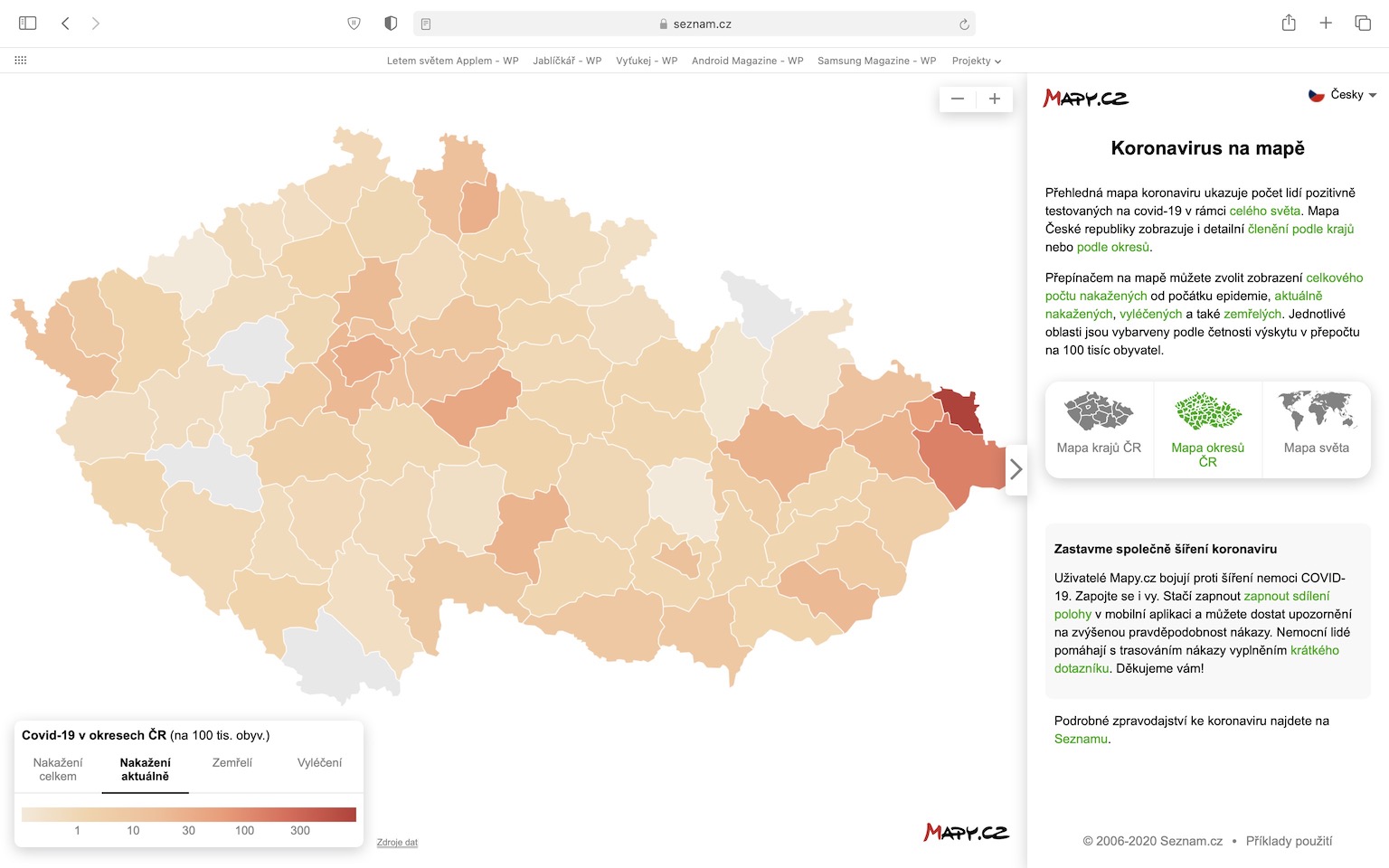
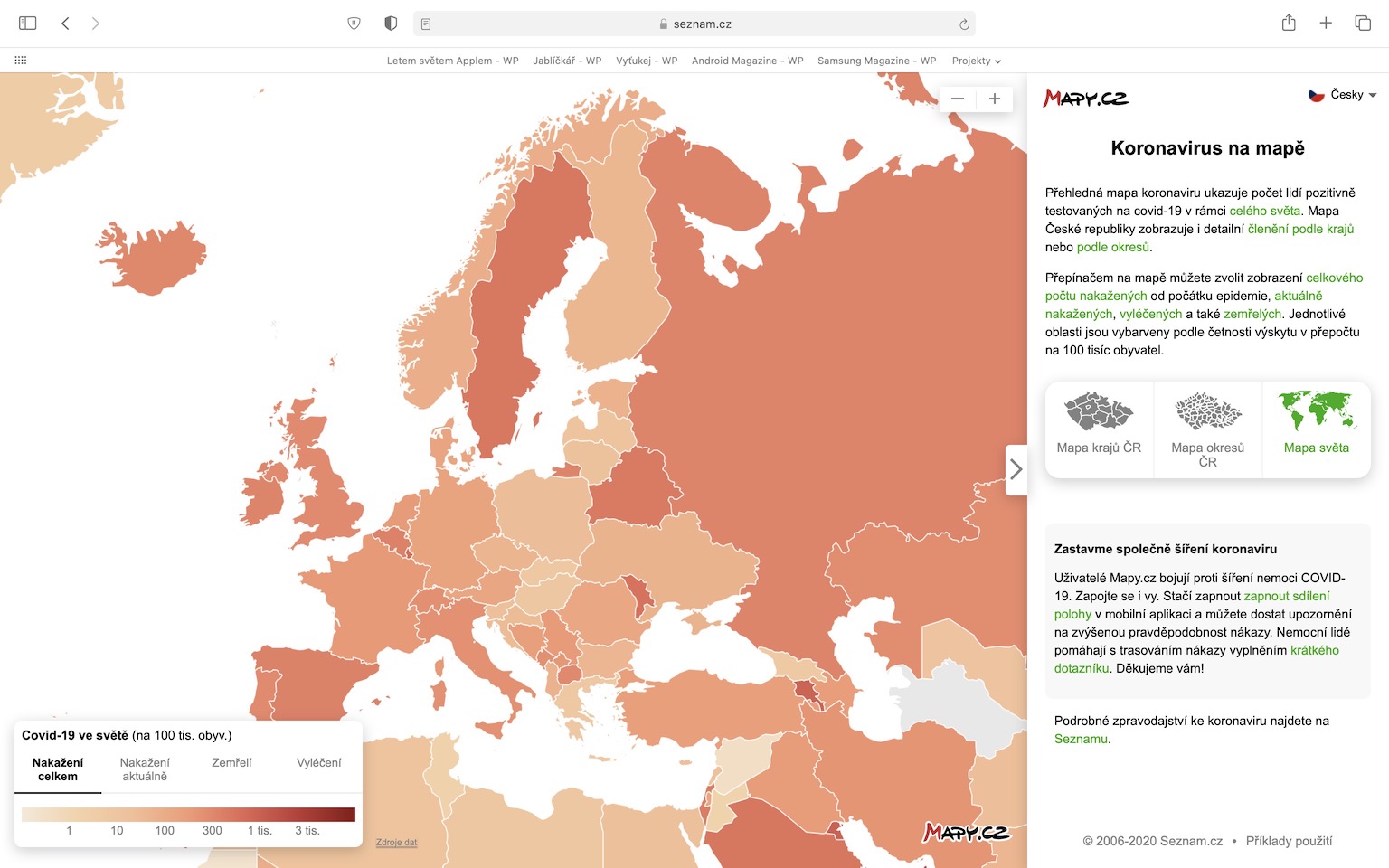
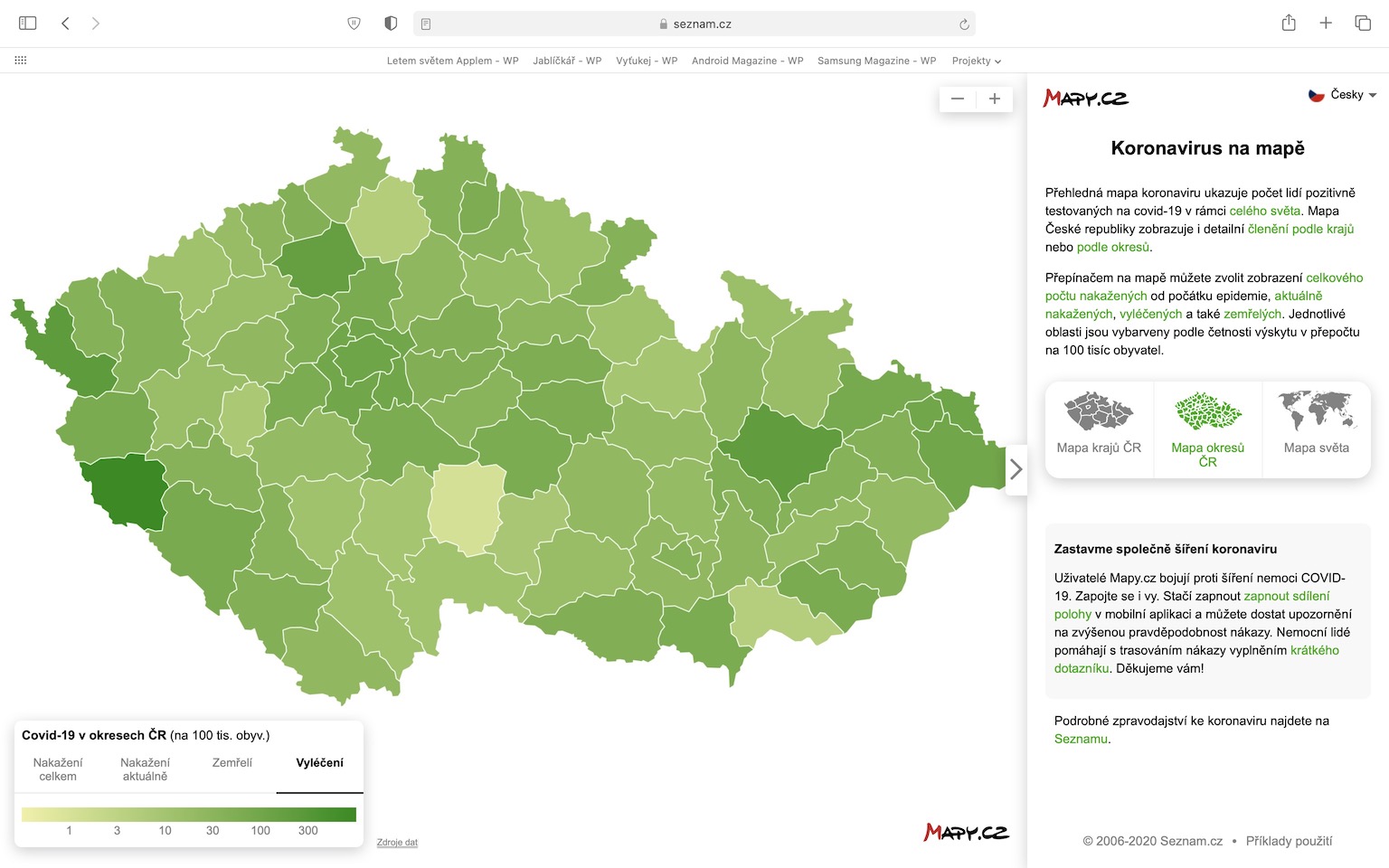
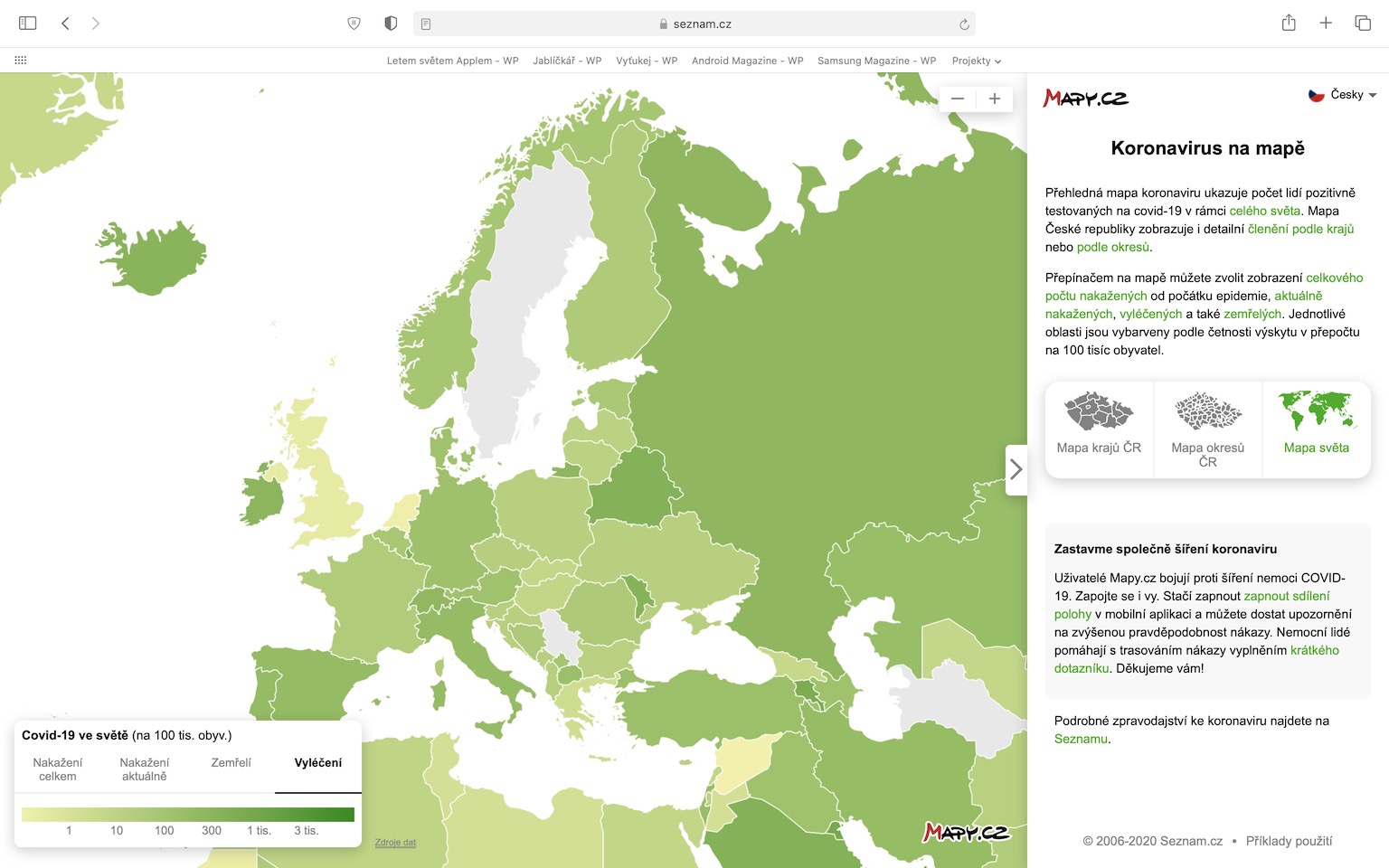
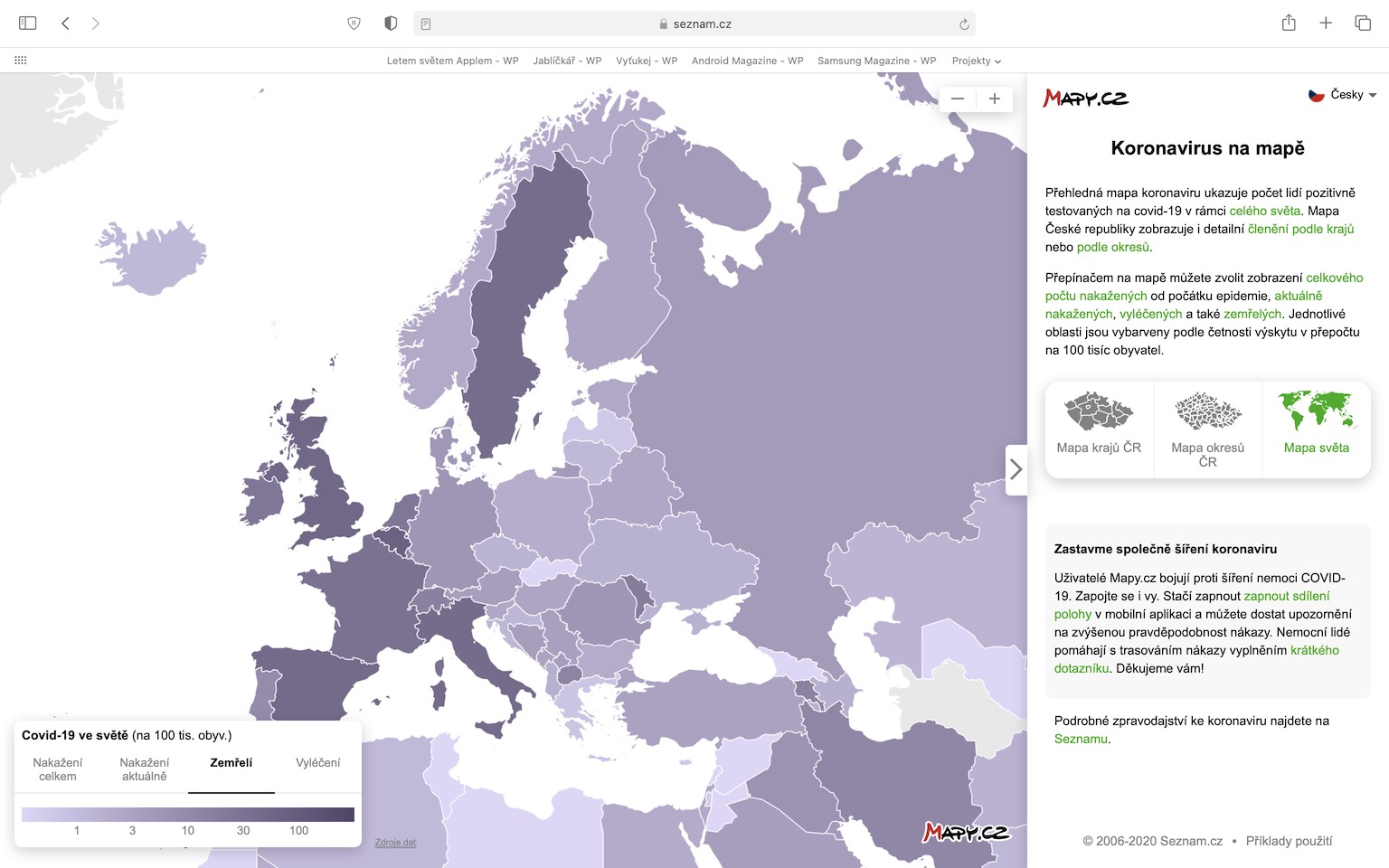
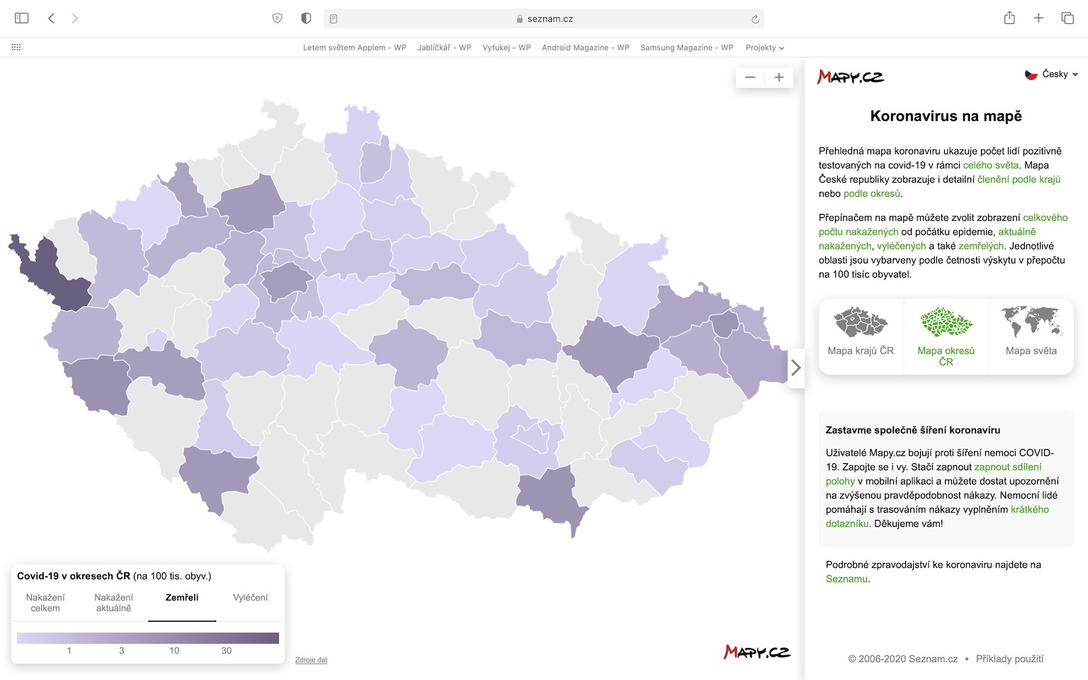
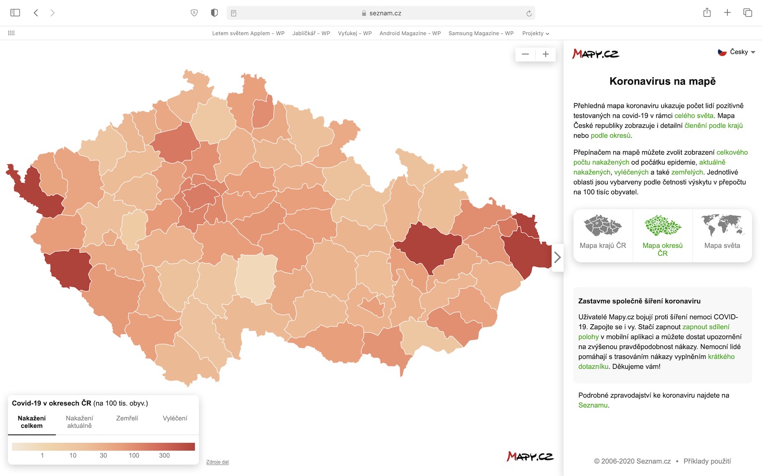
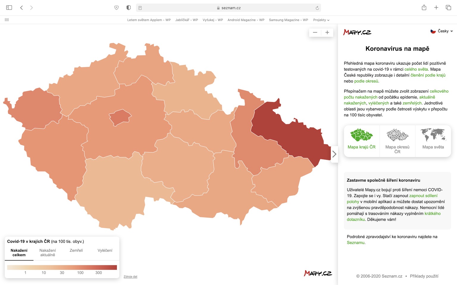
There are several different maps available on the Internet that can inform you about the numbers related to the coronavirus. But as I already mentioned, these maps cannot be considered completely relevant, as they often show the number of people infected since the outbreak of the pandemic - this number, of course, will never decrease, but will only "spookily" grow. It is simply important to account for people who have already recovered from the infection cured and who are infected currently. If you also want to get relevant and unbiased information, I have great news for you. One such map with correct data was created by Seznam. The map is very easy to use and you will find detailed information from the Czech Republic, but also from the world.
If the site coronavirus maps from Seznam If you move it, you will see a map of the world, which is divided into individual countries. After hovering the mouse over an individual state, you can display the number of infected people together with the average number of infected people per 100 inhabitants, you can also display currently infected, which is the already mentioned relevant data, then the number of deaths and finally the number cured, which also needs to be mentioned. In the right part of the screen, you can then switch directly to the Czech Republic, where the division by is available regions or directly according to districts. The display of the data is absolutely identical in this case. You can still switch the display in the lower left corner coloring maps, according to overall infected, currently infected, deceased and cured. Last but not least, at the bottom right you can read how Seznam is trying to defend itself against the spread of the COVID-19 disease. So, if you want to view the relevant and undistorted information that is not intended to cause panic, then the mentioned map from Seznam is the right thing to do.
 Flying around the world with Apple

What does this have to do with Apple? Wouldn't it be better to put the Covid operation to rest? It was never interesting, now it's just annoying and pointless.
What to unite at least in those maps. As for the map, the numbers are different.
May I ask where your data doesn't fit? For the Czech Republic, we take data 1:1 from an official source, i.e. from the publicly accessible API of the Ministry of Health. At the same time, we alert the UZIS representative if we find any discrepancy somewhere.