At the beginning of September, Apple presented us with a load of expected September news. Specifically, we saw the new iPhone 14 series, Apple Watch Series 8, Apple Watch SE, Apple Watch Ultra and AirPods Pro of the 2nd generation. So Apple has definitely not been lazy, on the contrary – it has boasted quite a few great haircuts, which are also characterized by breathtaking novelties. Undoubtedly, the iPhone 14 Pro (Max) attracts the most attention. They finally got rid of the long-criticized cut-out, which was replaced by a novelty called Dynamic Island, which attracted the attention of the giant practically the whole world.
It could be interest you
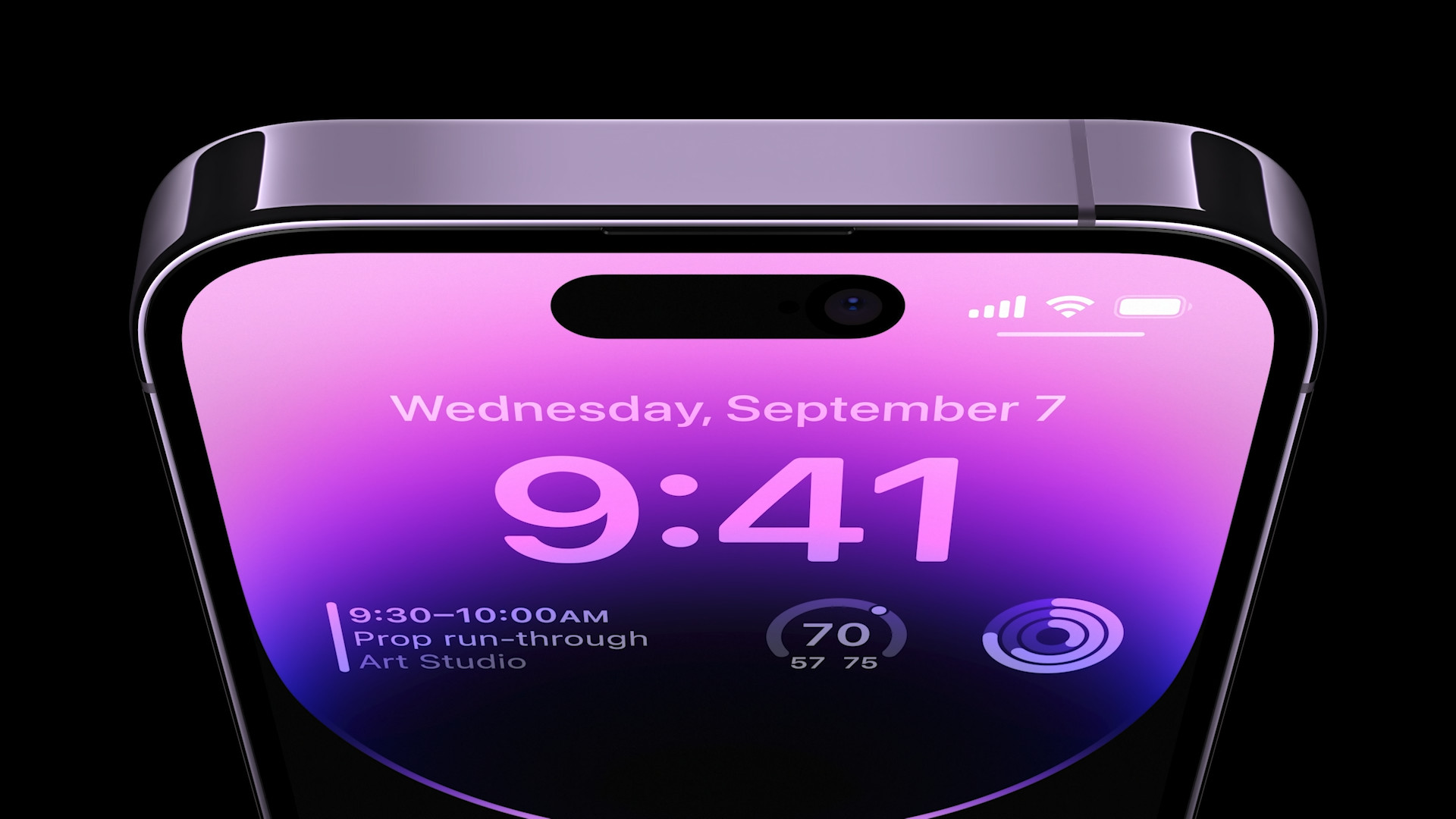
In short, the new iPhones have improved tremendously. Well, at least partially. The basic iPhone 14 and iPhone 14 Plus models do not offer so many new features compared to the previous generation – they only received minor changes. But this no longer applies to the aforementioned Pro models. In addition to Dynamic Island, the new 48 Mpx camera, the new Apple A16 Bionic chipset, Always-on display, better lenses and many other changes also applied for the floor. It is therefore not surprising that the iPhone 14 Pro is rolling in sales, while the basic models are no longer so successful. But the new series is also accompanied by one negative feature, which is pointed out by the users themselves.
The color in the photos does not correspond to reality
Several Apple users have already drawn attention to a rather interesting fact – the real appearance of iPhones is increasingly different from product photos. Specifically, we are talking about the color design, which may not always fully meet the expectations of users. Of course, it is necessary to realize that it also strongly depends on where you are actually looking at the product photo, and where you are looking at the iPhone itself. An extremely important role is played by the display and its rendering of colors. For example, older monitors may not give you such quality, which is also reflected in the rendered content. If we add to this, for example, TrueTone or other color correction software, then it is clear that you will probably not see a completely realistic image.
On the contrary, when you look at new iPhones in a store, for example, you have to take into account that you are looking at them under artificial light, which again can affect the overall perception. However, in such a case, the differences in the vast majority of cases are minimal and you will hardly notice any differences. But this may not apply to everyone. As we mentioned above, especially with this year's range, more and more apple growers are complaining about this particular problem, where the colors in the product photos are moving away from reality.
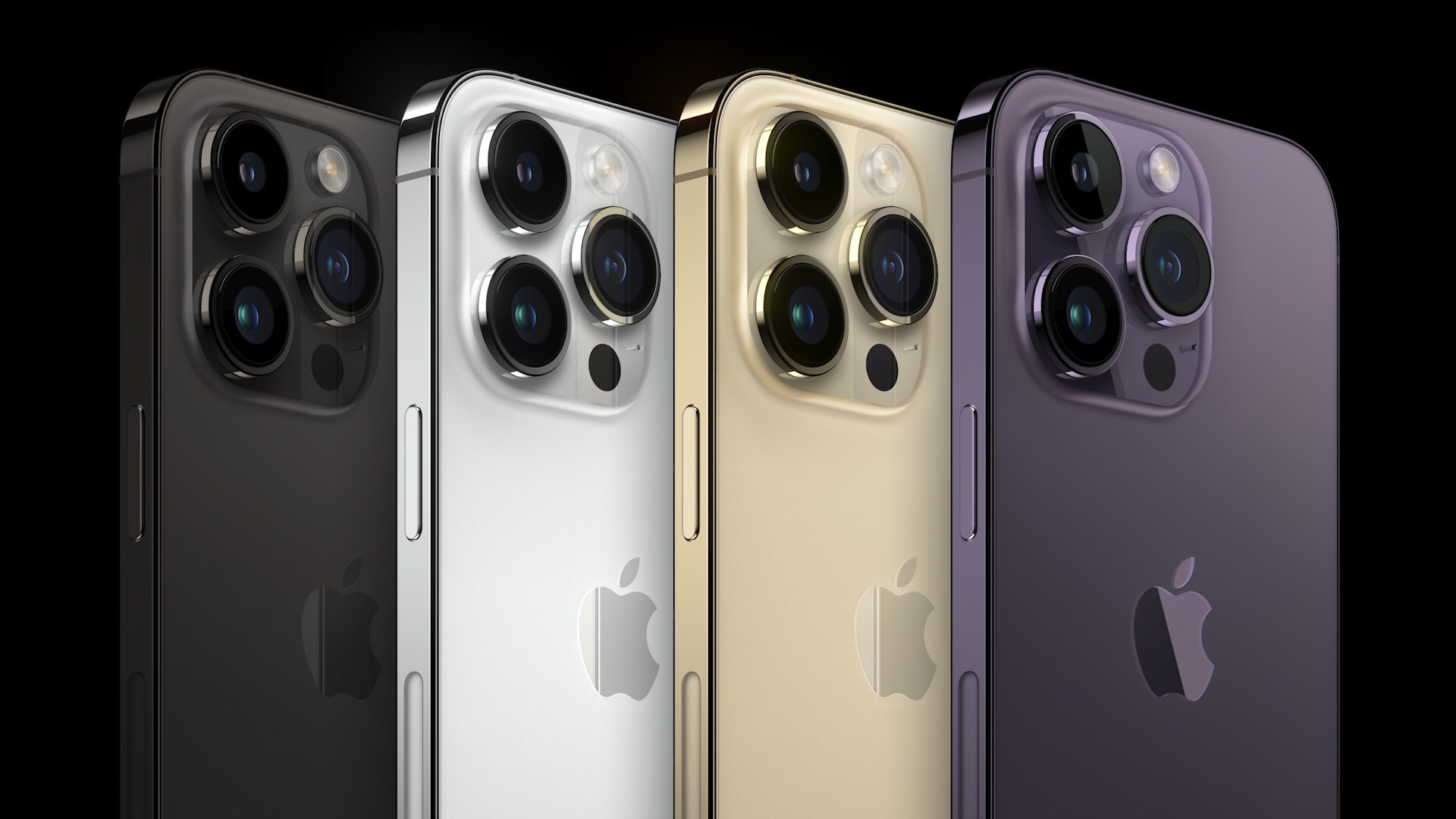
iPhone 14 Pro in dark purple
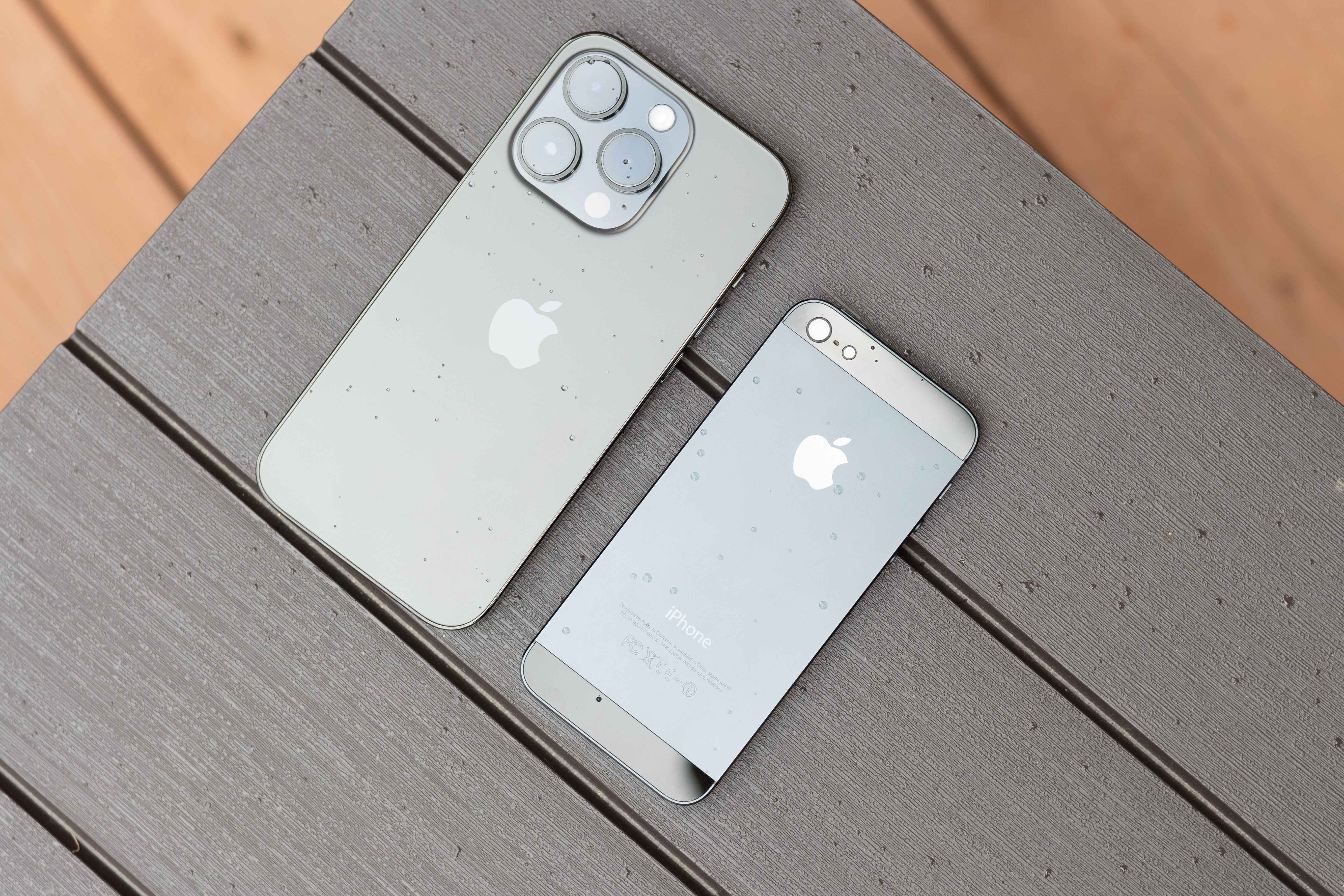
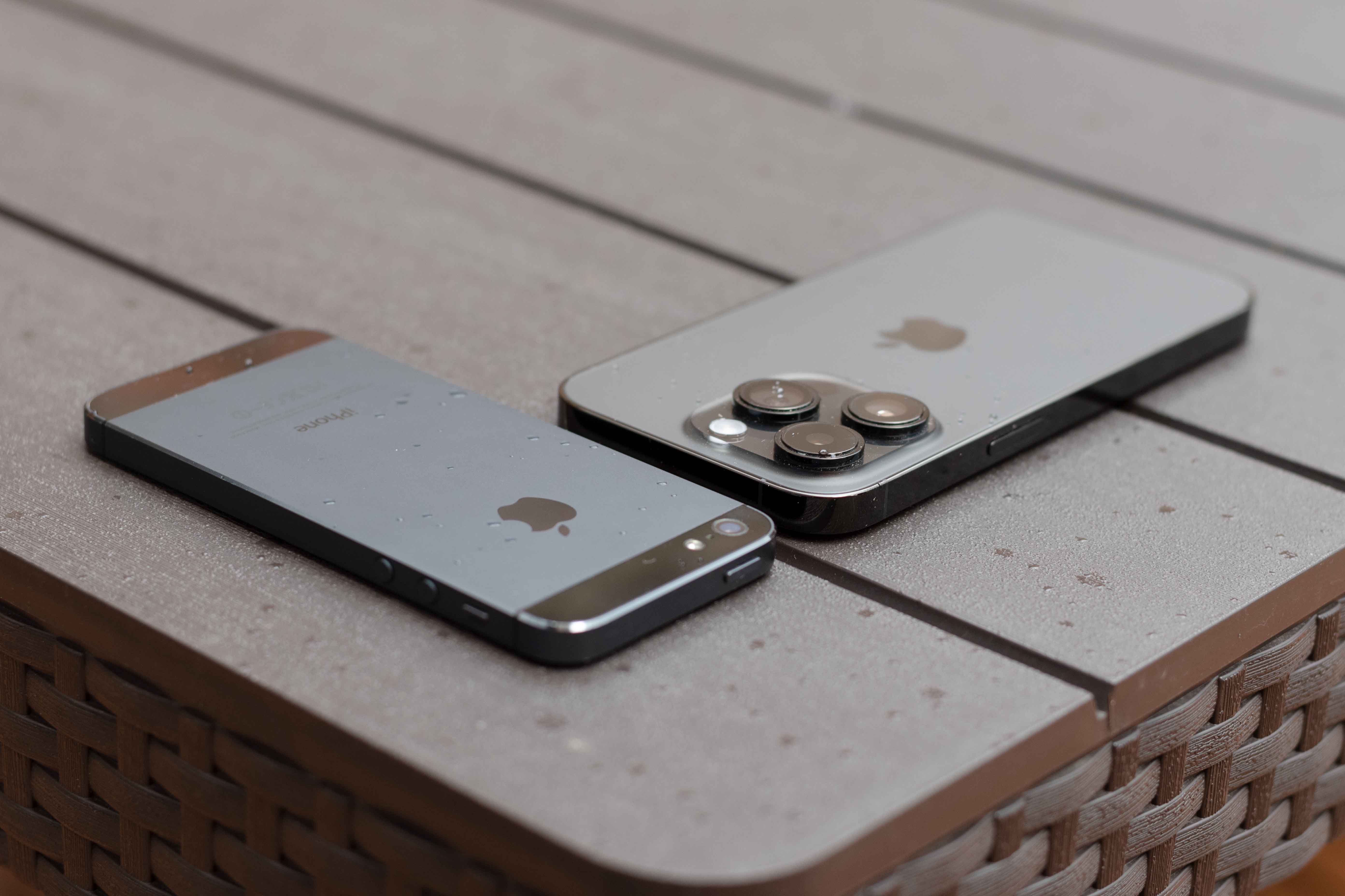
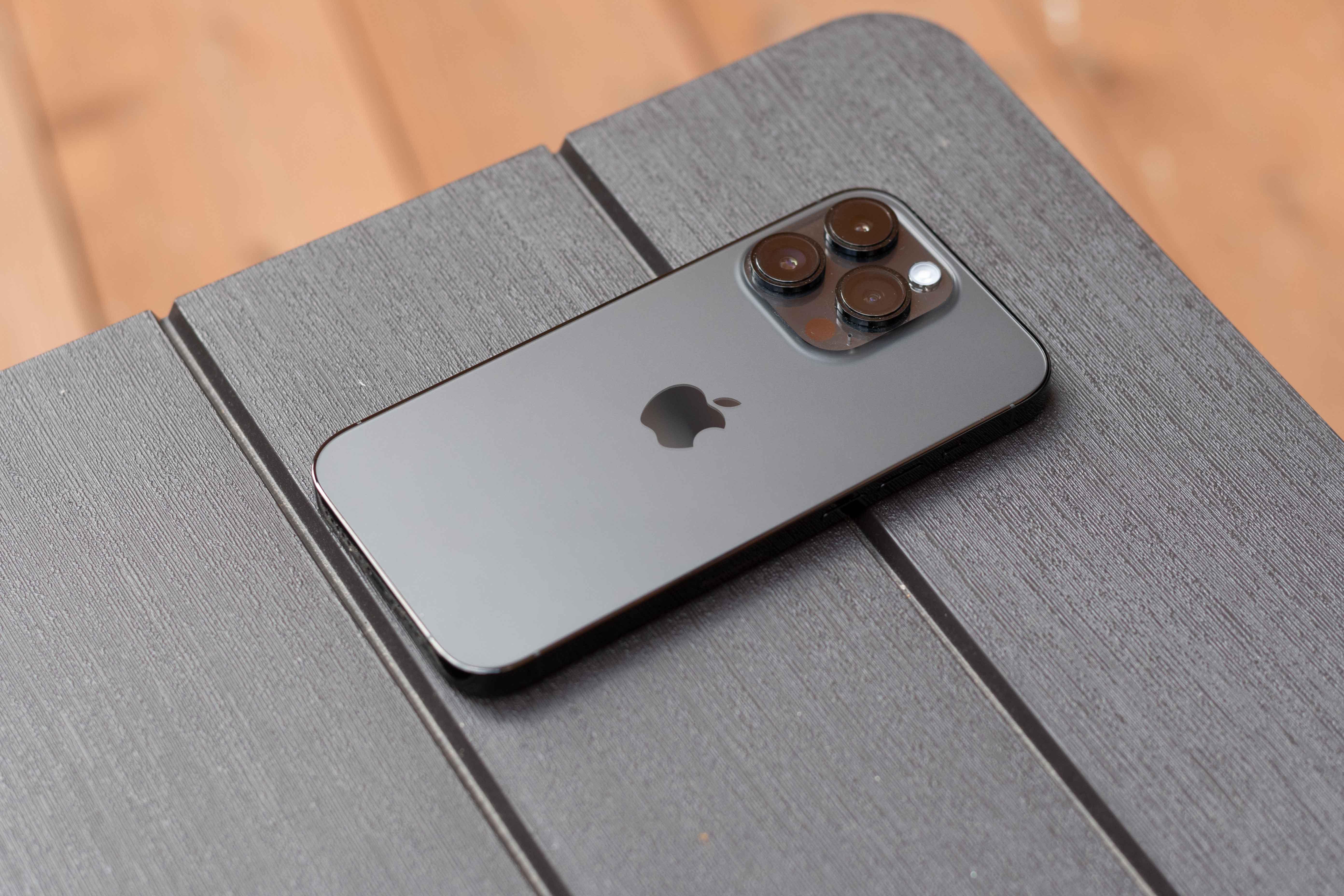
Users of iPhone 14 Pro (Max) in deep purple (deep purple) version most often draw attention to this problem. According to the product images, the color looks more like gray, which can be somewhat confusing. When you subsequently take this particular model and examine its design, you will see a rather beautiful, darkened purple. This piece is quite specific in its own way, as it reacts strongly to the angle and the light under which the color in the eyes of the apple-eater can change slightly. However, as we mentioned above, these are minor differences. If you don't focus directly on them, you probably won't even notice them.
It could be interest you
 Adam Kos