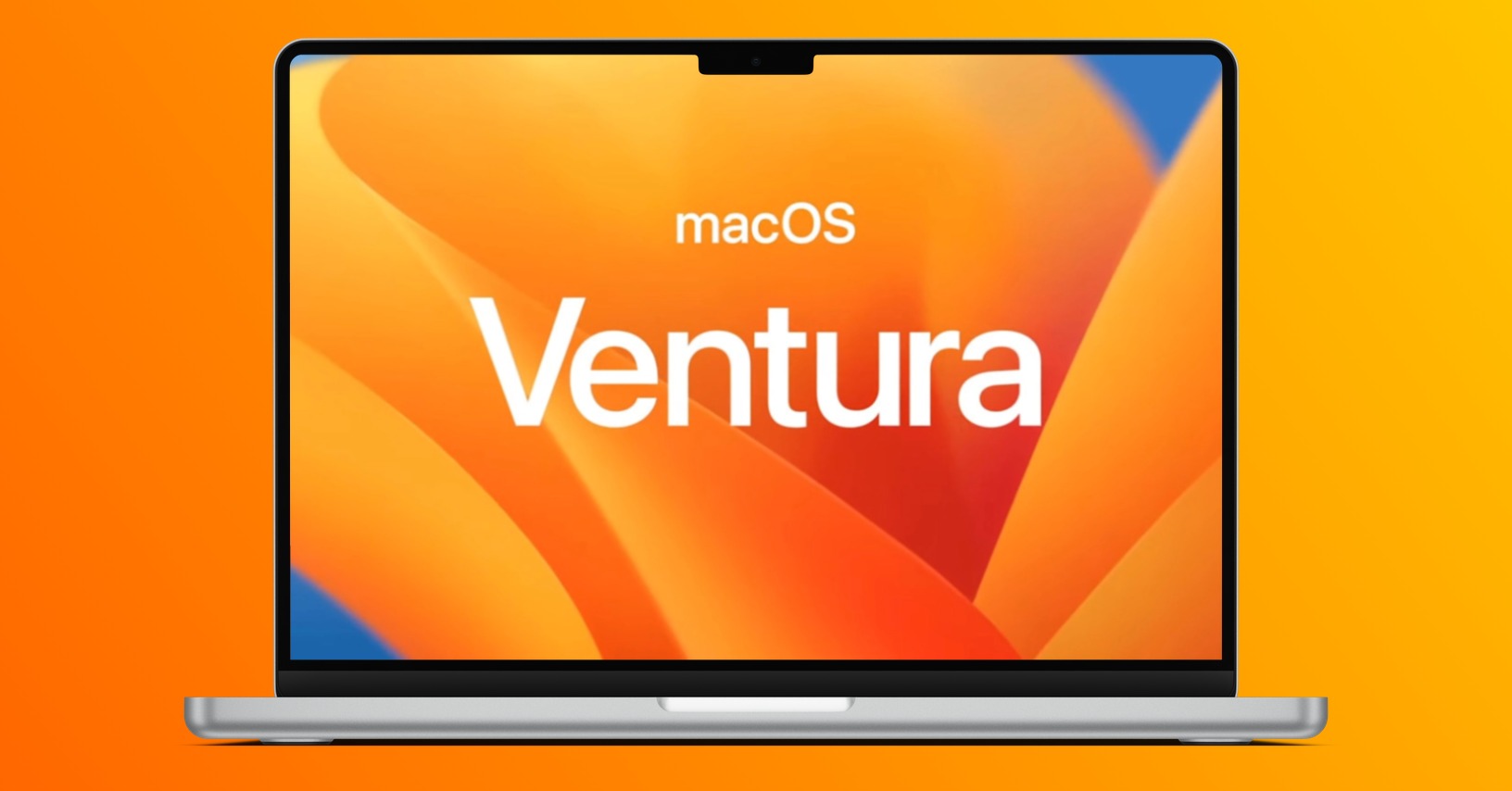
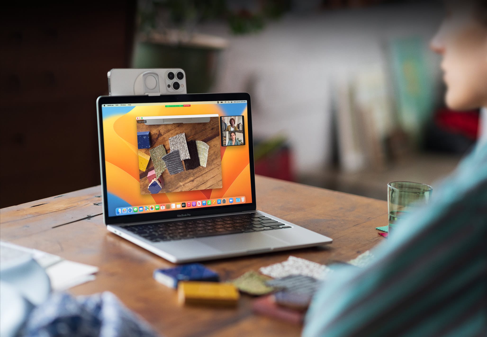
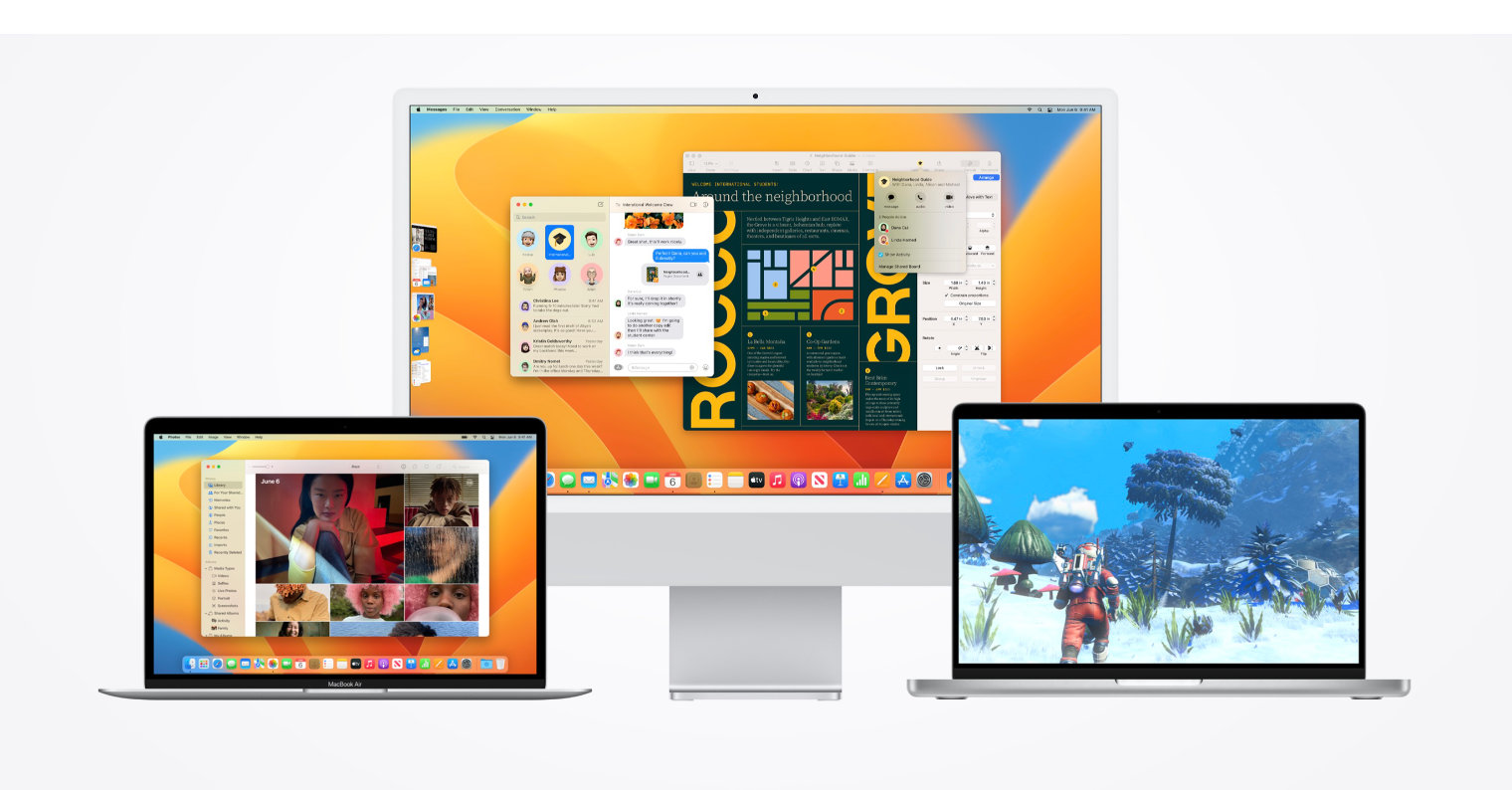
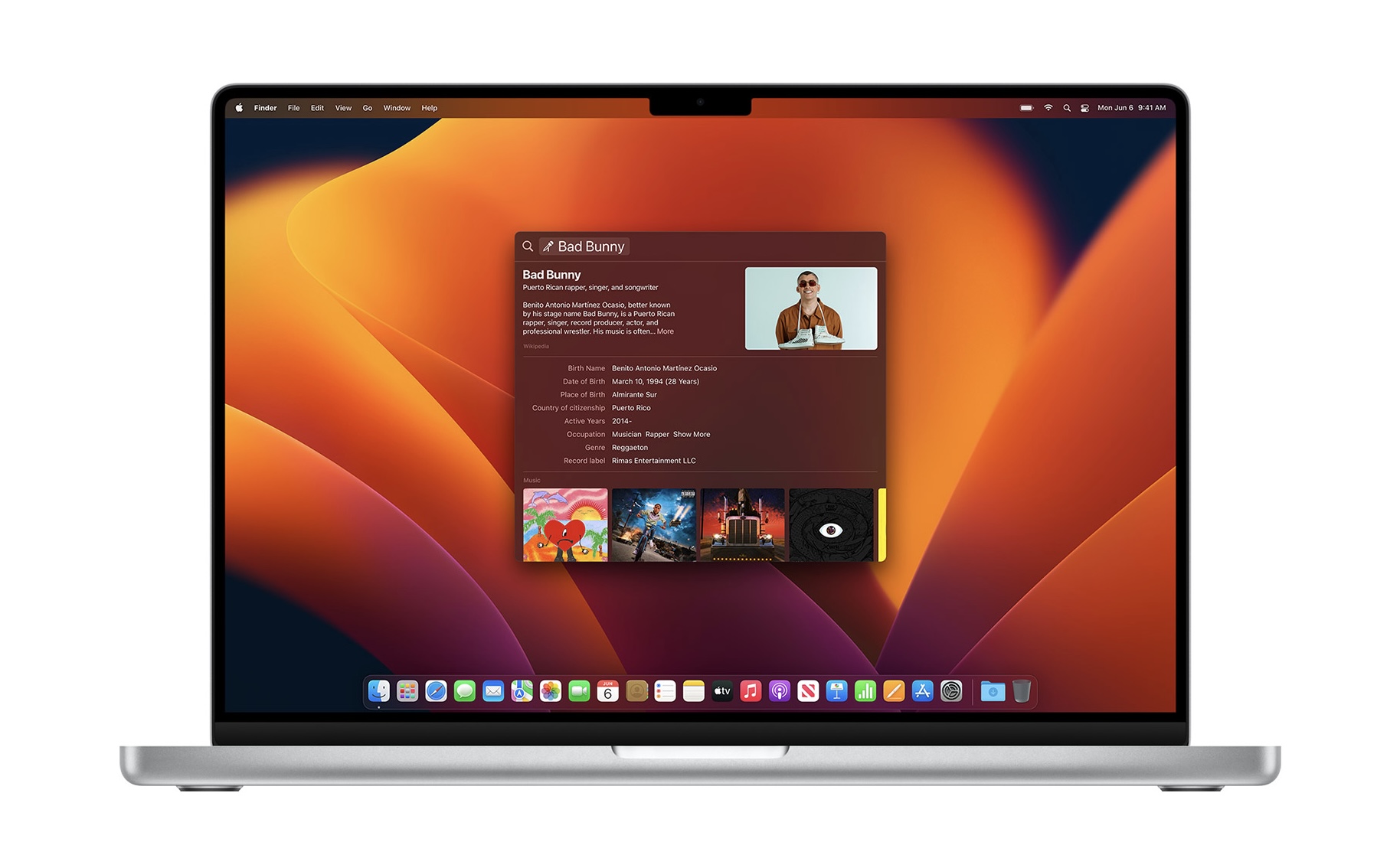
The macOS 13 Ventura operating system is finally available to the public after a long wait. The new system was shown to the world for the first time in June on the occasion of the WWDC developer conference, at which Apple annually reveals new versions of its operating systems. Ventura brings with it a number of rather interesting novelties - from changes to Messages, Mail, Photos, FaceTime, through Spotlight or the possibility of using the iPhone wirelessly as an external webcam, to a completely new system for multitasking called Stage Manager.
It could be interest you
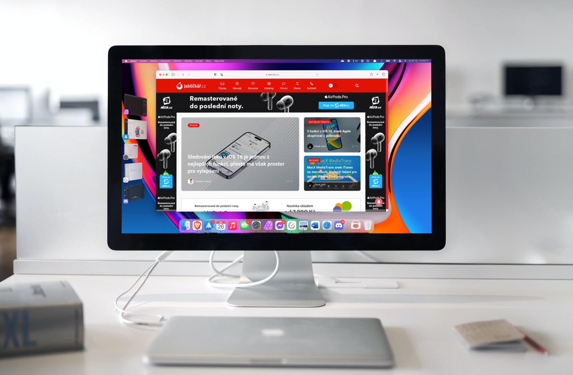
The new system is generally a success. However, as is the custom, alongside the main innovations, Apple also introduced a number of smaller changes, which apple users are only starting to notice during everyday use. One of them is the redesigned System Preferences, which after several years received a complete design change. However, apple growers are not twice as excited about this change. Apple may have miscalculated now.
Preferences systems got a new coat
Since the existence of macOS, System Preferences has kept practically the same layout, which was clear and simply worked. But most importantly, it is an extremely important part of the system, where the most necessary settings are made, and therefore it is appropriate for apple-pickers to be familiar with it. After all, this is why the giant has only carried out cosmetic modifications in recent years and generally improved the already captured appearance. But now he took a relatively bolder step and completely redesigned the Preferences. Instead of a table of category icons, he opted for a system that strongly resembles iOS/iPadOS. While on the left side we have a list of categories, the right part of the window subsequently displays the options of the specific "clicked" category.
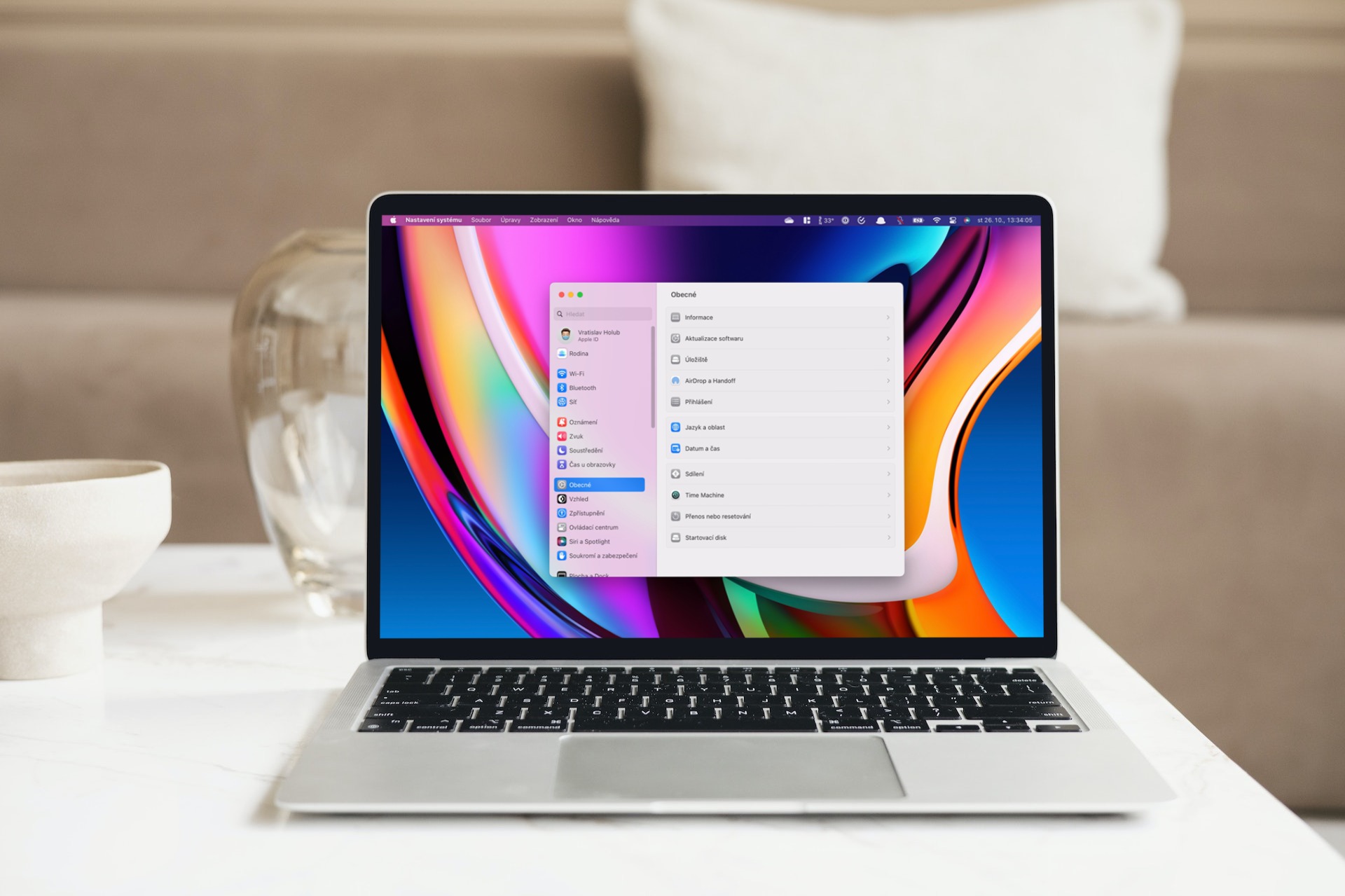
Therefore, it is not surprising that the revised System Preferences began to be addressed across various apple forums almost immediately. Some users are even of the opinion that Apple is going in the wrong direction and in a way diminishes the value of the system as such. In particular, they take away from it a certain professionalism that the Mac is supposed to offer in its own way. On the contrary, with the arrival of a design similar to iOS, the giant is bringing the system closer to the mobile form. At the same time, many people will find the new design confusing. Fortunately, this ailment can be addressed through the magnifying glass in the upper right corner.
On the other hand, it is necessary to realize that this is not such a fundamental change. Practically, only the way of display has changed, while the options remain completely the same. It will only take time before apple growers get used to the new shape and learn to work with it properly. As we mentioned above, the previous form of System Preferences has been with us for many years, so it is quite logical that its change may surprise some people. At the same time, this opens another interesting discussion. If Apple changed such a fundamental element of the system and brought it closer in appearance to iOS/iPadOS, the question is whether similar changes await other items. The giant has been working towards this for a long time. For example, following the example of the mentioned mobile systems, it has already changed the icons, some native applications and many others. How satisfied are you with the System Preferences changes? Are you satisfied with the new version or would you prefer to return the captured design?
It could be interest you
 Adam Kos
No, it doesn't fit 🤮, confusing, sprawling, I'd immediately go back to the old design
shut the hell up
What kind of shit? As in the world of Apple, you can't say that something went wrong?
Looks a lot like MS Windows now :(
I would rather be interested in why it is so slow, wherever I click in the menu, I wait a second for it to load.
I just tested it on my Pro 14 and you're right, it's powerful, you click and nothing happens for a second
I see it as a step in the right direction - it seems clearer to me and at least it is coordinated across systems.
It's true, in the 6 years I've had a Mac, I haven't really grown to like the original settings menu...
So I was looking for a change. But it's a habit. The search is the same as in iOS, so it's not terrible. But there could have been a bigger window.
Mac off and on timer gone…